


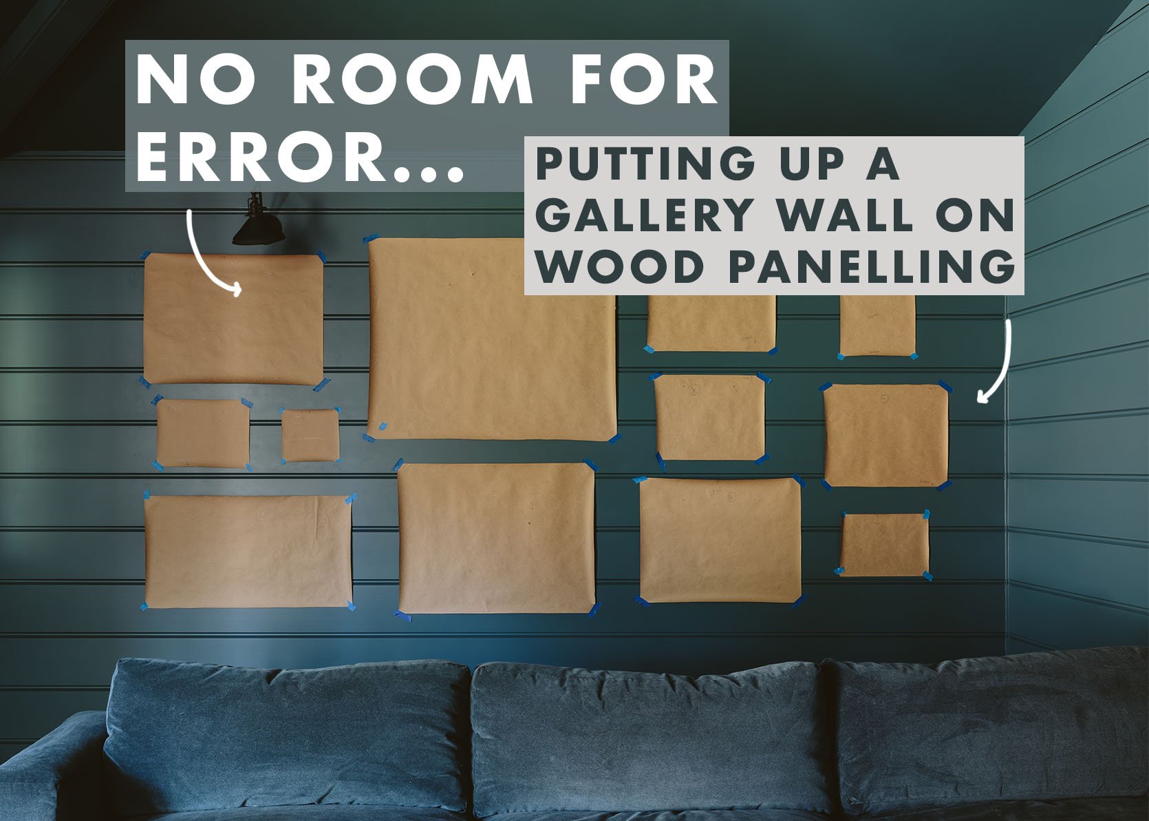

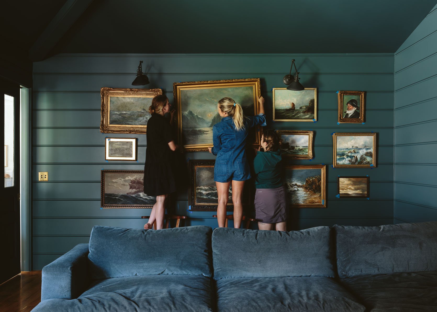
For the second time in my life, I attempted the “no wrong holes” strategy towards the always intimidating gallery wall. Sure, I’ll typically lay it out on the ground, and then try my best to recreate it on the wall, but there are always some hole mistakes (usually hidden behind a piece of art so I don’t stress about it). I’ve done maybe 80 gallery walls in my life and I feel more confident than most people, but it’s neither an art nor an exact science (it’s a combination). When we had clients, aka people who don’t love random holes in their walls put there by “professionals,” I would try much harder to be accurate, but still – there would be holes. In this room, with beautiful wood paneling… you can’t easily patch and touch it up and I really really didn’t want to look at my own mistakes in this newly gorgeous room. So I put on my “detail-oriented brain” (typically missing) and tried SO HARD to make this right the first time (with help from Emily M. and Gretchen).
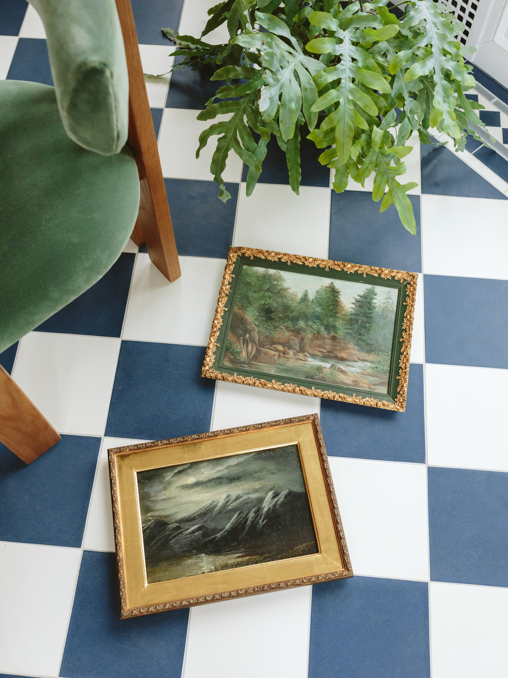
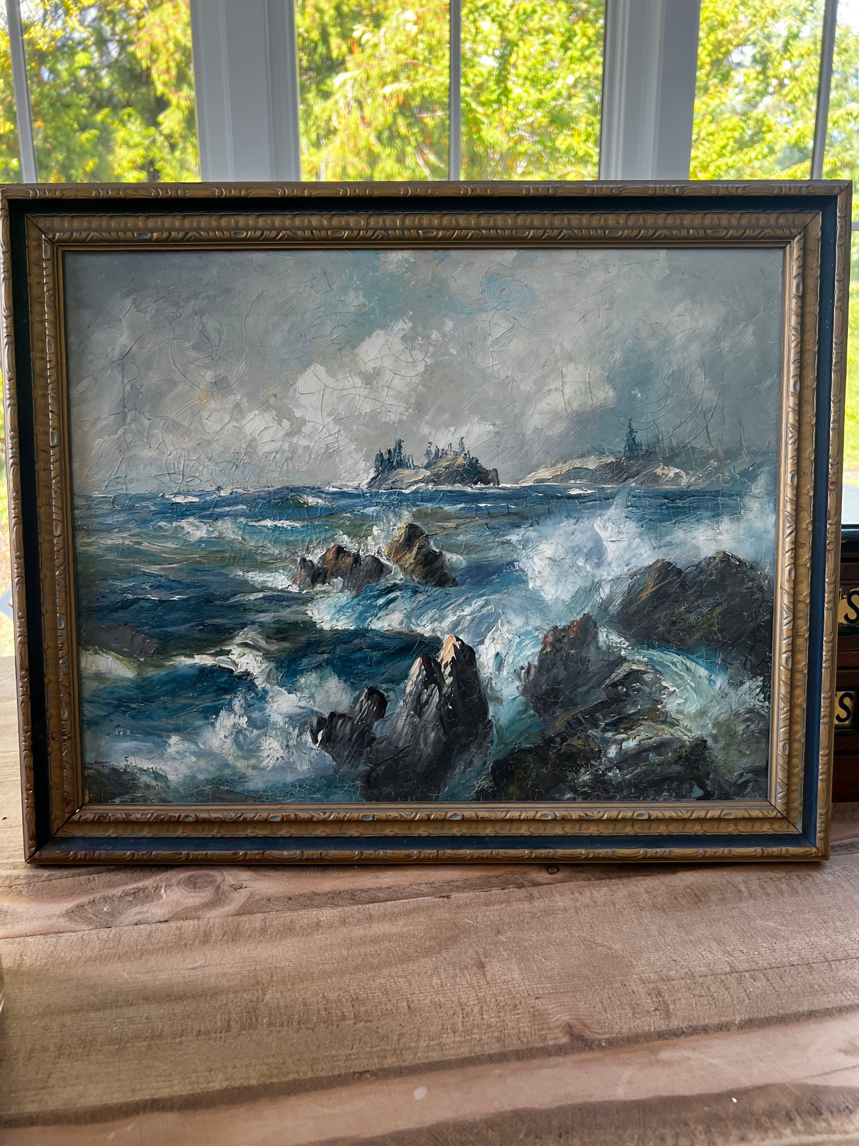
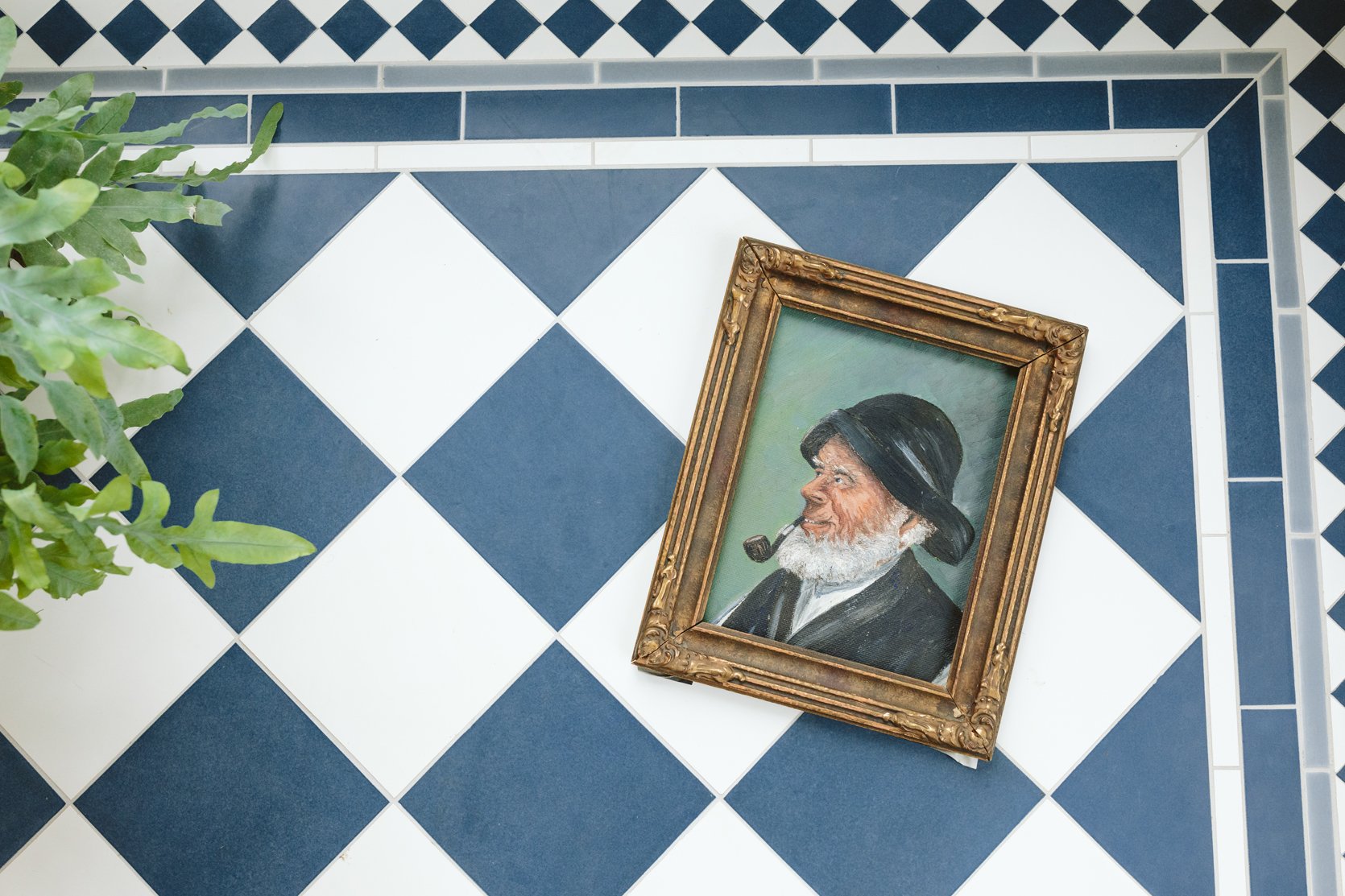
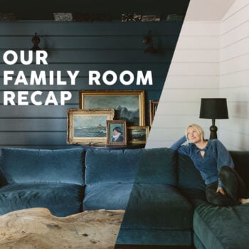
Ok first off, the biggest rule of the gallery wall is to collect things that you love, that work well together and for me, that means a cohesive color palette. I’ve seen this done a million ways – with random colors, mixed mediums, and totally different styles – and I think the thing that all great gallery walls have in common is unique awesome art. And it’s not as easy as that sounds. I don’t mean to be pretentious or intimidating, but where a gallery wall goes bad is when it’s just generic art thrown up to fill the space (in which case just do a diptych or large-scale readymade art – which we wrote about here and here). But if you want a dope, collected gallery wall (which by nature they should look collected), then ideally it should be full of unique, vintage, personalized, and/or straight-up good art. Again, I like a curated color palette because my brain appreciates cohesion, so all of my seascapes (which I’ve been collecting for years) are in the moody blue/green/dark world, nothing too bright or too midcentury this time. They all feel more like antiques than vintage (and yes, some were legit splurgy) most of the frames have some gold in them and are ornate.
STEP 1: Tape Out The Desired Wall Space On The Floor
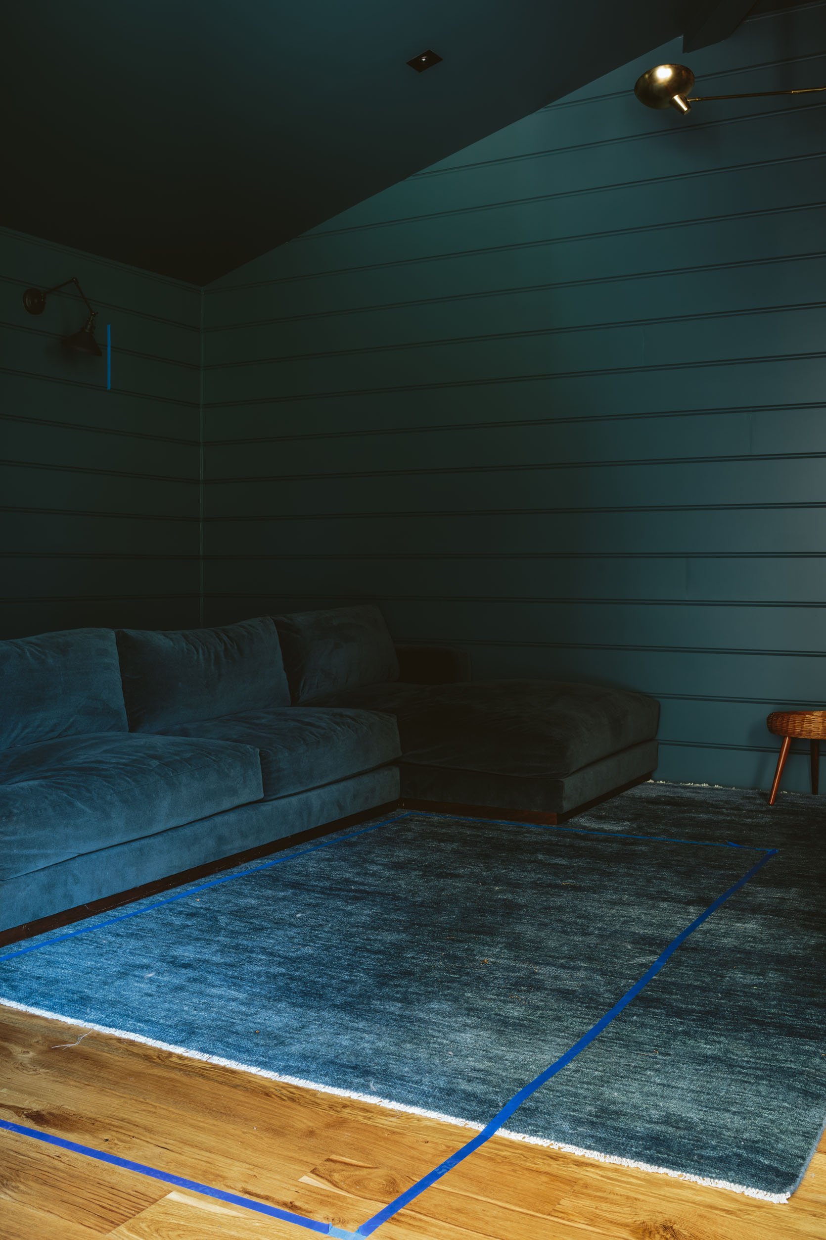
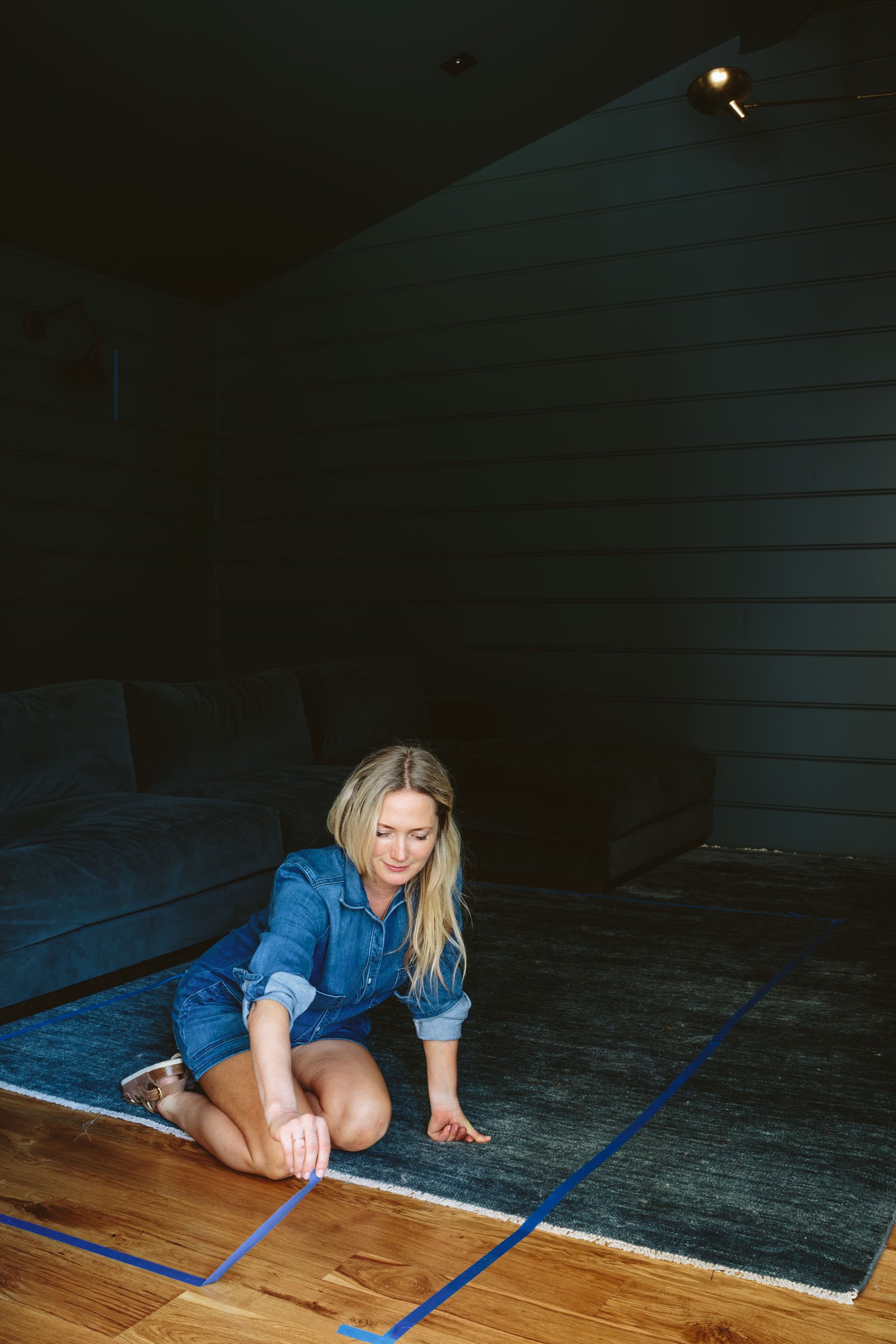
I knew that I wanted to cover the wall, but have the shape be more of a square (not organic this time). So the measurements were driven by centering it above the sectional, and the height was driven by the sconces, obviously, and the top of the sofa – we wanted to stay in that visual blank space.
STEP 2: Missing Photos, I’m Sorry!
Ok, so this is a crucial step that my team did while I was shooting something else in another room with Kaitlin and we forgot to get professional photos. But basically, you take paper (I have craft paper at my disposal) and trace each piece of art, then cut it out and LABEL EACH ONE (A, B, C, etc). Then use tape to write the coordinating label on the art. Don’t forget this next step – MARK with a pen on the paper where the nail hole should go so that once up on the wall you just nail, rip, and hang. And again, LABEL THEM. This is still not a perfect science, but it will get you farther faster.
STEP 3: Play With Composition On The Floor
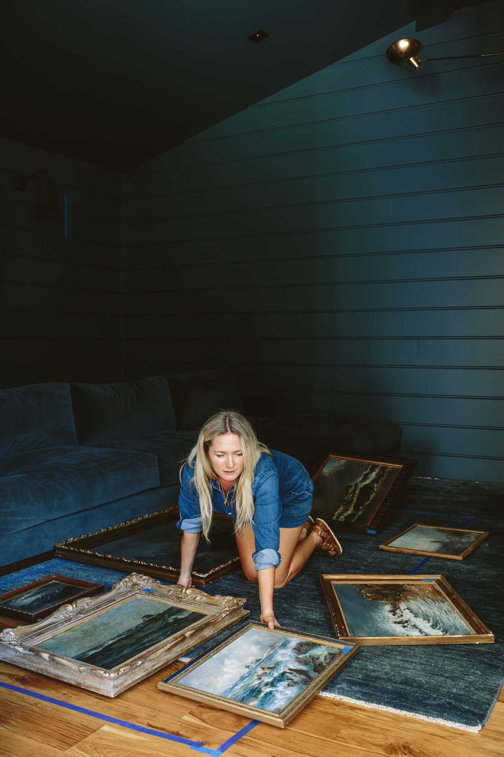
There are a million ways to do this, but I always start with the largest pieces, balancing them out on the wall/floor. So big go first, then the medium and small act as the filler to balance out the big.
P.S. See the pieces of blue tape on the frames? Those are my labels!
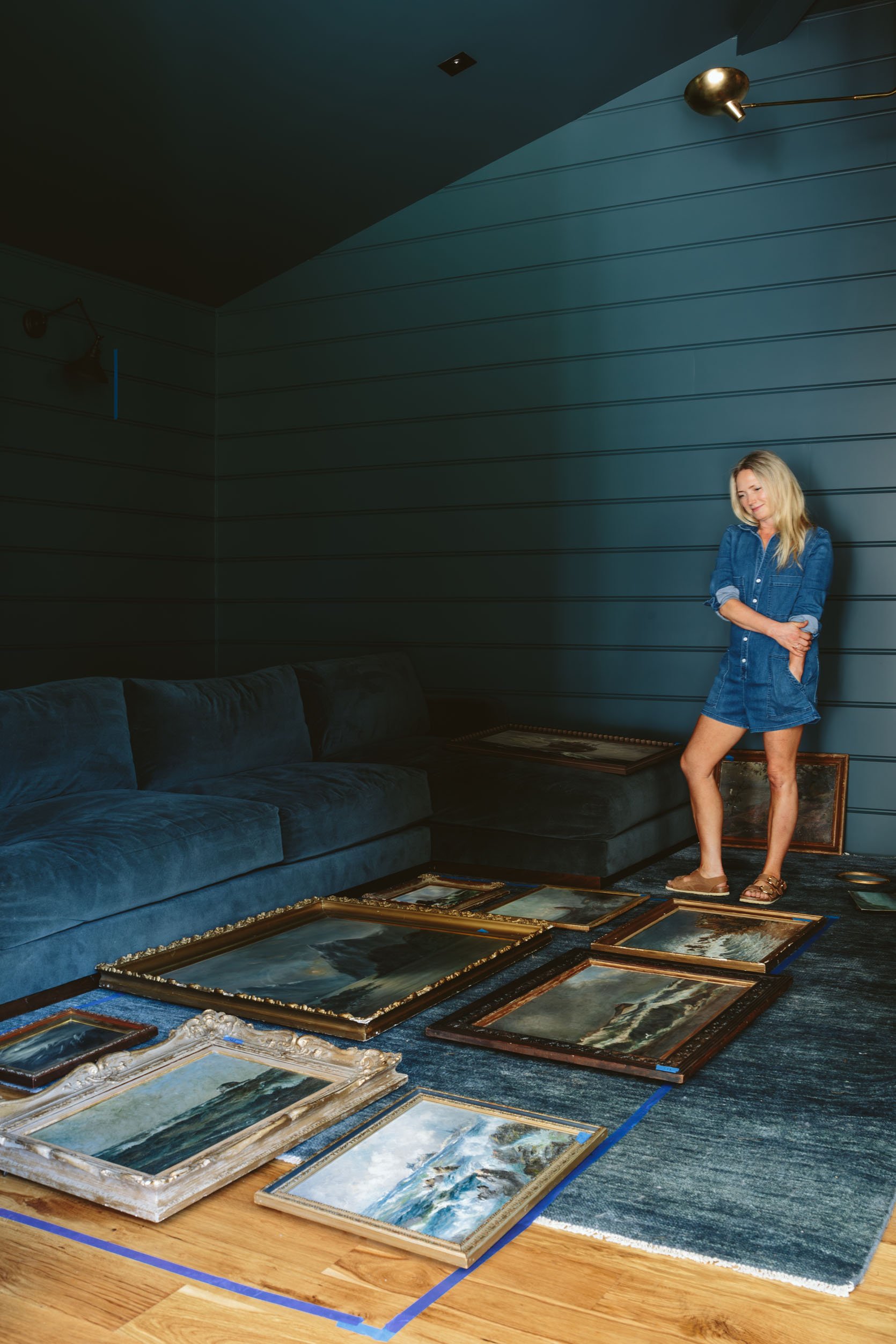
For this one, we didn’t keep perfect “rivers” between the pieces, so it’s in between a grid and totally organic. But the shape and size isn’t the only thing you need to keep in mind – it’s the color balance. One piece might feel visually “heavier” because it’s darker even if it’s small, and vice versa. You really just have to stand and stare for a LONG TIME.
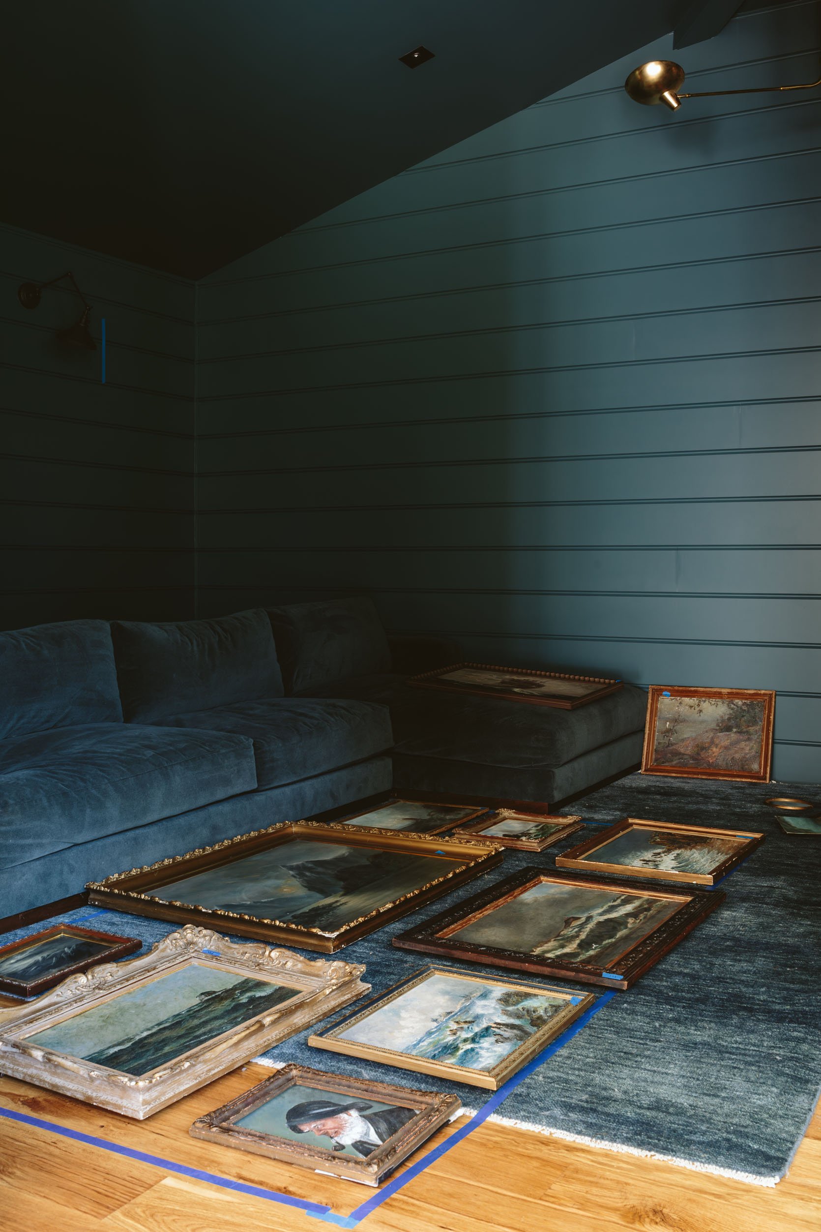
We finally got it to where we were 80% happy, knowing that it would still change. Then as you tape the corresponding pieces of paper onto the wall the imbalances become more apparent, and we changed before we nailed (when it was just taped).
STEP 4: Tape Paper On The Walls In The Same Configuration
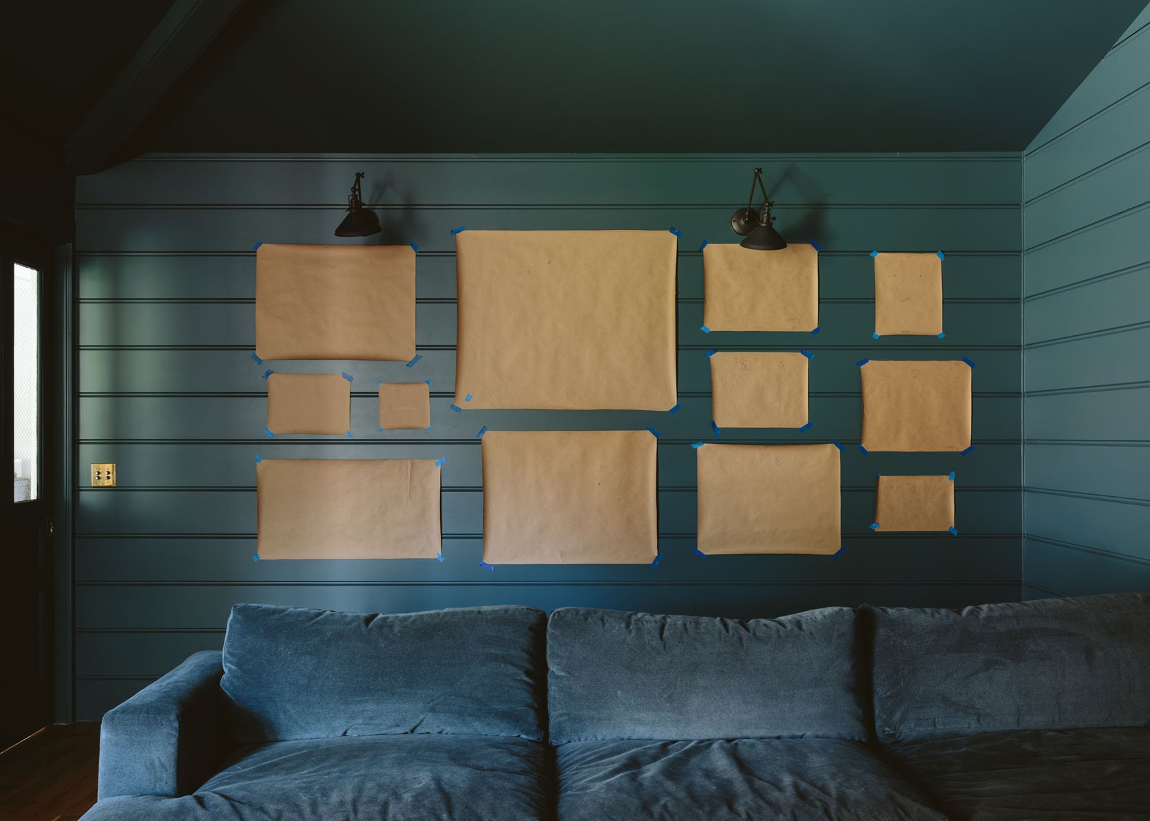
Now you can measure exactly where each one was in relation to one another, but I think that’s a waste of time (and would make my brain hurt) so we just went for it, knowing that blue tape comes up easily should you adjust (which you will). Once up, again, you might tweak even more. It’s a combination of trusting and forgiving yourself – just like life!
STEP 5: Nail Into The Marks On The Paper
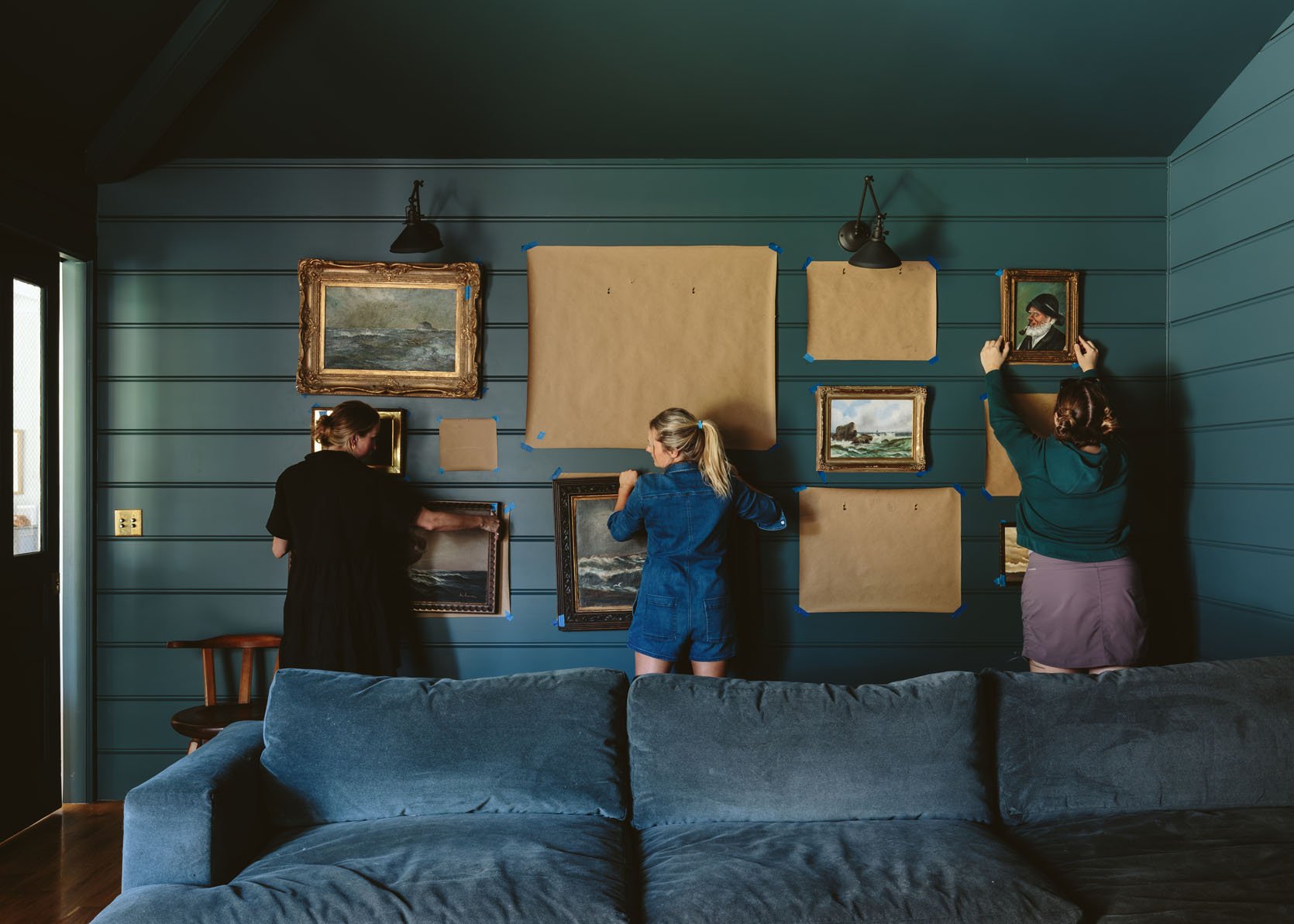
Remember those nail-hole pen marks you made? Time to take a shot, pony up, and hammer in your first hook or nail. We recently started doing two hangers instead of one because it keeps them from being tweaked. So that’s why you see two hangers (and again the marks are specific to where the wire would hang on the nails, not just where the center of the wire is on the back of the frame). It was SO FUN.
STEP 6: HANG THAT ART (And Rip Off The Paper)
As it came together we were all riding high on design dopamine – when things REALLY WORK!!!!! HALELLUJAH! Not only did this method create zero mistake holes, but my goodness we loved how it looked.
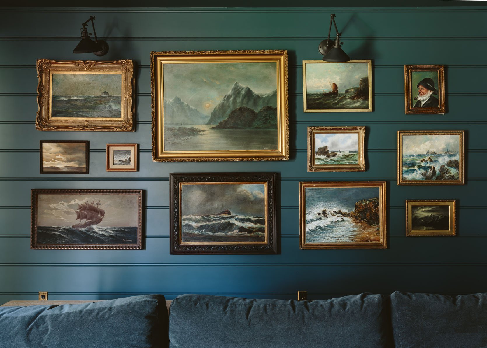
And if you have a really astute eye for reading this blog (thank you very much) you’ll see that we had to pull two of the seascapes from the kitchen (flanking the range) which I was sad to see go there, but they belong here, together with their friends and family.
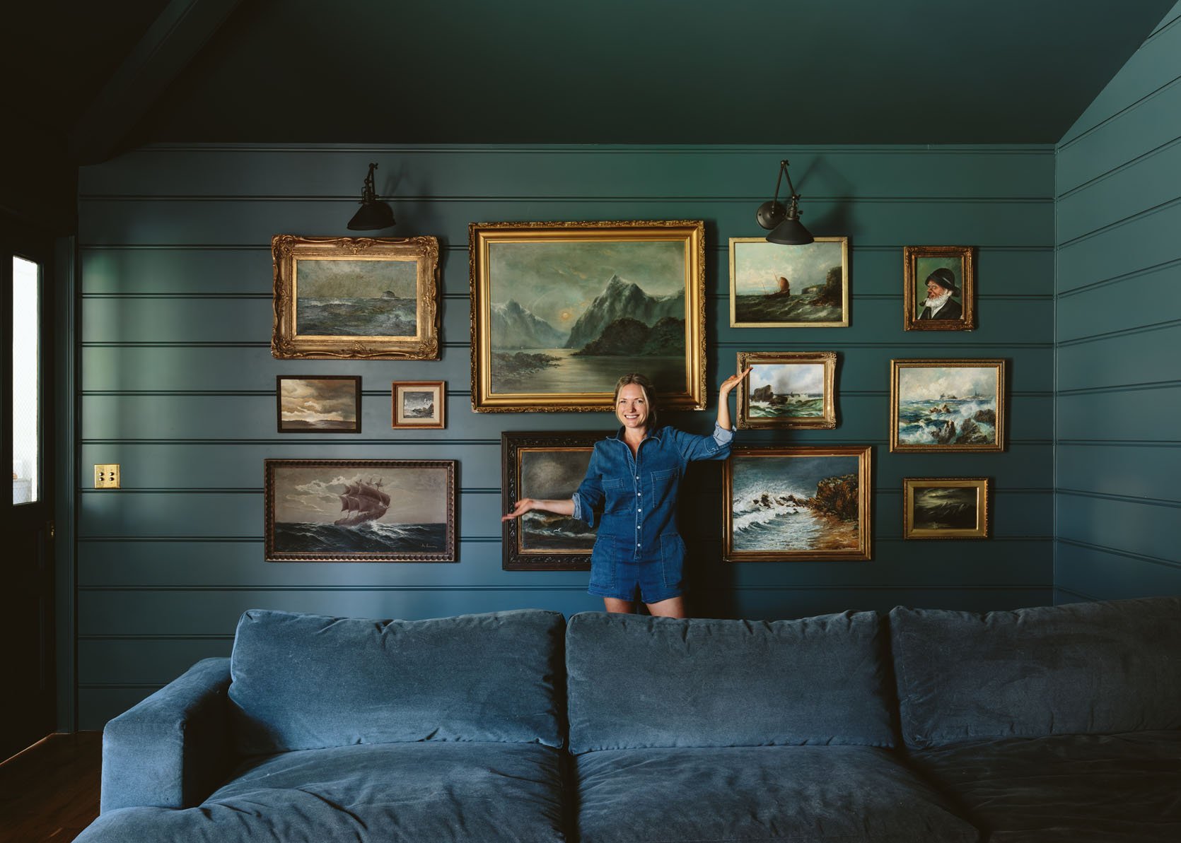
I’m so happy with it. You can even see it from the living room and with the sconces on their lowest dimmer it looks so inviting and dreamy. The full reveal coming soon (and I know you think you know what it’s going to look like together, but please come back to see how it’s all styled (and the two walls we haven’t shown you yet).
For those of you wanting to recreate this look, we rounded up some of our favorite online shoppable vintage or printable seascapes in this vibe. I highly recommend copying this room – the whole blue-on-blue thing with these seascapes is quite the cozy vibe.
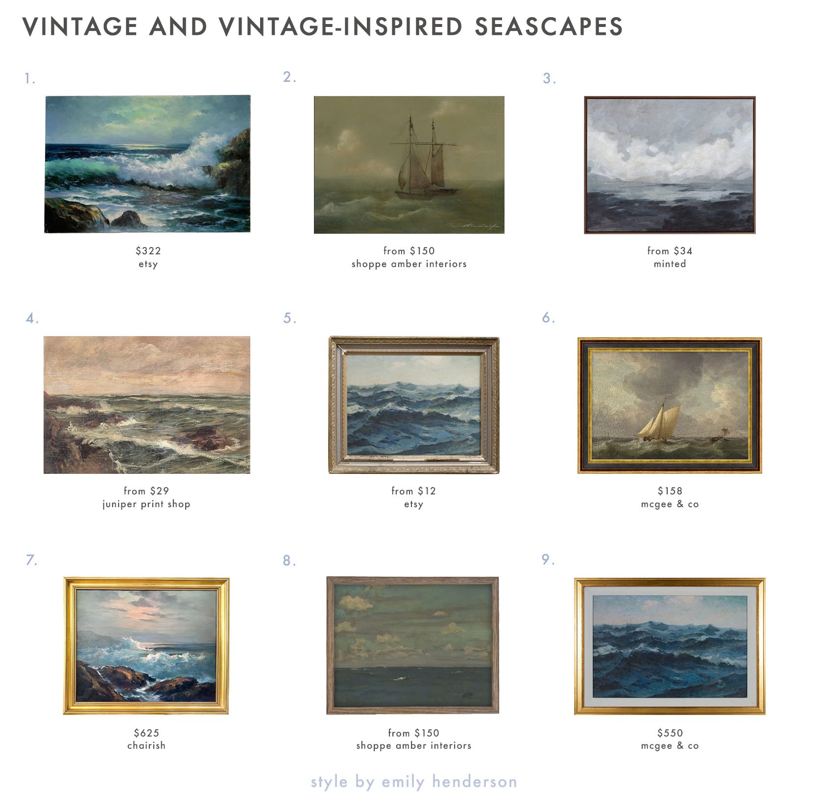
- Vintage Rocky Beach Seascape | 2. Sail 3 | 3. Winter Bluff | 4. Baltic | 5. Seascape Painting | 6. Seafarer | 7. 1960s Maine Seascape Oil Painting | 8. Landscape Framed VI | 9. Deep Blue Waves
*Photos by Kaitlin Green
This is so helpful; I am not a gallery wall person for the most part but I AM a major “no unnecessary holes” person, to the point where I sometimes leave art sitting leaning around the perimeter of a room for YEARS before committing. (Which is just so silly.) One time I hired an interior designer just to tell me where to hang everything and to actually get it hung, and which he brought his own installer for, and that was nice but also a somewhat silly and belated and expensive way to go about it. Love having these tips (especially in a climate/wall type where command strips don’t adhere as well (something about the moisture retained in plastered brick walls I suspect). I have a funny question not exactly about setting up the gallery wall – how “nautical” can you go when you don’t live right near the ocean? In our former Seattle house we were quite close to the Puget Sound, which was magical, and allowed me to justify a bathroom painted deep navy and filled with old timey ships and brass ship parts and vaguely nautical décor (but not like beachy – just, idk, maritime?) Now that… Read more »
I love this question, even if there is no ‘right answer’. I live in Minnesota and our nearest coastal areas are fresh water/inland seas. But we’re a 4.5 hour drive from there. Lakes and woods are everywhere, but those art scenes tend to be very brown forward. These blue/greens are gorgeous. but I also pause and think my home should reflect its place in the world (literally). Nothing feels stranger to me that seeing tropical themes in a northern locale for example, no matter how much I love a winter escape. On the OTHER hand, what I call “You are here” art that overemphasizes local/regional places can sometimes very AIRBNB/touristy. What is the right mix? Is there a right/wrong here? I think it’s personal. Either you love a palette and seek art that fits it. Or you love a theme and find a palette that aligns… I think there is likely more than one approach. but would love a professional opinion if people are facing a fork in that road, so to speak.
I personally think London would be the perfect place for a wall like this. And I agree on the no tropical theme. 🙂
I would say your heart wants what it wants, doesn’t matter where you live or don’t live. life’s too short to worry about rules. decorate with what brings you joy.
This is my philosophy. If you love a piece of art, you will find a home for it. And if you love the ocean, why on earth would you not have reminders of it in your home?
Kate Watson Smyth from Mad about the house blog states that a London Town home is the perfect place for tropical wallpaper /themes. All you have to do is look in your own yard or the neighbours and large foliage plants abound. She wouldn’t recommend for just any country house though. I think of London as rather quirky and unique. Put up your seascapes. Maybe not the ones that rub your the wrong way. Life is short enjoy your stay in London.
I credit you, Emily, and this blog for making me take a second look at traditional art. I’ve got a lovely collection of prints (and their block from my artist grandmother), posters and photographs, but my husband had collected more traditional works in very different moods. I’ve learned to embrace these and have further added portraits and landscapes that reflect both of us – much of it encouraged by moms like this. Enough about me, I want to give a standing ovation to this room overall. The bumps are natural and normal. but this result feels so so wonderful. If I had enough rooms I would 1000% copy this whole vibe. Instead I will take Inso and continue my less coastal more mid-western theme to the art and yeah, maybe even a gallery wall.
I struggle with gallery walls. I’m curious why this one wasn’t centered along the back wall? There’s empty space on the left but not the right and not centered to the sconces. Also, how do you determine the height? Is some of that just a visual “eyeballing it” decision or is there a rule to follow? I’ve heard art should be hung just slightly higher than eye level, but I’m 5’4″ and my eye level is very much different than a tall person’s eye level!
I felt discomfort about it not being centered under the sconces, too. As for eye level, I don’t worry about that, I just shoot for a height that looks right on any particular wall. I think the eye level advice is to help people whose inclination is to hang art way too high. A lot of my art hangs slightly below eye level.
There’s a door on the left that opens into the room, and is probably left open a lot. You wouldn’t want the door hitting the art. So I’m guessing that’s why the collection is positioned as such, and “centered” on the sectional.
It’s a pocket door on this side The door to the mudroom/bedroom area swings but opens into the hall not this room.
I think the art is placed that way to appear centered over the back of the sectional.
I think she was going for centered in the “room” over the couch rather than centered on the wall. The left side of the wall with the blank space aligns with the pass through space, so not really the main part of the room. I didn’t even noticed that it wasn’t centered on the wall until I read your comment.
I’m also a fellow shortie (5’3″). When I hang art, if it is linear (not a gallery wall) I hang it so the art is a couple inches above my eye level, which ends up being between my eye level and that of my tall husband. If it’s a gallery wall, I eye ball where the largest (or weirdly shaped) pieces look well balanced and then fill in with the medium sized, then the smalls like Emily advises in the post. (I’m an artist and have way too many gallery walls in my home full of my and my friends’ artwork. I’m addicted to art.)
This caught my attention at first, too, but I think she mentioned centering the art over the sofa. I can only assume that when you are actually in the room, being centered over the couch feels more balanced. (Since that left side is a bit of pass through + doors to porch). For height I have heard to center it vertically around 57-60 inches, and then do this for all of your walls so they feel cohesive. We did this in our living room and it helped a lot, as I am 5’2″ and my husband is 6’2″ so we needed a guide. For groupings, you center the grouping (so the center of the whole gallery wall), for single art, you do just the picture.
This looks amazing and worthy of the work you put in to making it right. Thanks for sharing your layout method. Looking forward to the full room reveal! Curious, though, why you didn’t instead just hang a long picture rail with chains (like in your entryway), just below the sconces, so you could change things up anytime and would have only the holes for the rail.
Interesting to see your process. To drill down on the diy, how do you determine how to measure and mark the craft paper cut outs for nail holes? Process must be different depending on whether the frames use picture wire, loop hangers on the outside edges or alligator hangers across the top? (I’m sure I have all those terms wrong!). And how/why did you decide where to stop and start the perimeter of the gallery when working with sconces that are centered on the wall and an off center sectional?
I think as long as the art you hang evokes a positive feeling or memory, it doesn’t matter if it’s local to you. I have a watercolor of a thatched cottage that reminds me of our trip to Dunmore East, Ireland. It’s in the same room as two oil paintings of a farm not far from where we live in the Midwest. They’re all rural scenes though and not at all modern so they work for us.
I just love this room. The colors and art are so good and I just love all the blues. I am looking forward to the reveal!
Bravo on the gallery wall and the shared tips. The wall is stunning and the room has such a comforting vibe while being casually elegant. So inviting and looking forward to seeing all of it!