


Would there be an EHD room reveal without a Frankenstein-ed style name attached to it? Today, we’re revealing Target’s cozy fall line and after seeing it all come together, we threw around a handful of word combinations to describe it—”Polished Cabin!” “Relaxed Rustic” “Refined Upstate.” Where we landed is actually funny, considering my latest personal style fashion evolution post, but honestly, this year, in both the home and our closets, evidently, it’s all about “Elevated Prairie.”
This look—which I’ll walk you through with all the hows and whys to get this warm, cozy vibe into your own homes successfully—feels like something out of a Nancy Meyers movie where Diane Keaton or Meryl Streep is the protagonist and this is the “upstate” home she escapes to from the big city when she decides to leave behind a big important corporate job to build a jam-making empire, and complicated relationships ensue.
“Elevated Prairie” is this happy place between rustic and traditional with a decidedly cleaner, more modern feel. Listen, rustic vibes do NOT have to mean cluttered or dated. The key is to keep lines clean, finishes more modern (hello matte black) and styling more on the minimal side, letting the materials and textures really charge forward on their welcoming crusade.

This is who I’m calling “cleaned up mountain Emily” because I put on a dress and heels, but if the neck handkerchief is any indication, I’m ready to go build a fire, hop on my horse into town, and DEFINITELY make an absolutely perfect pie crust, left to cool on my kitchen windowsill. But enough about my rustic-loving alter ego, let’s get into all the goodness behind Target’s new line and how we made it all come together in both a living space and bedroom.
Up first, the living room and entry (or hallway):
Step 1: Create a warm yet simplified color palette.

Shop the Look: Sofa | Square Suede Pillow | Hand Crochet Round Pillow | Woven Stripe Throw Blanket | Square Woven Plaid Pillow | Forest Framed Wall Art | Metal Log Holder | Mug
My general rule of thumb for ANY room, if you aren’t sure where to start, decorating wise, is to begin with the color palette. Typically, I like to advise anyone embarking on their color journey to pick 3-5 colors (including neutrals). Now, I’m not saying you can’t accomplish Elevated Prairie with a bunch of blues and greens, but well…yeah I am actually. There is absolutely room for both of those (and we brought in those cooler tones for some balance which I’ll show you in a sec) but in general, you want creamy neutrals (not bright white) anchored by tones with lots of depth, like rust and brown (yup!), while keeping it from going too dated with the addition of black, white and brass.
Here, we created a “not your basic” pumpkin spice palette that could honestly work year-round. We went with a mix of neutrals (off-white, gray and black) and pops of earthy hues (chocolate brown, rust, maroon) mostly pulled from the area rug but a sprinkling of other colors to keep it from feeling one-note.
I think green via trees (either in art or out the window) is almost a “neutral” to be honest and nearly every space has room for it. Here, we created our own diptych from matching framed canvases, which I actually really love. These would look great to round out both a sleek modern room, but also bring in nature to this refined rustic vibe. You know I love a tree moment; there’s something so grounding about them, and here, the framed canvas looks expensive and elevated (especially for $40). Also, unrelated, but equally good, is that log holder. I used a sample of it in the mountain house living room for the reveal and I’m 100% obsessed with it. It has a little leather handle that really levels up its simplicity.
Step 2: Keep key furniture silhouettes simple and unfussy.

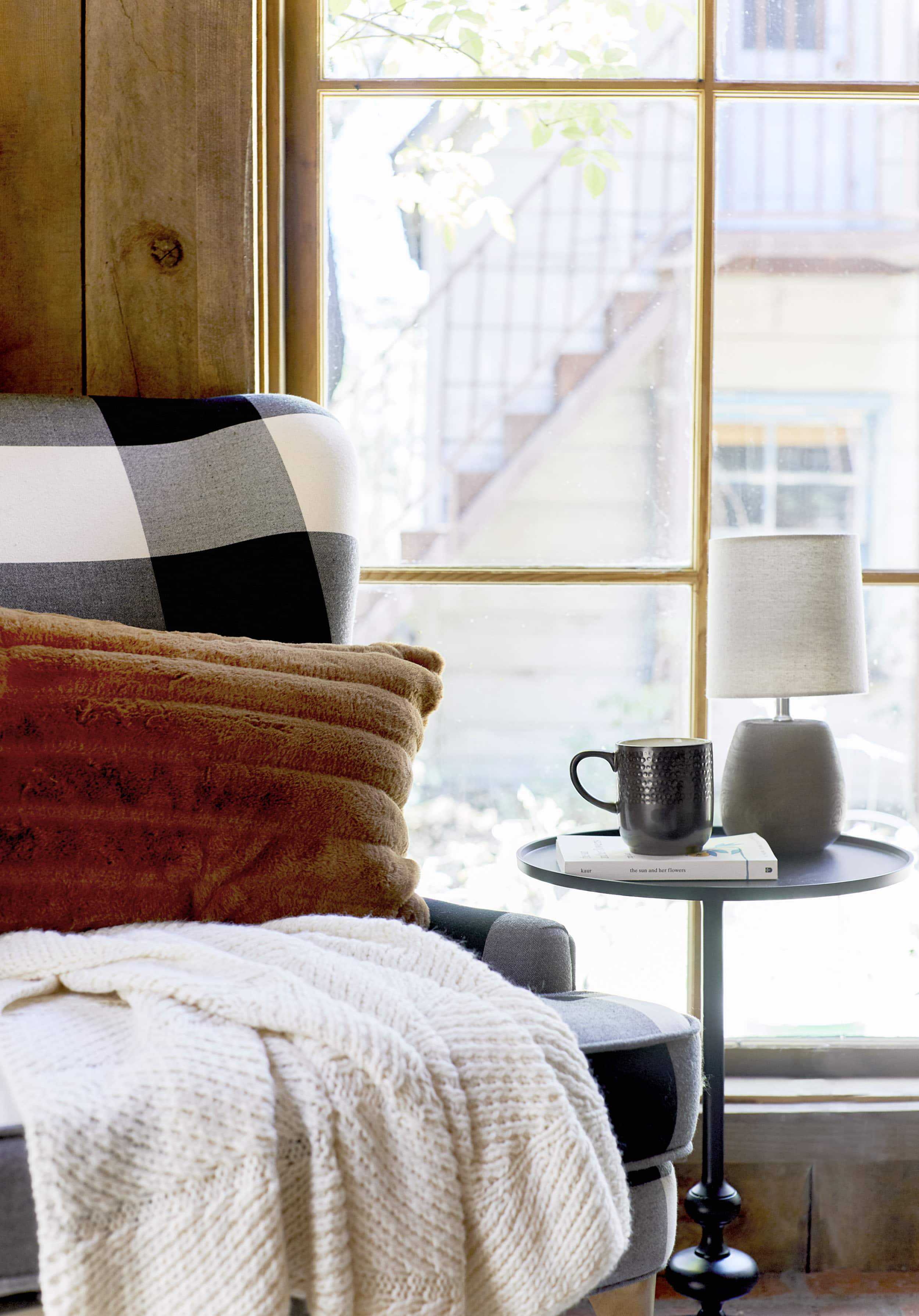
Shop the Look: Chair | Accent Table | Mug | Table Lamp | Sun and Her Flowers by Rupi Kaur | Faux Fur Throw Pillow | Throw Blanket | Artificial Magnolia Leaf Wreath | Slippers
Truly, this is my general advice for EVERY room (mostly so that those truly special pieces you bring in that make your heart sing can stand out). If everything is a “moment,” nothing is actually a “moment”…design words to live by I’ve found. Let’s take this cozy little reading nook for instance. That wing back chair is SO good. I first fell in love with it in last year’s line up except it’s back this year and BETTER THAN EVER in this buffalo check. A wingback can feel really traditional and stately, but the proportions here are much more minimal. The leg on this is delicate and slightly tapered, the arm is very low and subtle, and the “wing” part itself gives you a gentle hug without being too tall or overbearing. This is a Goldilocks chair moment: not too big, not too small…just right.
Also, that table. I professed my love for this little lady last fall when it was first released, and I still love it so much. It has a “traditional” turned base (it’s not really “turned” because it’s metal) but the silhouette is very thin and the black metal freshens it.
I’m going to show you that first photo again to talk through the other anchor pieces in this room so you can see that they fall under this “subtle furnishings” rule:

Shop the Look: Rug | Coffee Table | Coiled Rope Tapered Basket | Tray | Coasters | Vase | Faux Flowers | Candle | I Guess I’ll Write It Down by Beth Evans | All the Ugly and Wonderful Things by Bryn Greenwood
The sofa, in any other room, would be squarely in “modern” territory, particularly because of the contemporary leg, the gray felt-like fabric and just general sleek silhouette, but it’s actually exactly what this room needs to prevent it from going too heavy. Had we done something like a leather chesterfield in here, it wouldn’t feel as airy or welcoming, TBH, even though it certainly would have “fit in.” And while the X sides of the coffee table are certainly a little more traditional, the more delicate proportions (and being in a satin-y black finish instead of a heavier wood tone) keeps it quieter and a little more modern.
Step 3: Bring on (and vary) the texture.
On the internet, it feels like fall is synonymous with texture. If you have a TON of cozy textures via throws and pillows, it’s FALL! The internet is not wrong and that texture is actually really important to pulling off Elevated Prairie. Here, almost everything is a textural element, from the rug to the pillows to the throws and even smaller decor items like the brass tray on the coffee table. But let’s stop for a second to really break these things down.
Quickly, before we move on though, I just want to say, MAN, I LOVE THAT TINY LAMP. It’s faux wood, but it kind of looks like concrete here? You know how much I love miniatures (and lamps), so this cutie really speaks to my soul and is the perfect scale to go on that petite side table. Okay, back to texture:

Pillows: Throughout the whole room, we went with a mix of mostly solid-colored pillows in our color palette but almost no two are alike in terms of texture. On the wingback chair, there’s a (ridiculously soft) faux fur lumbar that is (sort of) channel-tufted for an added graphic layer, the sofa has a GREAT faux suede pillow as well as the round and knit accent pillow. Nothing is duplicated, yet it all seems very cohesive.

Throws: Same story here. These are scattered through the room because it’s fall and you might get cold, of course. We did a mix of solid, subtly striped and then colorful. I want to call attention to this great throw while we’re here. It looks so much more expensive than it is ($25), the large tassels and interesting alternative knit weave make it look like it could have come from a high-end design boutique. The throw on the sofa has a bit of a stripe that echos the pattern of the rug, and the maroon throw on the bench I’m going to show you in a second, is a great faux mohair with a quiet touch of mustard running through it and elongated fringe. All different, but, again, cohesive to the room’s color palette and general style vibe.
Rug: Scroll up for a minute to look at that area rug. Alright, you back? The colorway isn’t something I’d traditionally go for (if you’ve followed me for any time now, you’ll know I’m not huge on orange), but honestly, we’re all pretty obsessed with this one. It’s a stripe without being TOO graphic (thanks to the varied stripe width), it’s warm without being suffocating (thanks to the white throughout) and brings in a bit of unexpected texture via the staggered fringe. Most rugs have fringe fully on two sides, but this one shakes things ups by only having it in some key places (to draw your eye to the larger rust-colored stripe). I haven’t seen anything like that on the market, honestly, and it feels very “high market.”

Shop the Look: Tufted Storage Bench | Owl Basket | Striped Pillow | Cream Pillow | Throw Blanket | Hat
Decor: Every Elevated Prairie room needs a seagrass owl planter basket, folks. Owls live in the prairie, right? But all jokes aside, how cute is this? It really serves as a textural moment that breaks up the seriousness that can tend to happen sometimes with “fall” or even just more traditional decor. (Side note, I know we’re not talking about this technically in this section, but I did want to bring up that great bench. It has storage (!!), the angled legs make it feel mid-century while the tufting is a bit more classic, and the shade of blue is so great in that it’s not too navy, not too cobalt and can really work in so many different styles and palettes.)
Step 4: Layer in a touch of modern glam.

Shop the Look: Brass Pendant
There isn’t much “glam” here but I can’t cruise through a room without leaving brass in my wake. Usually, I like to use brass to warm up a “colder” modern space, but that’s not really an issue that needed to be solved here. Instead, the rustic prairie vibes needed our golden decor savior to pull in a touch of glamour and modernity. We brought it in via this great new industrial pendant that’s such a nice size for either over a dining table, next to a bed, above a kitchen island, or you know, in a little hallway or entry vignette like this one. It’s large enough that it has a presence but not so big that it falls into “overscale” territory (which I normally lean toward in lighting but not every design plays nicely with it).

We also layered in brass on the coffee table, which balances the room (both brass moments are actually on opposite sides of the space so they didn’t feel like afterthoughts or too clustered together). When you have more of an earthy thing going on, a little glitz or surfaces that bounce light are always a welcome to cut through.
Step 5: Sprinkle in the “Rustic.”
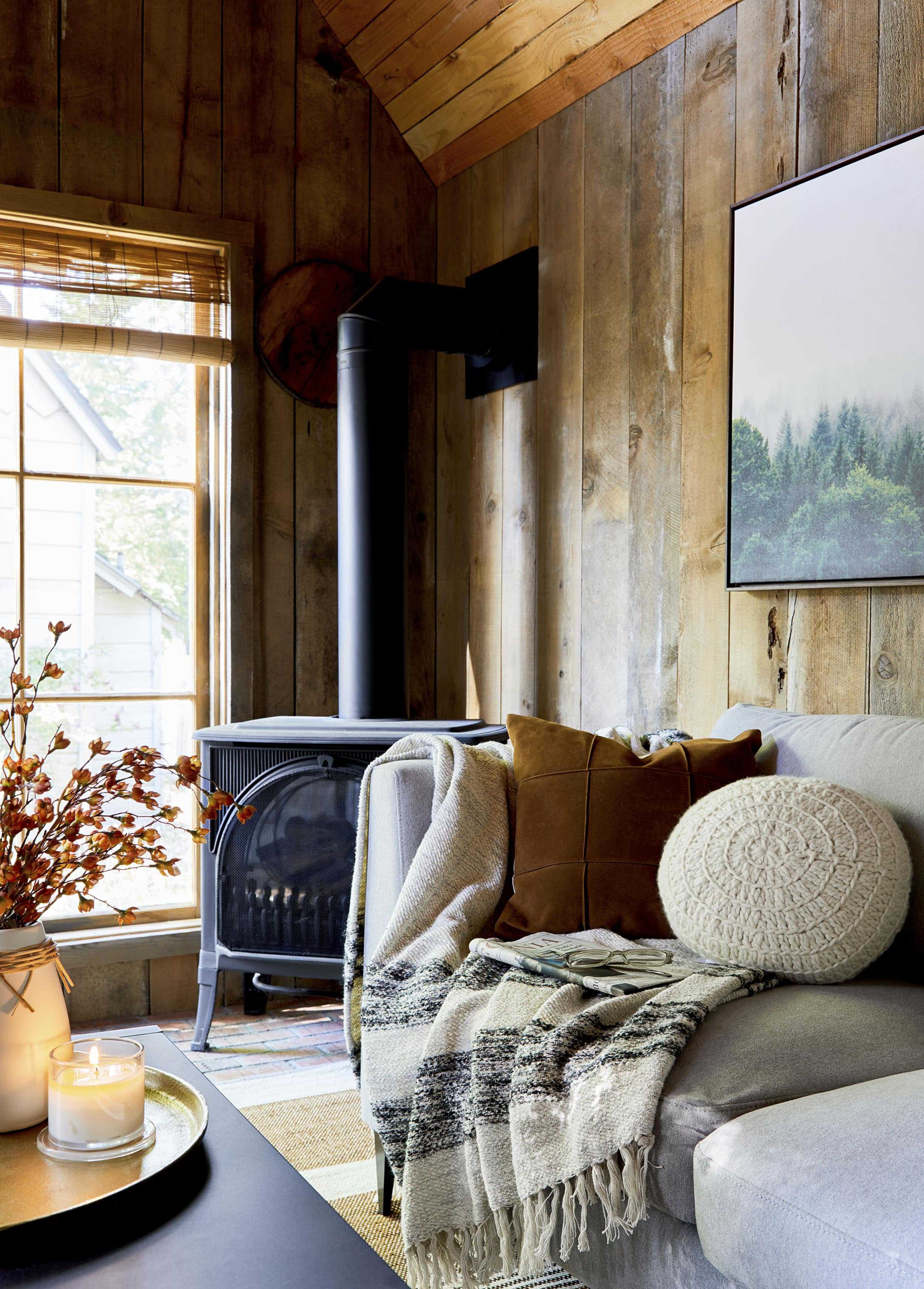
Of course, it would be remiss of me not to bring up the biggest “rustic” moment here which is the room’s actual walls, floors and ceilings. Sadly, you can buy none of that at Target, of course, but honestly, you can accomplish a similar vibe in your normal-walled home by sprinkling in a few more wood furnishings (another side table, a console, wood frames for art or personal items, etc.). Or, if you want more of the “Elevated” part of “Elevated Prairie,” pulling back that rustic wood layer all together would definitely tone things down. It would still feel welcoming and warm but without being too heavy-handed.
Either way, our obvious rustic fall touches here are those great faux florals in the vase on the coffee table. I’ve been on the fence about faux florals in the past, but I’m pretty much fully on board now (especially if you mix them into fresh flowers to fill things out…it’s about balance). Here’s why: look, I love dried florals, but if you’ve ever used them, they know they can be super fragile and messy once they start to crumble. Plus, you can use these year after year, which is always a win (and money saver).
Besides the fall-inspired color palette and all those cozy textiles we brought in, the other quiet, sophisticated fall moment here is that fantastic magnolia wreath. I’d put that on a door, over a bed, in a seating corner like above, layer on top of a mirror on a fireplace…it would work just about anywhere. Because it’s just faux leaves, it doesn’t really detract from any style or color palette. The back of the leaves are golden (like real magnolia leaves) which only helps to further the warmth of the room.
OKAY, GOT THAT ALL? Yes, it was a lot to go through, but I want to more quickly walk you through the same exercise in a bedroom that we set up in this same ridiculously inviting mountain house.
Step 1: Create a warm yet simplified color palette.

Shop the Look: Headboard | Bed Skirt | Woven Stripe Oversized Square Pillow | Standard Diamond Stitch Velvet Sham | Square Medalian Embroidered Pillow | Vintage Wash Solid Sheet Set | Full/Queen Micro Stripe Flannel Sham | Diamond Stitch Velvet Quilt | Faux Mohair Grid Throw | Concrete Planter
Man does this room give me life…and that’s saying something for someone who isn’t traditionally an “orange” person. But all that rustic wood is heavenly to this “mountain Emily” version of myself. Here, we pulled the color palette from the rug. We went with warm rust (like the living room), navy and neutrals, deciding to leave the softer pink and maroon to the rug so everything wasn’t so matchy-matchy. I think a good trick if you have an “anchor piece” like a rug that you’re picking colors from: leave a tone unique to it so it stands out as the feature it should be. This will also give you good tonal variety that will feel more effortless.
Step 2: Keep key furniture silhouettes simple and unfussy.

Shop the Look: Dresser | Gold Leaf Serving Tray | Homebody: A Guide to Creating Spaces You Never Want to Leave by Joanna Gaines | Vase
There’s almost nothing more nostalgic and “home” feeling than a simple spindle bed. The black metal of the one we used here keeps it a little more fresh than something heavier and wood and is SUCH a great price ($140). The curve on the top adds a nice movement to a room that typically has lots of straight edges. As for the nightstands here, we actually did a bit of a mix-and-match of the same style. The one on the left, which you say above, has a shelf for either a pretty styling moment or a basket to hold clutter or bed linens and a single drawer. The piece to the right of the bed is more a chest of drawers, which provides such great storage.
HOT TIP: Your nightstands DO NOT have to match. They can be either totally different or “fraternal twins” like these two. Where do you fall on this much-debated issue? Back to the nightstands. I want to point out that the drawers are nice and deep and wide so you can really use these (instead of like, shoving a single magazine and a remote control into it and running out of space soon after).
The varied ton of the wood feels super graphic in that chevron pattern, but the very fact that they are wood still makes it feel soft and not too attention-grabbing. I LOVE that long handle which makes it instantly more modern.
Step 3: Bring on (and vary) the texture.

Pillows: Here, we went with a handful of pillows that are all about the texture. The caramel pillow there has a pretty embroidered pattern on it while the velvet gives it a really luxe look and feel. The larger euro striped pillow has a nice nubby fabric (BTW, this pillow is RIDICULOUSLY soft you kind of just melt into it). The diamond-embroidered shams in the crushed velvet bring in a similar texture to the caramel pillow but the fabric is slightly different, which visually, brings in another texture.

Throws: Because I love a layered bed, especially seasonally, we went with that same crushed velvet from the shams for the quilt. BTW, Target has released this same quilt in different colors for a few seasons now and I probably grab it every time because it’s SO good. It has just enough weight to it to feel luxurious and is very, very soft. To make sure the bed didn’t come off too “glam,” we brought in this mohair blue blanket. You already saw this in a maroon on the bench vignette from earlier…it’s what I’m going to call the “throw of the season.” It’s soft, you just want to pet it all day, the long fringe makes it feel really special and elevated and the subtle color variation brings in interest without being too loud. Buy one in every color, add to all your rooms. You can’t go wrong.

Rug: Target has REALLY stepped up its rug game in the last several years. You might think all “big box” budget rugs are polyester or synthetic, but nope, this is a hand-tufted wool loop rug and feels very high quality. Fun fact: wool is actually stain-resistant naturally, so on top of being a natural material and feeling good between your toes, it’ll also stay pristine for much longer than synthetics.
Step 4: Layer in a touch of modern glam.

Just like in the living room from earlier, brass brings in a touch of glam that levels up and cuts through the rustic vibes. Here, we brought in lots of velvet (both traditional and crushed) through throw pillows, shams and the bedspread, and brass via the tray (which is the same one as in the living room).

I love the scale of this tray. It works great in any space, but I like it here as a bed tray to hold your coffee and morning paper (tablet?). It has some weight to it to so you don’t have to worry about it flipping or things toppling over should someone shift in bed.
Step 5: Sprinkle in the “rustic.”

Shop the Look: Lamp Base | Lamp Shade | Nightstand | Lidded Iridescent Jar | Black Chalk by Christopher J Yates | 2 AM Thoughts by Makenzie Campbell | Home Edit: A Guide to Organizing and Realizing Your House Goals
Sometimes, all you need to do to get a little rustic and fall feeling in a space is bring in a candle. You’ve already set the stage with the other elements of the room, so it was a matter of just a few extra-cozy or seasonal item. This Harvest Pumpkin & Clove candle comes in a non-flashy glass jar that I’d totally reuse once the wax is burned up. I also want to talk about the wreath up there above the bed. While the room certainly doesn’t NEED it, it’s a nice way to “seasonal-ize” a space because sometimes its nice to bring in those elements into your bedroom (why should the living room have all the fun). The dried florals are the same tone as the wood-clad wall, so it almost disappears into the background while whispering “fall.” As long as the other elements in your room are too fussy, it won’t feel too traditional.

And finally, what is a “fall” vignette without some leaves, hm? The brass here makes it feel more evergreen (in that you could leave it out all year), while still speaking to the aesthetic of the room.
I’m VERY into this whole Elevated Prairie look (even without all the wood-clad walls and ceilings). It feels like a quiet, thoughtful, welcoming style that can easily transition seasons while also being able to be layered with more “festive” items.
How have you started decorating for fall? Could you see this warm vibe in your home year-round? Let us know what you plan on scooping up in the comments below.
*photography by Sara Ligorria-Tramp, art direction by me, styling by Emily Bowser
**This post is in partnership with Target but all thoughts are our own. Thank you for supporting the brands that help to support this business.


Feeling pretty proud, as I already bought quite a few of these items. Now, thanks to the post, I’ll be able to better style then.
Please tell me where/how to purchase your outfit. I want the dress and scarf. I already have the shies (thanks to a previous post).
Solid advice for fall and texture. Have to admit I am not a fan of the brass tray in general and particularly not on the coffee table. In my mind, that metal table would benefit from a wood, leather, or maybe even stone tray for another texture and a bit of warmth.
So, if one has really obvious faux wood panelling (instead of the nice real stuff shown here), would you cover it up with paint or embrace it?
Paint! Sounds like you don’t like the “obvious faux” look of it – cover ‘er up!
Another vote for paint on the faux wood paneling. 🙂
Without seeing the situation, I would assume it should be painted!
I hope it is okay if I reference another blog here, but Elements of Style advised a reader on painting their wood paneling in their family room and the before and after pictures of the painted wood paneling are gasp inducing and inspiring! See the makeover here – http://www.elementsofstyleblog.com/2019/05/a-style-solutions-before-after.html
Again, hope this isn’t rude to do. Love that Target Magnolia wreath in Emily’s post – I’m going to have to go get that one!
So lovely!
Any insight into when the faux leather lumbar pillow from the mountain house post will be available? I keep looking but haven’t seen it available yet.
Same!! The items featured here are great but it’s that faux leather lumbar pillow that I’m really hunting. The people have spoken!
That pillow is SO good. So good it’s already sold out apparently! The link is here so keep checking: https://www.target.com/p/bed-lumbar-channel-stitch-faux-leather-decorative-pillow-brown-project-62-153-nate-berkus-153/-/A-54569057
I’ve been trying to get my hands on that metal accent table since you guys first showed it last year, and finally, after checking every freaking month, there’s exactly ONE in stock at my local store today. I bought it and can pick up in two hours– everyone cross your fingers!
What is this glorious house?
I know, I know. It is a friend’s and I am lucky enough to sleep in this space sometimes.
I am crushed I don’t live here. Well done with the styling too.
Ooooh I am loving this post. I think it’s because I’m craving fall so badly – it’s finally not going to be in the 90s for the rest of this week. If the room didn’t have the wood paneling, what color would you recommend for the walls? Like a cream or white? Or go bolder?
I would probably do something similar to the painted walls in the bedroom, a lime wash or roman clay finish to keep the texture http://www.portolapaints.com/specialty-finishes-1
As a Canadian who doesn’t have access to a target this post is killing me! So many beautiful things! I am drooling over the chair and the rug. So lovely!
Fall is just beginning to creep in here, so the desire to slowly cozy things up is hitting hard. I haven’t had the itch to go a target shopping in a long time…until now. Thanks Emily for the inspo! My favorite is probably the blue mohair throw in the bedroom.
The faux mohair throws are great. My favorite is the rug in the living room space. There is a lot of really great rugs this fall!
The setting that this Target post is staged in here is Everything! The color combinations are lovely and very dark and autumn/winter. Wondering how the modern rustic trend theme will play out in spring and summer?
It’s beautiful for fall/winter however, very cozy and warm.
I’ve been eyeing that green tree print. I just wish there were actually two different prints instead of the same one twice!
Love this post so much! And it’s so well-written. You really captured the cozy, warm, fall vibe. I want to live in this space!
Beautiful!
I love this look and Target’s line is gorgeous but I can’t tear my eyes away from the tree in the corner of the bedroom?! Any notes on what kind of plant that is? It looks much hardier than the fiddle-leaf figs I keep killing…
it’s great, right?? It’s an Audrey Ficus.
Yes! Thank you <3
I live in an adobe home and this is pretty much my style, because I’m actually a mid-century person, but I have to include the rustic stuff for it all to work.
I could spend an autumn weekend in that living room!
Thanks for this – great inspiration! I also enjoyed your previous post on the Target items you used at the Mountain home. I’m being sneaky here as the comments are closed on that one – I love that leather lumbar pillow in the master bedroom but the link takes me to the general pillow page. Do you know if it’s already available? Thanks so much!
link is here although it’s sold out atm, https://www.target.com/p/bed-lumbar-channel-stitch-faux-leather-decorative-pillow-brown-project-62-153-nate-berkus-153/-/A-54569057
I really like a lot of those pillows but having the pattern not continued on both sides (just having a plain backing) makes me say no to them. I’d pay a bit more to have a continuous material on both sides.
That buffalo-check chair stopped me dead in my tracks at my local Target. It’s a must-have, for sure.
Not a big fan of the “Prairie look” although if anyone could pull it off it would be you Emily. Much too rustic and gloomy for me but probably great for a log cabin somewhere. I like that you use different styles so that we can all find something that we love!
oh my goodness : “a Nancy Meyers movie where Diane Keaton or Meryl Streep is the protagonist and this is the “upstate” home she escapes to from the big city when she decides to leave behind a big important corporate job to build a jam-making empire, and complicated relationships ensue.”
I would so go see this movie!
Sounds like someone needs to watch Baby Boom! It’s a classic ?
I love the rug. In fact I ordered it immediately after seeing this post, I was afraid it will sell out too fast. Hope it looks and feels in person as good as pictures. Fingers crossed ?. Cannot wait already ?. What do you say, people who had chance to see it in person already?
Thanks for sharing!
Noticed you put faux greens in the bedroom/throughout the house. I need some greens in our cabin, is it too much to have faux green in winter months inside?
Love the house!!! Great article too! I have a question I am hoping you can help me with… my Grandmother gave me an old picture of her and her siblings as children in the original frame (a large oval frame with the front of the glass curved out). I would love to have some ideas on displaying this! Thank you!
Love the room. Would you be able to comment on where the wooden blinds are from?
Love everything about this! It is right in my jam for our new home which is nestled in a small town between the Cascade Mountains and rural farmlands. Already have so much of this going on, right down to a flat black metal side table (IKEA, though I didn’t discover its “provenance” until I got it home from the antique shot– my own vintage string holder moment..), rustic, organic touches sprinkled with just a couple of more modern hits.
But THANK YOU the most for featuring this style in a bedroom whose layout (and not so generous size) is nearly identical to mine, right down to the not-quite matching flanking nightstands/dressers with one slightly taller than the other.
Now I’m wishing I had let my husband do a reclaimed feature wall behind our bed like he wanted too.. but I was afraid it would be too trendy and would grow tiresome quickly. And we used up all the wood on another project. Pooh! 😉
Does anyone on the EHD team know how the color/quality of this caramel (diamond stitched) quilt compares to the similar Target caramel channel stitched quilt? Is the color the same (since the name is the same?)…they look slightly different online, but hard to know for sure. I’m on the hunt for the perfect gold/camel/brown velvet quilt and would rather not order ANOTHER Target quilt to compare if they’re, in fact, the same exact color. Thanks!