


The Portland master bath is coming along (in fact, if you saw this post from last week with sneak peeks, it’s pretty far along) and it’s time to start blogging about the process. This bathroom is by far the most traditional (in a modern way) I’ve ever done and I’m so excited about it, with some nerves. It’s like I’m an actress and I’ve always done comedy, but I booked a Shakespeare job. I can do it, but it’s a stretch (which is why I actually did this entire project—to stretch myself and learn) but it does make me nervous…as any creative project should. As a reminder, the Portland project is a house that my brother and I are renovating in a very high-end, older estate-style neighborhood that will go on the market to sell mid-July (and yes, you can reach out to Alex Sand, Christy MacColl or Carrie Gross at team@portlandcityproperties.
And by conservative, I mean I finally got to put in my Victorian clawfoot tub. I may never own one, but this lady will live in my portfolio. Let’s get you familiar with the room. Here is the overhead floorplan with dimensions so you get a sense of space and size:

The architect laid it out so it could fit a large shower, floating tub, two vanities (no more sharing, folks!) and a water closet. The entry door opens onto a hall that leads to the huge walk-in closet.
The jumping off point for this room was the floor tile. I had wanted it for a different project a while ago and was so excited to use it for this house. It’s exactly what I wanted: a classic material in a new, edgier pattern.

The floor tile is marble, which is obviously always a favorite in a bathroom (especially right now) but this is a mosaic that feels more forward and fresh. It’s from Ann Sacks designed by Kelly Wearstler, that crazy genius. I first saw it at the Ann Sack’s showroom in Portland (and worked with Aly who was super helpful). We actually worked with Ann Sacks for all the tile in the master bathroom because, well, IT’S ANN SACKS and everything they sell is beautiful, high end and perfect for this project. We complemented the floor tile with an updated subway tile (with so much depth and texture, but not busy) for the shower surround, a small Thassos tile for the shower floor and a larger scale marble for the bench. Because we already had a lot going on, we went with a modern V-groove paneling on the wall. It brings in a texture and makes the bathroom slightly less serious (which works with the rest of the house).

We worked with Metrie on all of the moldings, paneling and doors in the house (in Portland, we shopped at Medallion and they were so helpful and nice). For this room and the powder bath, we chose a 6-inch V-groove, with a 4-inch architrave on top to cap it off and 4-inch window and door casings (which is big, yes, but if it fits the style of your house, then go for it). We opted for sills versus just mitering the casing so that it looked more custom and classic (although I like a no-sill look, too). The new windows from Milgard (from the Ultra Series in Black Bean) were placed as low as they can go for the exterior roof line, and I can’t even begin to tell you how complicated it was to determine the height of the paneling because somewhere in the room the height didn’t work. It either hit the mirror, outlets or windows in a weird way UNLESS it was placed much lower which is less modern. The height of our paneling in our master is a more traditional height and I always secretly wished it were higher which is why I fought for it here. But the height issue of the architrave is why we took the V-groove all the way up on the vanity wall.

Finial Bath Filler | V-Groove Paneling | “Cyberspace” Paint | Iron Works Clawfoot Tub | Marble Floor Tile | Windows
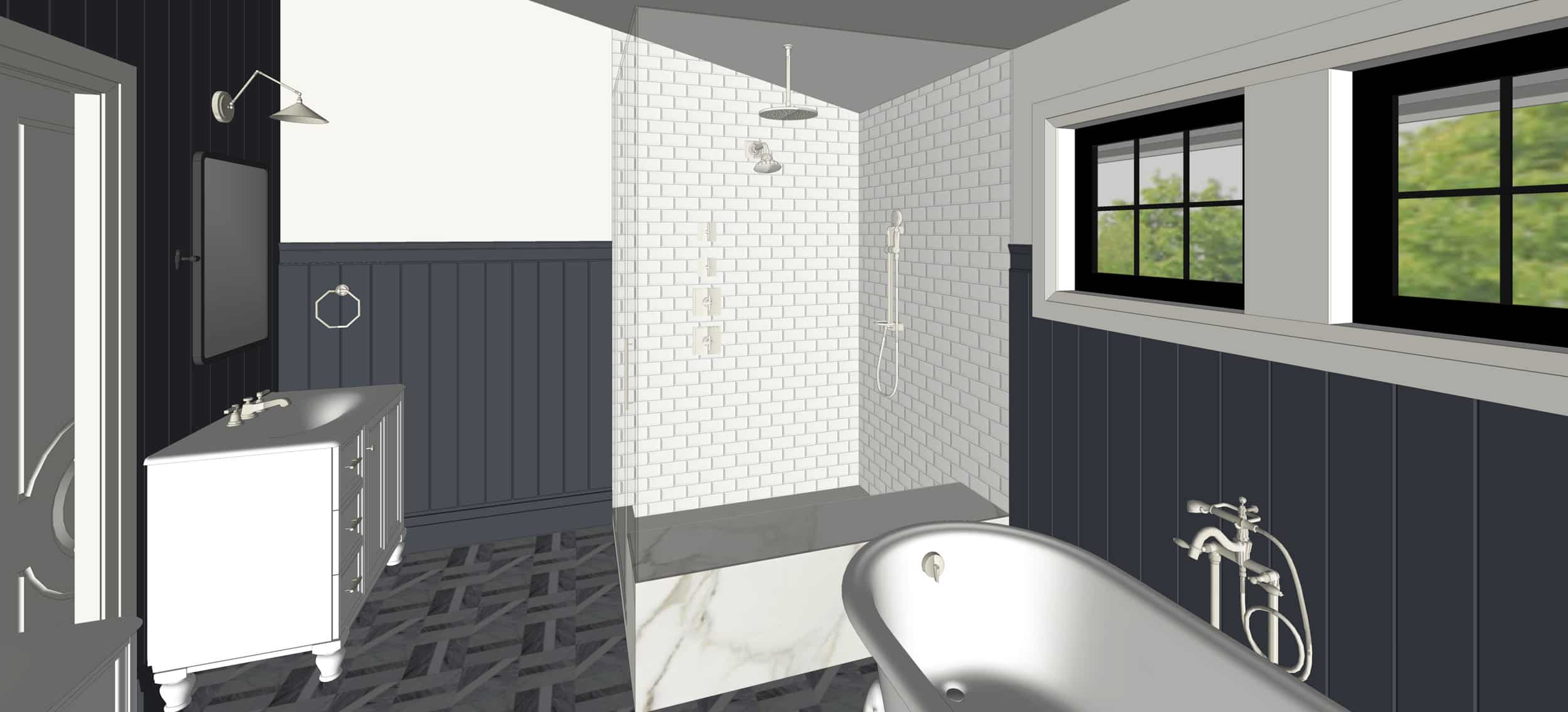
We went with polished nickel for the faucet suites in here versus black or gold because polished nickel is always classic and since I’m doing a lot of gold in the mountain house, I wanted to shake it up (plus I’m currently having a love affair with polished nickel—DON’T TELL BRASS, SHE CAN BE VERY JEALOUS AND SCARY). While that’s what I picked, I did want to note that there are so many other finish options offered by Kohler so you can really customize and get that design impact in the way that works best for you (you don’t have to stick to the polished nickel if you don’t love that but do love the Kohler fixtures, FYI). As a general rule, polished nickel is warmer than polished chrome and I often prefer it but to most people, they look identical. If you want a good laugh, bring both samples to Brian and ask him which is his favorite…the confusion is remarkable. That tub-filler is so beautiful in person and I love how the black accent on the handle makes it a bit more modern. Here’s a rendering of it in the space:

Now, renderings are always tricky for me because they can really make a space feel soul-less. As I look at this I’m like “Where is the color? Where is the warmth?” but when I look at all the actual materials when I’m sitting in the room, I feel good about it, knowing that it’s going to be so pretty, classic and timeless. We chose a bold darker color—Cyberspace by Sherwin Williams—to bring in the edge. I think a lighter gray could have looked boring, and yet choosing a more saturated color just felt too risky and random. This color is really dark but it has a lot of blue in it and we pulled it from the darkest tones in the floor tile. It’s that perfect inky color that we wanted.
Besides, the tile is really the star in this room. Or maybe that tub. I haven’t seen the tub except in the Kohler Experience Center in LA and it’s just so beautiful and still comfortable. It would have been SO HARD to order that super important piece without seeing it in person; it helped me to better understand its true size and scale in relation to some of the other pieces going in here. Here are a few things I really love about the Iron Works clawfoot tub: it actually makes the space look bigger because it has legs, the ergonomic back (which you don’t always find in a clawfoot tub), and it’s SO stylish but super classic—a win-win in my book.
Onto the shower.

My brother insisted on a HUGE shower as he is a big man, and he wasn’t wrong. It’s bright and light and full of texture thanks to all that Ann Sacks tile and marble but really quiet and simple. There is a skylight (from Velux) directly above it and it fills the room with the softest natural light. Functionally, the shower is luxurious and spa-like. Stylistically, it’s the same.
We opted against the niche and instead created a larger bench both for placing your bum and your products (which I realize is kinda controversial). Niches are always a visual challenge for me because they can look busy and cluttered and break up the pretty tile with packaging and labels, but obviously, you need to have space for your shampoos, etc. Creating an alternative to the standard recessed box has been something I’ve been thinking a lot about (and we have some good solutions happening in the mountain house).
Another hot tip: Be sure that your shower head doesn’t face the door. The shower head at our current house does because it was the only place to put the door and it’s kinda annoying to turn on and off because it will spray out and get all over the floor and your body, which is fine if you are ready to step in but if you are still clothed (or the water hasn’t heated up yet, it’s super annoying/STARTLING COLD).
Here’s what we have going on in the shower:

Shower Surround Tile | Pinstripe Showerhead & Cross Handle Valve Trim | Artifacts Hand Shower | Hand Shower Slidebar | Rain Showerhead | Shower Floor Tile | Shower Bench Marble
If you like being DOUSED in water in the shower…no part left untouched by water at any given moment, you are lucky because you can put water on your body through three different methods, here: overhead rain shower, showerhead and hand shower. I want this shower so badly. We went with the Kohler Pinstripe line in here because it’s so pretty and classic, and the Artifacts hand shower works well with it. Honestly, that’s the benefit of working with one brand that has matching finishes…you can mix and match different products effortlessly without having to worry that all your nickels or chromes or brasses are slightly different.
After polling every family in America (i.e. our friends and the EHD staff), our in-depth studies concluded that men and women vote differently on the rain shower measures. Men are generally pro the overhead flow and women like it for an experience but want an option for daily use. I think this is because women don’t want to wash their hair every day and men don’t care, but it could also be that water in your eyes for 20 minutes is annoying. The point is, these days, you have options and since we are secretly divided as a nation, it’s best to have both if you have the space and budget (I regret not having it in our house because even I every now and again want that more spa feel which you can get from the rain shower head).
Yet ANOTHER hot tip for you: Be sure that your hand shower can be easily reached when sitting on a bench or whatever surface you want to shave your legs. The placement of all the valves can get complicated so we chose to keep it really simple and kept it in a vertical line with the shower head.
Oh, one other thing to consider: Be sure to tell your contractor exactly how high you want your wall-mounted showerhead. The standard used to be MUCH lower than it is now and doesn’t necessarily work with all showerheads anymore. Plus, we are taller these days. And this is one of those things that unless you say something, they might place it at 72 inches. We had to raise ours in our old master bath and only barely caught it in another project. So be careful.
The biggest challenge of the room was the vanity wall. Trying to figure out the height of the vanity, the architrave (which is the top of the molding), the mirror and sconce is HARD. The junction boxes for the sconces were already placed and there was some issue with moving them that I don’t totally remember—it might have had to do with the pocket door or the engineering of that wall itself. I believe there was also something structural that made it so we had to divide up the vanities…I came into that part late in the game so we made it all work with the choices.

We had chosen and ordered the pivot mirror to go over the architrave, but then we realized that by going under the bottom of the mirror, it would hit the window on the other side in an awkward way. Neither are good choices. But having a pivot mirror meant that we couldn’t have a sconce that projected unless it REALLY projected and then that felt like a lot of projection on one wall.

Right now, I’m nervous that it’s going to feel flat, but again, RENDERINGS ARE MEAN. I love seeing them because it does help you solve a lot of problems, but without properly seeing the texture, natural light and of course styling, it just looks boring. Now, in case you are a designer or in design school, you might be saying “but you can render it out more to add those things!” and you are right. Currently, we don’t have the manpower to do it for the Portland project because it’s time-consuming, but we will be doing that for the mountain house (you might have already seen some more “real” looking renderings in the I Design, You Design Kitchen post). It’s not necessary to design the space, it is just more fun for all of you to see.
These more basic 3D renderings are done in SketchUp and they gave us what we needed to see without taking up too much time. For instance, by doing this, I realized that the placement of the mirror will need to be lower.
Here are all the chosen products for the vanity side:

Sconce | Pivot Mirror | Ann Sacks Floor Tile | V-Groove Paneling | Cyberspace Paint | Pinstripe Faucet | Damask Vanity | Pinstripe Towel Ring | Cabinet Knob | Drawer Pull
Kohler’s Pinstripe sink faucet is what turned me on to the whole line because it feels really solid and classic. As you know, I’m working with Kohler as a brand spokesperson this year but similar to my job with Target, I get full control over what I use in my designs as long as I am using a diverse selection (not the same faucet and same vanity in the same finish in every bathroom…I wouldn’t want to do that anyway). For the mountain house, we are using the super modern lines, but for this house, I wanted things to be classic and timeless. The more modern cross on the handles gives it a bit of an edge, though.
We chose the pivot mirror before we decided to paint that whole wall a dark color, so my first thought was that the black mirror didn’t pop. But it projects off the wall and I think that the black on the inky paint color will actually make it feel more edgy and modern than a polished nickel would. The hardware echoes the lines of the faucet but in the black, it feels more modern.

I also want to quickly call out that door from Metrie, which will be all of the interior doors throughout the house. Everybody fell in love with this door on first site (which is why I reached out to partner with them). It’s just so classic but special. It is also SOLID and extremely heavy, in a good way. The weight of doors is not something that I had previously obsessed over, but my brother is apparently super into the weight of doors and he won’t stop talking about how heavy and great these are. It really does make your house feel more high end. We actually had to reframe inside the pocket door to hold the weight (which is a good thing to know if you are to use this as a pocket). I will be talking more about this later, but doors and windows have become more important to me than I ever imagined they would. We have special doors (original) in our current house in LA and it’s one of those things that can make a house look more high end and intentional.
Lastly, the toilet room.

When looking at the plans last week, I thought that this bathroom needed to be pushed a bit into a more modern direction and I’ve loved Schumacher’s Deconstructed Stripe wallpaper FOREVER. I may still use it in Charlie’s big boy room in a few years, but for now, it will dress the walls of this water closet.

Pocket Door | Pinstripe Toilet Paper Holder | Kathryn Toilet | Ann Sacks Floor Tile | Schumacher’s Deconstructed Stripe
I love the juxtaposition of the elegant Kathryn toilet and the more edgy wallpaper. I’ve never seen a more beautiful toilet for a traditional house, I wish we had ordered that one for our LA house to be honest. I’m not sure it was even available back when I remodeled that home, but it’s just so pretty. I think if a toilet can be special and work with the design of the room and style of the house, then why not, right? The cut at the bottom feels like a little jewel in the space. That pocket door makes the room really special, but not too busy. It’s just enough quiet pattern and depth.

Here is a video of the walkthrough in the rendering. Now, again, remember that until these are fully rendered with natural light and texture, it can look soul-less. To remedy that for now, here’s a little sneak peek of where we currently are with the bathroom:

The shower doors aren’t in yet and there are still some things to be done, but all the plumbing and tile is in. And because all those hard surfaces can feel cold, we pulled together a product board of accessories we’d likely use to style it out to give you an idea of what it can look like full executed. It’s simple modern pieces, with a little bit of an edge but working in our color palette.

Large Abstract Painting | Glass Canister Set | Marble Soap Dish | Toothpaste | Toothbrush | Toothbrush Holder | Bathmat | Towels | Bud Vase | Wood Stool | Rug | White Planter | Wool Sea Sponge | Tub Caddy | Marble Toilet Brush | Waste Basket | Marble Tray | Bath Brush Set | Squeegee | Line Art
There you have it.
Here are all the accessories from above paired up with all the materials and products so you get a better sense of the look and feel:

Sconce | V Groove Paneling | Cyberspace Paint | Pinstripe Faucet | Pivot Mirror | Damask Vanity | Toothbrush | Toothpaste | Toothbrush Holder | Large Abstract Painting | Glass Canister Set | Bath Mat | Marble Soap Dish | Pinstripe Towel Ring | Knob | Drawer Pull | Waste Basket | Pocket Door | Pinstripe Toilet Paper Holder | Kathryn Toilet | Wallpaper | Line Art | Marble Toilet Brush | Ann Sacks Tile | Shower Surround Tile | Pinstripe Showered and Valve Trim Cross Handle | Bath Brush Set | Artifacts Hand Shower | Marble Tray | Wool Sea Sponge | Squeegee | Rain Showerhead | Shower Floor Tile | Shower Bench Marble | Windows | Finial Bath Filler | Iron Works Clawfoot Tub | White Planter | Wood Stool | Rug | Towels | Tub Caddy | Bud Vase


Gorgeous! I can’t wait to see it when it’s done! That floor tile is to die for. Here is a question for you….do you recommend mixing metals or always keeping everything the same in a bathroom? We are about to remodel our bathroom and I’m torn. I want chrome or nickel faucets, showerhead, etc but am in love with some unanswered brass sconces and overhead lights i found. It will have white subway tile in the shower and on the walls with handmade green Moroccan tile in the floor. What’s a girl to do???
http://quickbookspointofsale.us/
Oooh all that tile is just…amazing! Especially the floor tile. Incredible. Personally, I am not a fan of those sconces–they are to “task lamp-y” which is not a look that I love–esp in a bathroom–any light that shines in a specific direction in a bathroom feels odd to me. Also, while its really cool, I don’t think the wallpaper in the water closet is necessary. Feels a little forced. What if you did the wallpaper in the master walk-in closet instead? Can’t wait to see how this room comes together!
In my experience traditional fancy bathrooms always have wallpaper somewhere, it’s almost like, “haha! I can have wallpaper! I know it’s damp sometimes but I am luxury!” So I kind of like the audacity.
Well I saw a shot that showed the wallpaper completed and it looks pretty damn nice–so maybe I’m wrong! 😉
I, for one, am SO EXCITED about the Portland house and everything it holds for us, your readers. It was probably nuts to do it remotely, while you’re busy with a million other things, but I am so interested in how this home turns out. And this bathroom is beautiful, I love the dark paneling and all of the light/dark contrasts. Inspirational!
What a spectacular space! I am so in love with that floor tile! Can’t wait to see it finished!
I am not a Trad kind of person but I’m reasonably good at luxury and this my friends is luxury. Gorgeous.
Love the sneak peek, all the finishes together make the space feel really special and still elegant!
‘Wondering if you would mind sharing your choice for pocket door hardware. We also chose a Metrie door for our gut renovation (from the West End collection) and love how substantial the solid core door is but have struggled to find suitable hardware. The choices seem to be the cheaply-made (and not so attractive) $10 dollar option or break-the-bank (very beautiful) hundreds of dollars option. Many thanks.
Looking good! I love the Ann Sacks floor tile.
I’m still looking forward to a post you mentioned a while ago, on bathroom storage that doesn’t look medicine-cabinety.
OMG I have that tub and bath filler combo and it is the best! The plumbers definitely hated getting that girl in place (it took 5 or 6 guys, I think) but it is so relaxing. The number one question I get when people tour the house is “yea but do you use it?” and I 100% do, it is too inviting not to! Now I wish I had that floor tile under my tub but a girl can dream.
So beautiful . I love slightly more modern baths myself. In fact, I’m annoyed by mostly traditional design in the suburbs where I live (Chicago area), but I like your design a lot. And I love the materials and the door you chose. It will sell fast for sure.
We painted our vanity in our last master bath cyberspace and used brass hardware. Juxtaposed with white marble and subway tile it was the perfect amount of “moodiness” to enjoy while soaking in the tub. Can’t wait to see this finished!
Love the Ann Sacks tile and the door!
Also, this is still a flip (buying a home, redoing/upgrading it then selling it). You’re trying to white-wash it by saying it isn’t but it still is. Just accept it.
I agree- I think it’s in the word “flip” which sounds kind of…flip. Maybe there’s a better word for buying a house, using high end products and finishes and then selling it…french would be : “reverso”
Yea this is very Jeff Lewis- esque. High end flips. I mean even his show was called “Flipping Out”
Nice innovative design. I guess it will look much cooler when it finished. Although you could add some quality rugs to enhance the beauty and comfort. Here are some exclusive rugs for your floor: https://www.locrugs.com/product-category/persian-rugs/
Looks beautiful Emily! It’s fun to go outside our comfort zones sometimes.
On a side note: I have been shopping EBTH ever since you turned us on to them. Any idea why they are suddenly no longer operating in California?
Looking forward to seeing the finished product.
It’s beautiful, but no medicine cabinets? I’m seeing shockingly little storage (and counter!) space for a master bath… I don’t know about you, but I’d need a lot more counter space during my morning routine.
Me, too!
Absolutely wonderful design – every choice you made is classic but interesting – be proud!
So beautiful! And I’m about to start my master bath reno so I love seeing this. Can you share what color grout you used for the floor and for the shower? I’m so stuck in that decision and it’s driving me crazy!!
So cool! But the burning question is: how high SHOULD the showerhead go? Is 72 inches too short?
I agree! What’s a good height for a shower head? Would love to know this.
Ha! I thought the same thing. We are about to put in a master bath on place we just bought, and I need to know!
Put it higher if you have a tall husband/son!!! Mine is always ducking down under shower heads in hotels or other people’s homes! We have the bottom of our shower heads at 6’8″, so someone who is 6’4″ or taller can fit under it. So, I guess you would just count up the number of inches of your shower head?
What design software do you use to get such detailed 3-D Renderings? Or what softwares do you recommend?
Thanks!
I believe she said they used SketchUp for these. There’s a free version, or a professional version for purchase (which I believe you need for the “walk-through” video affect). Overall, the program is very user friendly and you can find beginner tutorials on their site or Youtube.
Beautiful!
I think you need to swap the vanities. We have a similar vanity, except our sink if off center, which works for the space. Opening those vanity doors as planned now will hit the wall. Swapping them will put the drawers against the wall!
Agreed, though I am less concerned about the door next to the wall issue. I just think having the drawers on the wall side would balance out better in real life, visually. The drawers would be on the outside edges (wall sides) of the entire expanse of the sink wall, leading the whole expanse (both vanities together) to look like one scene in two sections, not two separate scenes. In other words, like one vanity in two pieces, instead of two vanities.
I love the dark panelled walls but for me there is too much going on, with the subway tiles and the marble and the wallpaper and the design on the door and especially with that crazy floor. And that’s before you add in the wood and the plants and the towels and the other accessories. But I that’s just me, I’m still really enjoying following the process.
Is it possible to swoon over a bathroom? I am all heart eyes for the accessories and detail in the finishes. I love how you carried the angles in the Kohler fixtures through in the toilet and how it is all juxtaposed against the curves in the doors. Classic and timeless elements done with a flair for modern- fabulous!
I love the Kathryn toilet, too!! The pedestal sink that matches (in a few sizes, very nice) is such a clean but cool way to handle traditional baths. Our office has been using it on and off for I think 8 years. May I humbly suggest, in the same vein, the Duravit 1930s line? The freestanding toilet is similar, but the wall-mounted toilet in that line is SO COOL and an amazing sculptural detail for oddly-plumbed areas or powder rooms where the 8″ of floor space you save without a tank is a make-or-break-it dimension. …Can you tell I work in NYC? Whatever, Kathryn and Duravit 1930s, 4eva.
I am likely in the minority, but try as I might, I just can’t get behind that floor tile . The rest of the bathroom is lovely, though.
So excited for this and frantically googling flights to Portland for Saturday! I live close enough for it to feel possible 🙂
Where do you usually source your shower enclosures? I am having a hard time finding places with a lot of options that are a step above the average big box store.
Oooh such eye candy here. As a designer, I love your use of renderings, design boards, and labeled photographs to tell the whole story. Beautiful presentation, and I can’t wait to see the finished room!
I’m late to this one, but glad I didn’t skip it. Personally, I love the more traditional look of this house BUT with all the Emily touches that make it fresh. Ha — chrome vs. nickel. When we did a top-to-bottom renovation of our townhouse about 16 years ago, I was really set on nickel (except for my bathroom which has oil-rubbed bronze). And I CAN tell the difference. I’m surprised when people can’t. Our contractor could tell, but our plumber was hopeless. We let him purchase our kitchen faucet to get his discount, but he got the chrome (Kohler Vinada sp?). We didn’t make him change it at the time (there were SO many things to deal with), and with the brushed finish it wasn’t horrible noticeable. But I noticed, and it bugged me. Finally, a few months ago that faucet needed to be replaced, and I FINALLY got my brushed nickel. Maybe nobody else notices, but I’m happy! Is that Kohler Experience Center to the trade only? One thing I loved about planning our renovation was going to design centers and just drooling over all the products. BTW, my sister almost got the Kohler Kathryn sink. I’d imagine… Read more »
Could you tell me what program you use for your renderings? I am a designer and my firm is looming for a new program.
Would you mind sharing what grout brand and color you used for the shower surround? It appears so monochromatic!!