


Remember that time we spent months and so many hours of sampling, sourcing, pinning and rendering to ultimately choose shaker cabinetry?? I feel like every day over here, we are dancing this super unsexy line dance that shuffles between doing something custom and interesting and still making sure it’s timeless and functional. Sometimes, we choose “fashion over function” as my contractor says, but in the kitchen, we want to make sure those two desires are equally thought out. We could have designed this kitchen SO much faster if we wanted to do something more standard and basic B. But when you are renovating and paying for the labor of a custom design anyway, then we shouldn’t miss an opportunity to have it look custom (or do you?)
If you’re just joining us, you might want to do a quick catch up on the cabinet function and final kitchen floor plan post here, as well as the materials vote from the I Design, You Decide post. Okay, all studied up and ready to move on? Good.
I want to take you through the process of how we designed the cabinet doors and drawers, because man has this kitchen lived MANY lives from inspiration to where we ended up landing on the design.
At first, I was desperate for what you’ll see below, by deVOL.

They partnered with wood worker Sebastien Cox on creating a rough sawn and stained wood plank cabinetry front. It’s the perfect “modern mountain” cabinet front in my opinion and since it’s stained, it mixes easily with any wood tone in the floors or ceiling. Part of me wishes I could go back in time and just book them to do the kitchen but at the time (like four months ago) their lead time was four to six months and while we didn’t get a quote, I would imagine it would be rather expensive (as it should be). The contractor for the mountain house has an in-house cabinetry team, which makes the process quite seamless, with a three-week lead time (this is very short compared to industry standard, by the way). Of course, we didn’t want to totally rip off what deVOL + Sebastien Cox designed, but I really really wanted that look. So we bought a bunch of wood—both rough sawn and smooth—and started staining them to experiment.

The samples turned out kinda scary, and definitely too much of a risk for me. Sure, we did this, not professionals and they aren’t perfectly done, but it didn’t make us feel confident. They looked silly and DIY. If you use paint, you lose most of the grain, so we used colored stains, but transparent and semi-transparent. The Newburyport Blue one is the closest to the look we wanted, but I wasn’t convinced it would look GOOD. If we were doing a DIY budget kitchen, I might have gone for it, but I didn’t want to spend $30K on cabinetry and have it look “cute” and DIY. The rough sawn seemed like it would be also really hard to keep clean and even if sealed, I wondered if it would it give my kids splinters.
My contractor was also super concerned about the planks being applied together to create a panel. It seems like deVOL has small gaps in between theirs with some sort of wood bracket on the back to keep them together. I think this can absolutely be done, but we weren’t convinced we had the resources, experience or skills to execute it. (My contractor has been doing this for 40 years so he’s super experience but not in doing this exact thing so even he was like “I’m nervous it won’t meet your expectation”). I mean, there is a reason that deVOL + Sebastien costs a lot; they are masters and spent years perfecting this design. We were not and have not. We researched how they created that perfect color variation and it’s a special combination/recipe of vegetable dye and stain. Also, I knew I couldn’t exactly knock it off and that we would have to take the same idea and do something different with it, but we weren’t sure what that would be.

We also had the added challenge of needing floor-to-ceiling cabinetry and my contractor DEFINITELY didn’t trust this wood on a larger scale. He knew it would warp, and change with the weather and he didn’t want to be responsible for that, especially since we were doing flush or inset cabinet fronts. Floor-to-ceiling wood cabinets tend to warp REGARDLESS (MDF does a better job of staying in place) so adding in this challenge of multiple planks of wood seemed like a bad idea. This, by the way, is why people apply cabinet fronts on top of stiles and rails instead of inset or flush—you have so much more room for error because the cabinet door can hide any small gaps (but it isn’t as modern or forward). (For example, the image below on the right…those are cabinet and drawer fronts sitting on top of the stiles and rails—the horizontal and vertical wood frame between each door.)

So my contractor said he would try to cook up his version, something that gave the vertical plank effect, but just in grooves. He took cabinet door fronts made out of alder wood and routed grooves in it, then spray painted it a Smurf blue :).

He said that we could have the grooves any depth or width (the blade would determine this) and then the grooves could be spaced evenly or not. This seemed like a decent idea, but we were still concerned about the paint color, tone and finish. Those above were just spray painted and obviously not what we were going for.
So again, we shifted. I didn’t so much give up on creating our version of the deVOL design but instead, I found some imagery that got me excited about staining reclaimed wood black.

A slowly emerging trend of this type of almost “burnt” looking wood is certainly on the rise. It’s called shou sugi ban and it’s STUNNING. It’s a Japanese technique of preserving wood (which is normally used outdoors) by charring the surface.

A company in Oregon deals it out and we LOVE it. We saw it in person at a store in San Francisco called The Future Perfect during a team trip earlier this summer, see below.

While I really wanted that look, around the same time we found this reclaimed wood near us in LA and stained it black. It didn’t have the crackle of the shou sugi ban but we loved it and it was STUNNING.
Here’s an example of a similar look in action:

The key is that it needs a lot of texture and grooves, otherwise it just looks like newly painted wood. The stain sunk into it perfectly in this beautiful matte finish.

But our contractor still had a lot of concerns about the stability of this wood for the floor-to-ceiling cabinetry. He said that he trusted it on the island because it would mostly be clad (besides the panel-ready dishwasher and the trash pull-out). So we decided to do this treatment on just the island and then rethink the cabinetry front on all the lowers and the floor-to-ceiling. Now can it be done? Sure, but I think to make it super stable and not warp it would take us hiring someone who has done this many many times and can guarantee that.
Next, we actually fell in love with the alder that he had used as a sample and we threw that into a rendering.

Honestly, I really wanted real wood cabinetry in here in the first place, but there were so many variables: A. We hadn’t chosen the wood floor yet (and still haven’t) mostly because trying to get it to work with the ceiling and not have it be $60k is proving VERY, VERY DIFFICULT, and B. I’m still not happy with the ceiling so even picking the wood for the floor and cabinets gives me anxiety. So trying to mix three different very important woods, in addition to the black on the island was starting to scare me. It would have to be PERFECT and I didn’t feel 100% confident. We ordered more samples of the alder and THANK GOODNESS we did because it came in WAY too pink.


Now, in a perfect world, I would have had the wood floor locked down, and then maybe we could have had wood on the cabinetry. But things have to move forward and as of now, there is no wood floor, therefore it’s hard to choose the perfect tone of wood for the cabinetry.
Of course, you can stain a wood “any color” in theory, but getting that pink out of the wood and creating that perfect tone is not as easy as you think without going really dark and we didn’t know what tone we wanted because it was all based on the ceiling that has like 95 different tones of yellow and pink (SEE WHY I JUST WANT TO PAINT THE CEILING WHITE SO WE CAN HAVE WOOD TONE FREEDOM IN THE REST OF THE HOUSE?????)
Honestly. There are just so many ways to skin a cat and decisions had to be made.
So then we decided to do the grooves in the alder, but painted, like so:

We like this a lot but then realized it’s pretty much the same thing that my friend Sara Sherman Samuel + Semihandmade had done.


As much as I love this, I didn’t want to do exactly what another designer had designed and have them think we knocked them off. Again, when you are doing something custom you really should do something CUSTOM and special.
So we started playing with the scale of the grooves and brought them way closer, inspired by the below shots.

We popped that scale into a rendering and showed Brian. We were all pretty into it, although the shadow lines did make it busier, but just a flat panel could look like closet doors which is NOT what we wanted.


Brian didn’t like this. He thought it was way too contemporary, and it didn’t feel like the cabin that he had envisioned. And I understood that and tried to make it feel a bit more traditional by adding a Shaker panel around it and that is where we landed.

We went with a 2-inch panel that meant our hardware had to be tiny in order to fit, but we loved that look. The fridge that we chose (which was ordered months and months ago) had two freezer drawers and those lines broke up the floor the ceiling, so to balance that we broke it up in even more places so it didn’t look so random. Instead of one continuous line from floor-to-ceiling, we broke it up where the top freezer drawer is all the way across the wall.

Then we added another line to balance that out (where the microwave is, and I think it’s actually a lift-up cabinet but more on that later).
But it still felt a little cold and contemporary and just like A LOT of white.
Next, we started playing with the idea of breaking up the cabinetry with glass panels to add depth, dimension and warmth.
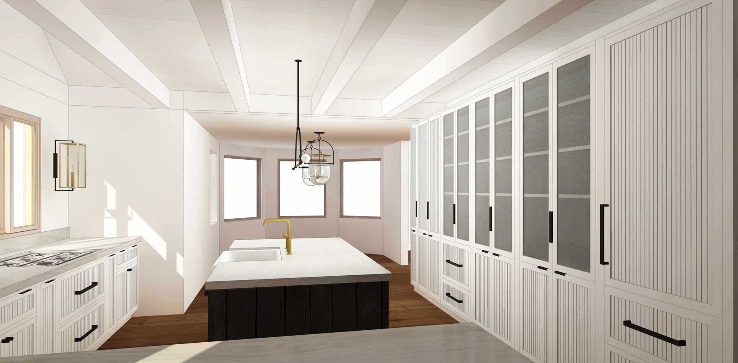
We instantly loved the idea, although three felt too heavy. Besides, we didn’t want to see the food inside the pantry, but seeing into the dry bar and the appliance cabinet would be fine and also help guests figure out where things are located (which I realize might be a challenge).


So we reduced the glass to two cabinets and loved how it looked (you’ll also see how we played with different hardware).

In these versions, we have this thicker, wavier glass but Brian wasn’t into that so I think we are going to do clear glass. The original idea was so that the “blurrier” glass would mask the contents, but once we decided to only do it on the dry bar and the appliance cabinetry, we are okay with seeing inside as it’s going to be pretty.


We loved how it looked and you guys voted for the above version (off-white cabinetry and the matte black dark island)…
BUT…one morning I was in my kitchen, trying to clean the front of our current cabinets and was annoyed by how the food sticks in the corners of the Shaker cabinetry and when you try to get it out, you often can chip the lacquer paint. That’s when I realized (and some of you mentioned this) UGH, those tiny grooves are going to be impossible to clean and will be disgusting within a year.
Turns out, there is a reason people use Shaker or flat-paneled cabinet doors and drawers—they are easy to keep clean.
So after all of that, can you believe we are down to this?

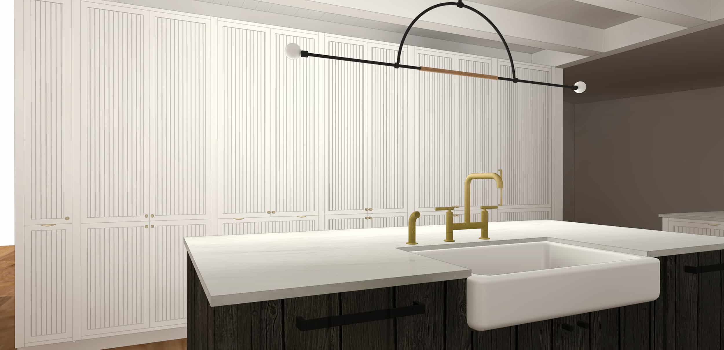
Shaker. SHAKER!!!! I mean, I LOVE a Shaker, but am I being super boring? I KNOW I’ll never get sick of it, I KNOW it’ll be a classic forever, and we are customizing it a bit with a super slim panel (2 1/4 inches). We are also putting wood inside the glass cabinets, I think that will be pretty and look custom. Inside those cabinets, we have some really pretty detailing which I think will help elevate them, as well. Also, the island with the black wood is more of the “moment” and you can’t have like five moments in a kitchen. Also, that stone is SO pretty which you can’t tell in the renderings and we are doing a 2-inch face on it which I think will make it look edgier. But, I always try to do something a little unexpected—just a twist on something traditional—like my brass grout in my first kitchen or the grates on the cabinet in our current kitchen. So I suppose this glass cabinet with the sweet little latches maybe is our other moment?


I do feel like I might be missing an opportunity, but I also don’t want to “over design” this house, which is something that I know I’m prone to. I promised myself that I would limit the materials and finishes in this house to help it feel more minimal, clean and Scandinavian, but I still need SOME contrast and warmth to ensure it meets Brian’s “rustic cabin” needs. Shaker feels classic and can go “cabin” or “chalet” really easily.

We are mixing flat panel and shaker and as I’m writing that I’m realizing that we may need to tweak them a bit. That is totally another story and stay tuned.

So as I’m staring at this, I can say that we aren’t doing anything too innovative in this cabinetry and that makes me kinda sad. We are only using a 2-inch panel around the cabinetry and it’s usually 2 1/2 so that slimmer line will be nice. Also, the lighting is INSANE and that stone is far more beautiful in person than it is in the rendering, I PROMISE.


Once you see the black wood, you get reminded why the rest is more simple, and it really does work in our rustic/refined/Scandi/cabin/chalet/kill me/California vibe. But the shaker on its own is not setting any innovation records (and I’m clearly a little bummed about it).
So, what would we do if we could go back in time? I think probably hire a local cabinet maker who could take over the design of the fronts to ensure that something more interesting could work. Or hell, hire Sebastien Cox himself and deVOL to do their beautiful work.
But it’s in production, folks. And I have to remind myself that sometimes doing what is simpler and more classic is actually more beautiful and will ultimately be more timeless. CAN YOU PLEASE ALL AGREE WITH ME IN THE COMMENTS BEFORE I STOP THE PRODUCTION WHICH WOULD THEN PUT US PAST OUR CONTENT DEADLINES?
Thanks!
Sincerely,
The former human being that used to be Emily Henderson but is currently taken over by an indecisive crazy person who gets to talk about her indecision on a daily basis for her job.


It’s gonna be beautiful. Why not clad the interior of the cabinets in the same black wood as the island?
We might. I kinda love the warmth of the wood back there and to bring in one other finish that is subtle, but its definitely something i’m still toying with. The inside of the other cabinets are wood, but more cabinet grade because they are for food pantry, etc. Stay tuned 🙂
No! Please leave the warmer light toned wood in the cabinets. It is beautiful and a great accent to the black and white.
Ok deVOL is just stunning all the time. In the perfect world all of our kitchens would be designed by them and be magical. But I appreciate that you’re living in the real world with the rest of us. Is the shaker cabinet a ground breaking risk? No. However, I agree that this will let the eye focus on the more interesting island. Again, these renderings are so impressive and really give the idea of a space, but what you put in it to style it out is really what will determine the feel of this kitchen. The white shaker is a blank canvas for better or worse.
Have you considered that brass fixtures on top of white shaker is adding to the contemporary feel and also maybe feels like many other spaces you have designed? The black hardware was refreshing on the renderings, but only my 2 cents and of course I haven’t seen any of it in real life.
Agreed! Black hardware would be more interesting! I also agree with the previous comment about cladding inside of glass cabinets with black wood.
Hilariously I don’t know what we have even decided on RE hardware! I’m still thinking there is something newer/fresher out there, too. The black was feeling so cold (I love black hardware) especially where it was more of the micro knob and the squared off handle. So in the brass it at some warmth, but my original intent was black for this kitchen. We dappled in the leather trend, too and we have a bunch of roundups planned – ‘the hardware I didn’t choose’ Stay tuned …
I vote black hardware too. Especially on the island. You could get a texture that feels “mountain manly.” The brass feels more glamour girl to me and it distracts from the island’s spotlight.
It’s funny. As I was reading this I wondered about maybe leather. It brings in the same warmth that you mentioned RE the wood interior of the cabinets and is also rustic. I still struggle with the practicality of it, though. How does it look in a year’s time?
We have leather handles in our pantry cabinets, which are used frequently, and they look great after a year – the same as when they were installed.. I think leather is a great idea. White shaker cabinets are beautiful, and I am sure will look lovely, but they do not feel that rustic or mountainy or manly. The leather would help in that regard.
I love the LOOK of micro knobs, but the lack of functionality drives me bonkers. Our cabinet doors are always grimy around the knobs! If you want the cabin to be easy and low-maintenance, it might be wise to at least consider something else.
What about wooden pulls on the cabinets?
We just installed our kitchen with a grooved panel front throughout. Again drawing inspiration from those beautiful Devol kitchens.
Oh to not be constrained by budget and distance !!
It’s traditional but we’ve chosen more contemporary colour combos (Dulux Domino lowers and Dulux Mangaweka uppers) to modernise the overall look.
I comment here as I note the discussion re brass vs black handles for hardware. We were trying to use something very slimline and sleek as to not detract from the groove panelling but struggled to find a suitable choice that wasn’t bespoke and a zillion dollars per handle. In the end we chose a finish that is black but has an aged rubbed brass textural look the closer you get. This might be the kind of product that could suit your project as you get the best of both worlds as is it quite rustic but modern at the same time. It’s from an Australian brand Kethy. I’m sure you have access to a tonne more choice in the US but might be worth checking out ?! Good luck and cannot wait to see where you land in the end !
Hi Emily, I am sure you know, just in case you didn’t devol does beautiful Hardware. At 45 pounds, for there aged classic brass cup handles, it isn’t bad. (Eg Christopher peacock few hundred plus) Even just 9 of them for that counter under the window and run. I get what you are saying, can’t change, but just one more singing moment – hence consider adding brass to the kick toe plate, functionally way more practical than a painted finish, and not as expected.
What about hardware that mixes black metal and wood together? I think you could find a modern looking one that will bridge the gap between the traditional cabinets and the modern/rustic feel while regaining a little of the warmth from the wood.
I agree with this, especially about the brass hardware!
I was going to say the same thing about the hardware! White shaker is classic. The brass is beautiful but feel I feel like I’ve seen it 4,276 times. Picking some fresh-looking knobs a pulls would go a long way, I think!
LOVE the shaker and LOVE the wood inside the glass cabinets! Yes yes yes!
I agree 100% on the hardware. We’ve seen the brass fixtures SO many times in various EHD designs. I think this is the opportunity to do something different, bring added interest to the cabinets, etc. and it’s low risk since it’s hardware! Would love to see a “I design you decide” for the hardware…black and other options, different shapes, etc…maybe wood? Anything but brass. Black would tie in the island nicely too…
OK. message heard. y’all want different hardware. I’m on it 🙂
I love the shaker look. And what you have going on is amazing and will be stunning. I have some ideas about the hardware that you might love! Stuff that is bespoke and modern and kinda deVOL esque. Can I point you to it?
Meanwhile I love the handles because it looks like our kitchen!
http://kellygolightly.com/how-to-style-a-kitchen/
That said, maybe too “glam” for Scandi vibes? Then again…maybe not?
p.s. I love the cabinetry you landed on AND the black island, even though I originally voted for white (the black is def the way to go now that I see it all together).
hahaha you are hilarious. Your rustic/refined/Scandi/cabin/chalet/kill me/California vibe is totally on point Emily. Please stop second guessing your choices. Not every single thing has to extra ordinary. Like you said, sometimes classic and simple is best. Personally, do not like the grooves. They look way too busy. Shakers FTW !
YAY. thank you 🙂
I love where you ended up. Design is supposed to be about making things beautiful, not about having to prove how innovative you are with every single thing. I can completely understand the pressure to be innovative in your profession, but you’re completely right – you can’t have 5 moments in one kitchen. The cabinets are STUNNING, and the house is gorgeous. Done and done. May your family be happy and healthy and well there.
I totally agree with Erin. Emily, step back and simmer down! it’s going to be beautiful.
Here’s my 2 cents. I live in a house built in 1929. We have a butler’s pantry with glass fronted doors. I love seeing my beautiful dishes and guests do appreciate not having to open and close cabinets looking for a mug or a plate or a cordial glass. HOWEVER, we have those latches, and no one closes them. NO ONE, do you hear me? Not even I close them, so the doors are forever ajar.
With a cabinet door you just close it. With the latches, you either have to slam it (please don’t) or twist the little doohickey while you have things in your hands. They look cute, but so not functional. It’s arrrrgh every day.
love you Emily!
OOH … interesting. But I love those latches!! and yet I think you are totally right … something to think about, for sure.
Color! I am totally digging the design of this, and if you hadn’t told me it wasn’t innovative enough, I never would have thought it. That said, I totally dug your color vibe at your previous house, as well as your “let’s get weird” mantra. Would LOVE to see the perimeter cabinets in a cool color–it would be super deVol, in an Emily way. I think this house is going to be so good–comfortable, livable, cool, the whole nine yards!
You can just put a soft-close mechanism in the door (or even a magnet!) and not have the doors ajar, regardless of whether the latches are latched. I get that this is an issue in a 1929 house, but not a problem that new kitchen infrastructure can’t fix!
Oh good to know. thank you Rachel 🙂
I was going to chime in with the same comment re latches. I’ve lived in old houses where they are original and near impossible to use (I actually kept pliers out for some), but even new ones are a pain and doors are always left ajar. I love the look of them so much, but they are not worth it in my opinion.
We had those latches in an old house built in 1905 that we owned once upon a time. I LOVED using those cupboards in my kitchen EVERY. SINGLE. DAY!!! They were the sort of thing I noticed and enjoyed continually. I got very used to the twisting motion as I opened the cupboards and it became automatic for me. I never thought about it. I will say that the latches were old enough and worn enough that you could push the cupboard closed without slamming. Still, I would put up with a small extra step in order to have the latches again. Sometimes we love things just because we do. Those latches had my heart!
Maybe they wouldn’t be quite so annoying in a vacation home where you’re not dealing with them every day of your life? I agree that they’re so charming!
P.S. I love where you ended up. The cabinets are lovely, and the light fixtures and island will look fabulous! When I saw the grooves, I immediately thought of how awful they would be to clean.
I have seen people remove the tongue of the latch so it doesn’t really function but you still get the look. You would then use the same hidden hinges that are on all the other doors, preferably soft-close.
@Priscilla SAME. I have latches on my laundry room cabinets. They are adorable, but every time I pull out my heavy detergent from the cabinet, I silently curse myself for choosing those latches. So not functional, and I’m not even using them every day. I can’t imagine the curse words that would fly out of my mouth if I had them in my kitchen!!
I guess I might slam my cabinet doors a little to shut them. Really of feel like I just give a little push and the latch snaps shut. This could be because I had to replace the original latches with reproduction stamped metal ones (the originals were stamped too) because after I stripped the paint from the hardware I found that the chrome had corroded. My sister still has her original latches and they are terrible. Partially because they are tiny, covered in so much paint, but also some of the springs are busted and don’t work anymore.
I wouldn’t be scared off the cabinet latches. Even if they don’t close at first, it just takes a gentle push of the door to engage the latch.
OMG! My mom has these cabinets and I walk around closing the latches constantly. I love them but yes, no one ever closes them (except me). If that would bug you, I would look for something else.
I think this looks great but I don’t like the brass hardware- I think slimline Matt black would work better especially on the island where the wood & Ben hoop are the heroes. Designing for yourself is a killer – designing for yourself and a huge audience is just bonkers!!! Stop second guessing & get on with it …..and paint that darn ceiling white!!!!!!!! 🙂
I AGREE with you on the island and it has bugged me. So there we are considering doing something different than the white shaker. it feels too ‘glam’ all of a sudden.
Agree about the ceiling. It is paralyzing you on so many other decisions. Paint it white!
perfect choice!
There are so many other special custom-looking elements in this kitchen. I think the shaker cabinets help those stand out.
Keep moving forward. It’s going to be gorgeous. Now let’s just keep our fingers crossed for black cabinetry to prevail in the adjoining family room. 🙂
I loved the final design more than all the others. Way to sell it. 🙂 The other designs felt a bit too over the top for me. This feels like the perfect stretch for a homeowner instead of something out of NY fashion week that I would never wear.
i LOVE where you ended up with the white shakers…You’re right in that it’s always classic and timeless. I can’t wait to see actual pictures of how this house ends up!!! Also I DEFINITELY think you should paint the ceiling white!!! It was gorgeoussss in your last house! 🙂
I love it! The process might have been long, but it will look amazing.
ditto with all the options given their due, this feels timeless. love it EH.
Thanks guys 🙂
I’m struggled to vote on the kitchen because with the groves the cabinets looked so busy in the white, but I did really like the black island. I don’t think I voted until day 3. This option is so much better. Love it! Although I’m in love with the alder wood mockup (agree with you about the pink undertones in reality).
I’m sooo bummed about this! I mean i agree the grooves would be annoying to clean but as a vacation home i feel like that’s minimal compared to an every day kitchen.
I also agree with a previous commenter about not loving the hardware. I preferred the black.
And lastly, i think the clear glass should be re evaluated. Again. There must be a better option?!
I’m sad too! Loved the grooves. I thought it made it feel so special.
I think we’ll try to use it somewhere else – maybe the cabinets in the family room?
Switch your grooves to horizontal and space them to be letterboard width apart. Throw them into the mud room, playroom, or another casual family space so you can leave sweet letterboard messages for each other. Reclaimed black stained wood with white letters or that gorgeous alderwood with black or white letters. If it’s too trendy/dated, toss the letters and keep those beautiful grooves blank!
Yes! Much less traffic in the family room. The overall Scandi-vibe should be simple and calm with finished surprises. The grooves on cabinets in the family room would accomplish just that, while the gorgeous black island and the stone are the surprise in the kitchen.
I LOVE the shaker cabinets! I think it’s a smart decision for many reasons. I also think black hardware is worth another look. Its going to be stunning!
1) devol is doing avant-garde kitchens as a marketing tool to sell products. You’re doing a kitchen for real life. And the rest of us who might take real life ideas from you don’t want crud in our cabinet grooves either.
2) I think where you’re different from other design content is still in styling. So I’d rather see a relatively un avant-garde base, similar to something I might actually have, so that you can style it in super interesting ways that don’t require a complete renovation.
I agree with 2 above. We love and follow you Emily because you are able to elevate the everyday. We may try and get your look with basic shaker cabinets incur homes but look to you for lighting, accessories, colors, PAINT, etc. A million ladies of the chalet will be DIY painting reclaimed wood black after this. You have a whole house within which to make special moments. Zoom out…this project is special as a whole.
thanks guys 🙂
Totally agree with these comments. THAT is what draws in your audience and what brings us to your blog each week!
I think the proportions of the shaker detail you are using look subtle and custom. I think in real life the proportion of the panel and the shape of the cabinetry will read modern and custom (more so than you realize in the rendering). Also, I think you are right that keeping the cabinetry simple will make the ‘design moment’ island design stand out more.
Thank you 🙂
Nonetheless, the shaker cabinets are the prettiest and it’s in that last rendering that I really notice the island and the light fixtures. They seem to get overshadowed by the cabinets in the other renderings
I agree about the shakers looking great and allowing for the the other elements shine.
In fact, if this had been an option originally I wouldn’t have hesitated voting for it. It’s going to look fabulous Emily!
Totally agree that the shaker cabinets give the island and the awesome light fixtures the breathing room to shine. On top of that you say this insanely beautiful countertop there that isn’t reading well on renderings. At some point the eye will need to rest!
I’m Team painted ceiling
This is going to be stunning!!! I love that you are trying to push out of your comfort zone and this makes the island and lighting stand out and they are really the focus. Can’t wait to see it in real life.
What if you did painted white floors? That would probably be a messy shit show but just trying to think of solutions. You probably do have to paint the ceilings white in order to get a good wood on the floor.
I’m not sure why you care if ‘someone thinks you knocked off your design’ since I’m sure the Shakers don’t care, besides is anything really original?
Good point. “Shaker” cabinets don’t look much like authentic Shaker furniture anyway.
Terre – I Lol’d!
HA. those shakers are PISSED 🙂
I really love where you ended up. I’m not just saying that because you asked us to 🙂
It’s lovely, and balanced, and calm but interesting, with plenty of moments. And it’s not even built or styled out yet. That last rendering really sold it for me. The dynamic between the island and the cabinets and the fixtures and the lighting – it’s fantastic.
All of this made me laugh out loud because isn’ this the stream of consciousness that every designer goes through?? I’m glad you have the personal maturity and wisdom to choose something that, while classic instead of of-the-moment, you know will work for you for the long run and suit your family. You’re making the RIGHT CHOICE.
Why don’t you do those beams in a wood finish? That would add a definite layer of “cabin” warmth and tie into the highly contested wood ceiling in the other areas. (Which you absolutely MUSN’T paint, haha.)
Thanks Stacie 🙂 The ceiling is already painted white and its kinda the darkest room, even with the new window, BUT I do think that if we would start from scratch that would be what we’d do. maybe if/whe we reclad the living room ceiling we’ll do the same treatment to this, too.
You’ve got to paint the ceiling white. Now that I am seeing more of the rooms come together (bathroom/kitchen) that wood ceiling is too “rustic”. White will make it feel cozy but fresher (like the kitchen.
I’m team Paint It White too. I love the look of wood but not when it’s competing with the floor, etc. and whenever I see a before & after with white painted wood, I love it. Although…could you stain the ceiling really dark, almost black? Now I’d like to see a rendering of that. I think you were having trouble with different wood tones between the beams & the ceiling…maybe if they were all really dark (or all white, ha), they would blend? But then would it be *too* dark? I have no idea!
I think you might be right about painting it white…I had been Team Keep the Wood, but now that I’ve seen the rest of the designs for the bathrooms and kitchen, I think the wood ceiling might look waaay too rustic. All the rest of the design is going in a more sleek direction, so I wonder if the contrast will be too incongruous? Regardless, I love the dark wood for the island and can’t wait to see how it turns out!
I’ve shown brian SO MANY photos of beautiful dark ceilings and he responds, ‘you are joking, right?’ We are up here right now and he was staring at the ceiling. Now that the windows are in and the wood is STUNNING it makes the ceiling look even worse!
Classic is classic because it’s GOOD! You made me lol with “kill me” and also made me feel better about the struggle to make a ridiculous amount of decisions. I’m currently living my dream life and getting to CHOOSE FINISHES for our new construction, and I get mad at myself for being overwhelemed and scared to death about my dream come true. ?. You’re gonna have plenty of opportunity to put your spin on it with accessories, etc. It’s gorgeous…great strong foundation for the other moments!
The struggle is SO REAL. And we are so far into the process with so many people helping and its still SO MUCH. Good luck 🙂
Hi, I love these renderings , its so helpful to visualize, what program are you using to accomplish this. Everything is so clearly defined.
Thanks so much!
I LOVE IT! Sure it’s not as innovative as us designers always want to be, but I think there are major things to be said for classic and timeless! As much fun as doing something innovative and trendy is, it’s just that “trendy” and it will fade. Plus the black stained island is going to be SO GORGEOUS! You do you girlfriend.
Totally into the shaker, cleanliness is a blessing when it comes to rentals. The burnt island will be your accent so it doesn’t read as too boring.
But I will say, with this simpler design, it made that light fixture now read as so straight and a little dull. I kind wished for a pop, and think that would be the place.
I didn’t think I had strong opinions either way on this kitchen, but I definitely felt relief seeing the shaker cabinets. They just seem to compliment the beautiful island so well. I think the slim lines of the previous design felt very modern in an anachronistic way. It’s like sometimes I want to try on a modern sculptural dress with interesting lines and it looks so cool on the hanger that I just have to try it on. Then I realize in the dressing room that, while it looks cool, it just doesn’t look like me and I’m trying too hard and the Zac Posen in my head is like “just wear something simple and beautiful.”
I want to remodel my kitchen next year and will add on a small addition to make my tiny kitchen small. I have been looking at kitchen magazines and kitchen remodeling stores and cannot find anything that looks “right.” I like House and Home magazine and recall a kitchen article that advised that you should design the kitchen that fits you and not what is popular. That has always been in the back of my mind and when I saw your blog, I realized what really goes into kitchen design. Your developmental and creative approach is wonderful.
I lost track of whether or not this had to be the final decision, but why not do the cabinets in a color? A deep Green or a mossy gray green would be very mountain esque and I think would tie in those statement lights you are going for. Right now the kitchen is feeling way too modern Victorian with those modern lights, white cabinets and countertops and brass hardware. I think the brass hardware is especially a miss – too blingy for a laid-back mountain cabin. Also, I think your cabinets can be classic and you can bring “moments” in other ways – look for a really interesting door for that door on the left, maybe tile or wallpaper for that back wall behind the range, maybe a patterned floor in just the kitchen…. Keep the cabinets simple so everything else can shine!
Agree with this completely! You’ve lost the ‘mountain’ feel everywhere except the island…I’m totally on board the shaker train, but the bright white with brass and the modern light fixture makes me think ‘champagne and canapes’ belong in this kitchen, instead of ‘chili and hot chocolate’, and other cabin-y things. Don’t get me wrong, it’s beautiful….but for a mountain retreat, why not go cozier?
Oooo…. shaker cabinets in a cozy color would be amazing and cabin-y. And with the wood inside the glass cabinets? I think it’d be GORGEOUS!
Yes, and all the white is making it seem so generic…like you were afraid of color because of “resale.” It’s sad when it’s going to be a place you’re in for at least ten years. Why design for the next owners?
Not that this is really the case here. It’s just starting to lean that way to me. Very nice, but no wow.
Yeah, I thought maybe a color for the Shakers would be better, too.
I agree with everyone else about the hardware – the white Shaker + brass is a pretty “done” look and doesn’t seem to mesh with the style you’re going for here. I especially don’t like those brass bin pulls… that’s the hardware in the kitchen of the temporary corporate housing I’m in right now :-/
What about something black with some texture to it so that it feels a little more organic/rustic/cabin-y, but in a modern shape? I know that sounds weird, but I think you could make it work like what you’re doing with the pebble tile!
You’re totally right that you don’t need 5 moments in the kitchen, but I think 2 is appropriate and that they should be strong ones.
Ooooh, yeah! I just had some custom bookcases built, and the center bookcase has glass doors on the upper half. My guy had a source who made custom bronze knobs which we used on those doors. They have just enough rusticity (a real word?), but aren’t overly blingy. Of course, only needing two knobs, it was affordable for me — not the case here.
Shaker, good.
Black island, good.
Hardware, go crazy! Do something fun! Even steel handles in the shape of tree branches! Or fish! ;).
Not everything has to be serious and IT and the newest possible – we like you for the body of your work, you don’t turn into someone new with every new room. But you know that! This is applause. xoxox.
Have to comment because I think the final design is AMAZING. Go Shaker! I agree with what’s been said here that it allows the other, more custom and designed elements to shine. The only thing I’m stuck on is the brass hardware. I agree that it leans a little glam, which I don’t think is what you’re going for here. Would be great to see a mockup with the black matte hardware, or perhaps a copper that mirrors that coppery tone in the light fixture? Yay Emily! You, Brian and your team are doing such an amazing job. I am loving following along this Mountain House journey 🙂
I’m a little disappointed you weren’t able to do natural wood paneling. The design renderings you had for that read as both modern, scandinavian, and natural (which works with rustic). Rarely do you see a wood cabinet kitchen, and even less commonly do you see one done well. I would say paint the living room ceiling white (which I have been against till now), and do wood front paneling in the kitchen. It was warm, tied in with nature, and would be the most stunning option.
Yes completely agree. The rendering with the Adler wood paneling was beautiful and really created a mood in the kitchen. It would be beautiful with or without the grooves. My fav.
OMG yes! Definitely! The white ceiling would really help solve tje problem of the myltiple wood finishes in thea house and would allow for wood cabinets which would look very fresh if done simply. I would love to see a light wood kitchen! Enough with the white!
Totally agree. The alder cabinets are stunning. There are amazing products out there that would help mitigate the pink tone. Rubio Monocoat might be the answer to your prayers. You can completely change the wood look with their precolor treatments and reactive effects, all while maintaining the wood grain. This product was a game changer when I decided I couldn’t deal with pink-toned red oak floors. Their instagram page has lots of inspiring pics.
Yes yes yes! I was totally on team Keep the Wood but think beautiful wood cabinets a la your friend’s LA house would be amazing.
i was loving the detail of the grooves but i love the clean openness of the shaker too! I cant wait to see it all come together — and also don’t stop sharing the ramblings of your brain. It’s one of the reasons I love reading this blog! I feel like we get to be part of the project.
I realllllly wish you would do black fixtures and not brass.
I’m worried about the open space in the cabinets. I think it would look better if it were larger and more continuous. Would you do more of an open space coffee bar there or something? It looks weird with 2 disjointed open cabinets. Maybe you could find some kind of vintage hutch to put there. I am VERY pro-shaker!! Great choice. Sorry this isn’t helpful.
I agree about the spaced out two glass cabinets looking odd. I’d prefer to see them side by side but I’m pretty sure the design/placement of what is behind all the various doors, has sailed.
Hey Girl Hey!
You are all good! I (and think many) love your spaces because you design IRL and are forced to think creatively about functional designs that work FOR REAL PEOPLE WITH REAL LIVES!
If we want showstoppers we can refer to the magazines for rich people’s houses that have butlers and only live in them a few months a year.
You do such amazing and beautiful and provocative things within the confines of still being liveable.
i love love love the shaker cabinets, the colors, and the hardware. Rugs, accessories and window hardware will add a ton of additional texture and character. the island into your living room – does that have stools? does your main island have stools?
I LOVE the look of the wood inside the cabinets. I think that will be stunning and is the second “moment” you’re looking for. In the original renderings with the three glass-front cabinets, I agree it looks heavy, but now that you’re adding wood and the glass is clear, I’d vote for leaning in and going back to three and just get some pretty containers to store food in (or put the food another cabinet and instead sprinkle in some ceramics/other decorative pieces to fill the space).
I think you can update and take risk with the hardware. What about something black/hammered/horn/branch like ?? If the rest is class go with a more creative hardware.
Love it just the way it is! You are so talented and an exacting designing technician, so I can understand the indecision and desire to make it special, special, more special. But, having followed you for years, I know you will make it beautiful and unique, while still timeless. And that is saying something. To production, I say!
Anyone else thinking the farmhouse sink is the elephant in the room here?
Yes! It is WAY WAY to shallow. I hate a sink that is not at least the depth the width of a plate
Looks amazing. big believer in simple is better and your light fixtures are killer. They shine a lot more with a simple design. They are the editorial moment and Im sure the counter will be amazing.
yes not everything has to be so designed it will look awesome!
With demo starting on my kitchen today, I’ve had the same internal debates about whether or not my kitchen was creative/fun/interesting/not cliche and overdone. Sigh. What you’ve picked is classic and beautiful and the layout is amazing!
When I get overwhelmed by design choices and I’m staring at a deadline, I remember my mantra:
Do The Simple Thing.
Always works out for the best. You did good. Onward!
Its nice. Just nice. It doesn’t feel ant different than any other nice kitchen on pinterest. It doesn’t feel special and that makes me sad. It feels like settling.
This is beautiful. Shakers are awesome!
I love the shaker, the island really shines this way. I do prefer the black hardware on the island, so the wood stands out not the hardware.
Smart move. I’m pretty sure I instantly tried to disuade you from the tiny groves on every cabinet at first posting. It is just such a pain and for a vacation home (for you), and a home that others will use (airbnb???) and not take as great of care of as you would, it would be a huge mistake. You have a lot of cabinets. Simple is better. It is calming and quiet and lets the stone and lights shine. I’m convinced you made the right decision…or at least the best decision you have presented so far. Maybe something else is out there and you haven’t landed on it yet, but in 3 years it is just more content! You will love what you get…at least for a time. Now go poor yourself some vino…it is nearly 11:00 AM in CA right now!
I still think you should paint the ceiling white and put wood everywhere else! I loved the renderings with the alder cabinets.
If not, why not wood hardware?
I LOVE IT! Like you said, shaker is classic and so very cabin but also modern. I totally 100% love the flat paneled drawers, I always think drawers should be flat and doors shaker, but I’m no interior designer. I can relate with wanted to do something edgy and unexpected, but I think you found the perfect balance with the shakers and island. It’s gonna be so good! The reclaimed wood, btw, would probably be a pain to clean and attract lint like a white cat on a black shirt.
What if (hear me out) the glass cabinets become open shelving and you throw some kind of textured *something* behind it — think painted white brick or maybe even the dark stained wood? I feel like what often works in Scandinavian design is the charming combination of doneness/undoneness. Also, it’d invite a little more of that rustic “texture” that Brian seems to gravitate towards. Finally, it would create an opportunity for some greenery, lighting and would help make that wall also feel like it’s own “moment”.
This is a great idea! I’m worried about traffic flow while those glass doors are open for drink fixin’- at least I think this turned into the bar area?
I really like the look of the grooved fronts! Shakers are too busy with lines in different directions and boring because they’re so ubiquitous. Those grooves are unusual and more harmonious. Ahh!