


Remember that house we’ve been showing you (this backyard, this edgy basement office) over the last few weeks? It’s a killer home the production and design team staged and styled for Emily’s upcoming book project and today we’re showing you the master bedroom, which is a study in how to do moody yet modern (and also, one of my personal favorite spaces here). The wall color—French Beret by Benjamin Moore—was already there, selected by the homeowners Amanda and William Hunter (of William Hunter Collective), so the team really leaned in to create a luscious retreat with a tonal palette, lots of texture and hits of glam. We’re breaking down the seven things to keep in mind or try if you love this dark, cozy vibe, whether you want to use it in a bedroom, dining room or beyond.
Go tone-on-tone.

Let’s start with THE talking point about this particular room, but also moody rooms in general: for the greatest design impact (and to create something that reads very “editorial” and high-end), go for a tone-on-tone look. Note that this does not mean everything has to be the exact shade. In fact, you’ll want to vary them, but in this room, there’s an overarching punch-you-in-your-face, blue-on-everything moment happening here. It’s kept interesting and visually layered by playing with tones: dark inky navy blue headboard, cobalt and denim blue bedding, slate walls and matching millwork, blue-ish gray curtains. The lower the contrast, the moodier yet quieter it will feel. Let’s say we decided to do these same dark walls, but then pair them with bright white bedding and blonde wood furniture…that would be a very different story. Pretty, but not the subdued, quiet, straight-up dreamy vibe we have here. So, for that calm moody oasis aesthetic, pick a color and run with it on nearly everything.
Paint all doors, trim and woodwork/millwork.
The whole “paint the baseboard and trim the same color as the wall” movement is HUGE right now, and sure, maybe it’s a little trendy and in a few years will fizzle out (we hope not), but this is also clutch for moody rooms. With such a deep, pigmented color, is there anything else to do but slather it on every surface? It wouldn’t be right to have a bright white on the baseboards, doors and woodwork. For a truly uniform look, you’ll want to go with the same finish for both (or for something super dramatic, you can do a flat wall and a high-gloss trim, though the matte-on-matte is a bit more modern).
Vary it up with lots of texture.

Bed Base via Article | Headboard via Article
When you’re really working within a single color for your whole palette, it’s super crucial to vary up those textures so things don’t come off one-note. Here, we used linen on the curtains and duvet, velvet on the headboard, cotton on pillows, a textural quilt and a nubby low-pile patterned shag rug (all the bedding, by the way, was borrowed from The Platform Experiment, a staging company we teamed up with on this home to tap into their insane inventory of props). A good rule of thumb to follow is to pick at least three to four textures and fabrics in varying monochrome hues to nail that perfectly layered (but still tonal) aesthetic.
Keep wood tones rich and dark.

Rug via Lulu and Georgia | Nightstand via Lulu and Georgia | Sconce | Duvet via Lulu and Georgia | Tray via Lost & Found
This is not the time to go all light and Scandi. This is the time to fully lean into the richness you’ve already started building to really dial in the moodiness. You’ll want to stick to darker finishes (like walnut) but careful that they don’t lean too red or else you risk losing the more modern edge of this style. This nightstand that we borrowed from Lulu & Georgia has a few tones in it, sure, but they’re all more neutral (not too yellow, not too red), and the interesting shapes created by the drawer front creates more visual interest in a relatively simple piece. When you don’t have a ton of furniture in a room, finding pieces that feel special and different is clutch to “simple yet intriguing” so you don’t end up with “empty and flat.”
Brass is the perfect complement.

Honestly, there is no better metal finish than gold for the moody, sexy vibe (though matte black is a good runner up). You’ll want to stick to a darker aged or unlacquered brass instead of a brighter, shiny finish. Bring it in via lighting (like these sconces from Schoolhouse), frames, accessories, and curtain and cabinet hardware, though be sure to not go overboard. You don’t want EVERYTHING to be gleaming brass, but a few touches will really elevate and break through the darker tonal palette.
Paint the ceiling (or don’t).

Okay, so this one is purely preferential. Here, the ceiling was kept white, which draws the eye up and brings in a punch of brightness overhead, but there’s another winning option: painting the ceiling the same color as the walls for a truly cozy, cavernous (but in a good way) room. In my dining room (which I’m revealing in two weeks!), I opted to bring a dark color up the walls and onto the ceiling and I couldn’t love it anymore than I do.
Keep furnishings simple and pared back.

Chair via Lulu and Georgia | Throw via Serena & Lily
And finally—and we can’t say this enough, but the dark tonal color is the star of this room/style, so keeping furniture pared back and also streamlined is the key to not creating a space that feels overwhelming or suffocating. There are really only three furnishings here: bed, nightstands, chair. Boom, done. There isn’t much by way of “decor” or art, either; accessories were kept to a minimum, and there’s just one framed piece over the bed.
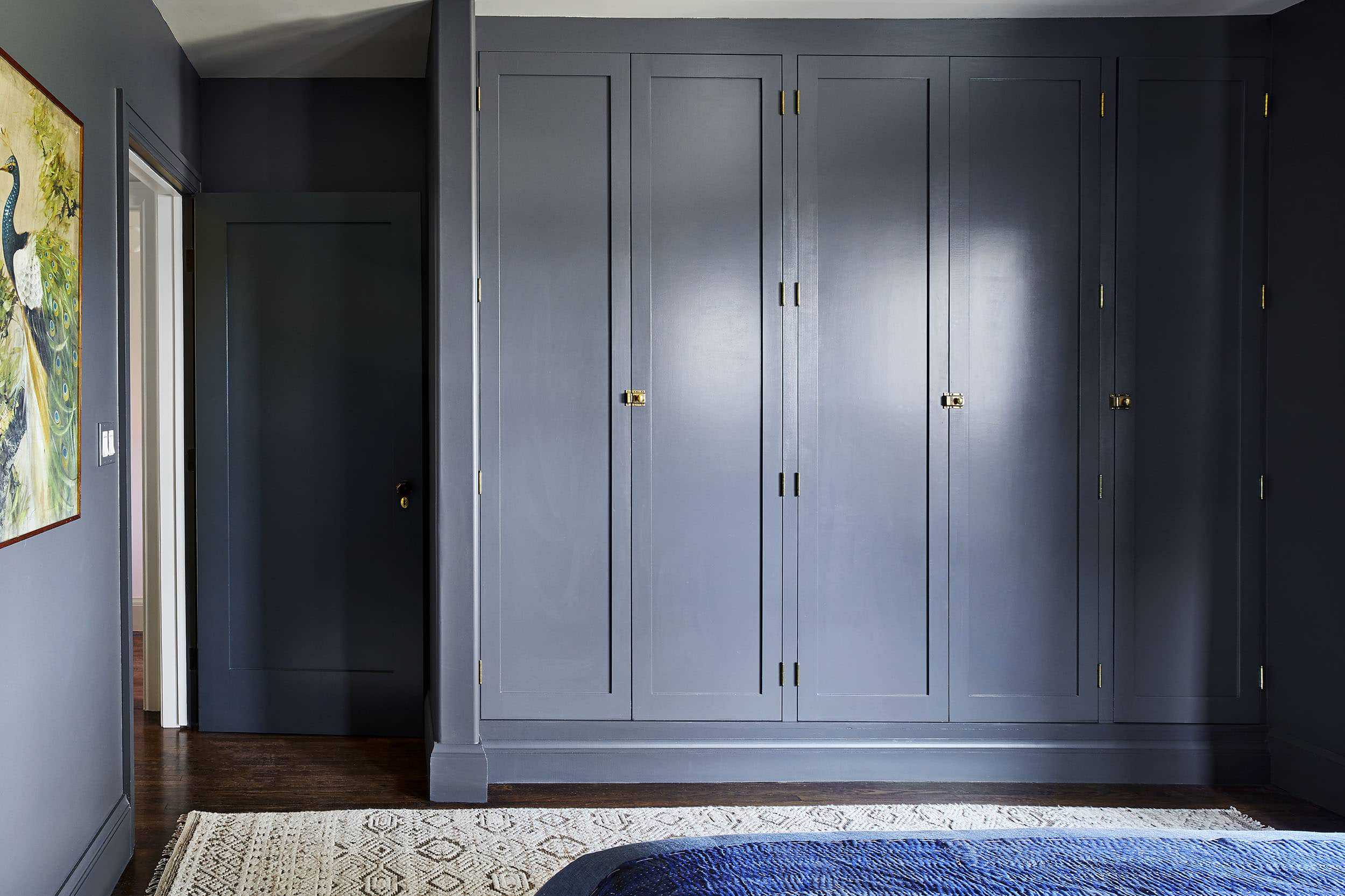
Because of the wall-to-wall built-in wardrobe, there’s no need for a dresser, but here’s a trick for everyone who doesn’t have custom woodwork that blends seamlessly into the wall: paint any larger pieces the same color. It’s actually a designer trick to get a cool, high-end vibe for a smaller space. You can try it on a bookcase or dresser (though keep some of the other casegoods their natural wood tones to vary things up and bring in warmth). Of course, you can totally skip this, too, and just go wood for all pieces.

We’re all pretty obsessed with this look (amazing job Velinda and Erik), especially because it’s rich, textural and luxurious but still modern and cool. It’s like a parfait of style…so many layers, all necessary to create a balanced, sweet treat.
What do you think? I know dark and moody isn’t for everyone (we also really dig bright and airy, so we get it), but is there any room in your home you’d be willing to try this aesthetic in? Bedroom? Powder room (easy), living room? Let’s hear it.
***photography by Sara Ligorria-Tramp for EHD, produced and art directed by Emily Henderson, designed and styled with Velinda Hellen and Erik Staalberg


I love this look! I’ve been painting the walls and trim the same for years because it makes small spaces look larger. Usually, when I paint the ceiling the same color, I have it mixed up 20% lighter because it always looks darker on the ceiling and the 20% gives it the same tone.
Oh great idea! I feel like I’ve also read this somewhere, thanks for sharing.
That is a great idea. I love the small bathroom I painted F and B Hague Blue all over but for the door. Makes everything recede, it feels bigger and the impact with fixtures and marble is like no other. Yet making the ceiling 20% lighter would of made it more interesting.
I have a small bedroom I want to paint dark, ceiling too, but it is north facing. Northern light is grey so I don’t want to do a dark color with grey undertones, which so many dark colors seem to have. Any suggestions would be appreciated.
Oh I do love me some mood!
This looks stunning!
I did my guest bathroom in Benjamin Moore dark pewter on walls and woodwork with warm wood mirrior and woven blinds, aged brass lighting and a few accessories, gray patterned tile floor, and white oversized subway tile. It looks perfectly moody to me. Love the chic look! Thanks Arlyn!
OHHH that sounds fantastic.
Wow this sounds amazing!! Any chance you have a link to a picture of it? Redoing my master bed and am considering a similar aesthetic.
Does this work in a room with very little natural light?
Yes! I’d love to see a picture of this combo as well!
I’m sorry I don’t have the slightest knowledge about linking my photos on the internet. It’s Greek to me. So sorry!!
Thank you for your ooo’s and ahhh’s! Its a fantastic color. Dana from housetweaking blog used it in her daughters bedroom.
Moody works for me in my foyer, because I get the great impact a lot going in and out. I would also consider in a room that had a lot of light like the above bedroom with corner exposure and big glass doors.
Thank you for the great advice! I’m wondering if these principles would still apply in a room with no natural light? I have a room in the basement painted navy but it’s less “moody glam” and more “dark cave.”
Honestly, I think yes. A room with no natural light would actually look a bit dingy if you tried to go the “light and bright” path to counteract it. I’d say for the color, maybe try some higher sheen finishes to bounce around light, bring in plenty of lamps and metallic punches. You do need a little bit of contrast when you’re not cutting through the dark palette with natural light, so keep that in mind with textiles. Maybe try a lighter color rug or anchor piece of furniture?
Thank you! So helpful!
Gorgeous room! I’m curious what you do about the switchplate and outlet covers? A white plastic switchplate would break the mood.
You paint those too. They don’t disappear as much as we’d like, but at least they don’t shout.
I’d say either paint them the same color of the wall as Cynthia suggests, or go the metal finish route (aged brass, oil-rubbed bronze, etc.).
I’d change them out to black and use an aged brass plate.
Thank you for asking this question! Came here to ask the same thing. I really feel like the US is missing an opportunity for more stylish switchplate covers and especially the actual outlets/switches. Europe seems to have SO many more options for this kind of thing.
Emily has been using Forbes & Lomax and they’re so chic and feel very Euro: https://forbesandlomax.com/
I just ordered a catalog from Forbes and Lomax. Be still my heart. Too bad my wallet wants a cheaper alternative. Ha.
I went dark in my dining room a couple years ago and could not love it more! My 1920s house has NO storage, so I brought in a large storage cabinet and painted it the same color as the walls – it tricks you into thinking it’s built-in even though it’s not!
Love it!! I’d love to see a “get this look” with options for other moody colors- violet, burgundy, green, and marigold.
I love the little side windows over the nightstands.
I’d like moody in every room, but probably compromise to just the bedroom. Thinking of doing similar but opposite, blue walls with grey bed. This was so fun to see!
We are doing this in our library with Hague Blue. I love it!
I think it’s a timeless look harkening back to colonial period decor. In a few years it may not be trendy but I think it will still be classy.
I love this! My room is very similar currently, but not quite coming together…It’s the doors and trim that need to be painted the same color. My fear is the transition into other rooms. I’ve seen you struggle with this in your own house as well like the playroom, etc. What are your thoughts on the transition? I am afraid of creating a “black hole” that’s not really black, but just feels like you are entering a different dimension versus the rest of the house having that Scandi/Modern Mid Century vibe. Help! 🙂
I second the question about the transitions from room to room when you start playing around with door and trim colors. I feel like this could be a post in and of itself with exploring all the options
Wondering how you light this room in the evening/night? I don’t see an overhead light (good as I don’t like them) but only two small reading lamps by the sides of the bed. Are there more lamps?
The room was actually staged to sell, so I’m sure if it was a lived-in space, I’d say at least a floor lamp to amp up the lighting, too.
Our real estate agent is telling us to paint over our dark gray master bedroom (containing glossy black furniture) as it makes the room look smaller, and they think may be too particular to taste. We feel the space looked drab with light wall colors before so aren’t sure what to do. Glad to read this gorgeous room was actually staged for selling.
Where are the curtains from? I love them!
Ugh I wish we knew (they were selected by the homeowners and we aren’t sure). I know Pottery Barn and Restoration Hardware both have really beautiful Belgian linen curtains (though a bit pricey).
Gorgeous room!! I want to move in there. I do have a question. Would you choose a warmer blue tone for a north facing room? Or a cooler blue tone for a southern exposure?
Hmm…honestly, it depends on the room, how high it is, what’s outside the windows…yes the direction the room faces will change the tone, but your best bet is to get at least three or four tones of a color you like (a little warmer, a little cooler, a little lighter, a little darker) and test them on all the walls to see what it does in your specific room.
I’m so in love with that style of closet. Dreams!
NO KIDDING. It makes me weak.
I’m putting this in my “someday if I’m feeling brave” file…
I just looked at my BM “colors” and the French Beret is #1610 and on the color sample it looks like a quite dark charcoal. The lighting you shot the photos with makes the walls and built ins look much lighter and more blue, like a lot more blue. I love the finished look very, very much as photographed, but think for me the actual color may be a bit too dark?? Beautiful in any case. Looking forward to your book.
Now THIS is my look. I disagree that it’s a “punch you in the face ” look though — for me, that’s a room with all white walls. Maybe it’s because I’ve always been light-sensitive, but bright rooms feel oppressive and make me feel irritable. Just me?
Not just you! I have a ton of eye floaters and white rooms make me so stressed! My bedroom is dark dark blue. So relaxing.
EEE so glad to see this! We did our master in Kendall Charcoal – trim + walls + ceiling a few years ago. It’s like a relaxing cave and we love it but I sometimes got a little envious seeing the bright and airy white bedrooms! We do have a seating room off the side that we did the opposite in – all alabaster shelving walls – it’s the sun room of the bedroom so I like the high contrast. LOVED seeing this space though and the ideas around textures. Thank you!
I love it all, it’s enveloping and cozy. BUT I’d REALLY like to know who makes those great flats you have on.
I believe those are Vince: https://rstyle.me/+psveaxjbzPAmakKJj_TL1w
I was also dying to know! Thank you for asking!
Can you do a post about how you paint windows? Does that only work if they’re wood (the actual frame around the glass). I think ours are white vinyl, so even if the trim was painted, it would still probably ruin the effect?
Yes, I was going to ask the same thing! Please answer 🙂 I’ve always loved this look, but my house has white vinyl windows, as so many homes do. Is this look actually achievable with white vinyl windows?
Wow! I really love this. I don’t think I’d ever do this in my own home (more so because it’s out of my comfort zone and I’m not very adventurous when it comes to decorating), but I’d LOVE to stay in this room…as a guest, in a hotel, etc. It looks so cozy and inviting and relaxing! I think the pictures that caught my eye the most are the couple that barely show the rug…which makes me wonder, would I love it even more had the rug been in the same color way? Either way, beautiful!
Can we get a “get this look” for the bedding? Please and thank you!
beautiful calm colour paint , i love the bedding . the bedroom looks very mature for winter. I love it
Moody perfection! Could you further source the bedding? Thank you!
I love the look but feel like the bedding is the wrong shade of blue. Everything else is perfect. Why was that shade the choice? Just for my own education…
Love this! My bedroom is already painted a similar color and this is inspiring me to take the plunge and paint the base and trim. Question – the rest of the trim in my house is white, so is it ok to mix it up like this? And where do you cut the dark paint on trim leading to other rooms? In my case a bathroom and hallway with white trim and light colored walls.
I really am in love with that wardrobe. Was it custom built with this color, or did it look different and they were able to paint it this deep gorgeous color? Currently exploring building a wardrobe in my small condo, but the designs from the bigger box closet companies are seriously lacking–custom like this would probably be outside of my budget but it’s nice to dream!
I saw these in person and they looked like IKEA Pax with custom doors? The inside was very IKEA.
Why are my clients afraid of painting all the millwork dark?? What does it take to turn back after its been painted a dark color?
I’m not trying to be mean – I enjoy so much on your site! – but I don’t ‘get’ this look at all. Is it my New England bias? The blues read too bright for the room to me and the bed seems mismatched in mood to the rest of the room – much more slouchy and messy than moody or effortless cool. The one picture that makes sense to me is the one with Emily in it where she herself (like The Dude’s rug) ties the room together.
Lovely design, but those lights seem to have limited utility. Reading in bed would not be a comfortable option give the scale and placement unless I am being deceived by the photos.
Way to dark for me, for me it feels like a dungeon or a dark cave ……..give me warmth and comfort before I go to bed in a room…..why is the designing world turning dark with gray all the time? What happened to bright cheerful loving colors I ask.
Loving this room! Would be so fun to see a complete opposite version of this room. Maybe this could be a series? Opposite design for the same room!