


I can remember mine and my husband Charles’ faces when we first walked into this apartment. We had spent the last few weekends apartment hunting only to be disappointed by a multitude of reasons (“cat-fish worthy” photos as compared to real life, value, parking, etc.), but then we walked in here and we instantly knew. There was a (non-working) fireplace! Original oak floors! Coved ceilings! Laundry room! We made it down the hallway into the first bedroom and quickly said to each other with pure giddiness in both of our eyes and voices “this is it. We have to take this today.” It was clean, pristine, spacious and in our budget. It was NOTHING like our apartment in Florida that we had loved, but in a way that’s like replacing a dog that you had to put to sleep with another dog, but like, a totally different breed so it didn’t feel like you were trying to recreate something. Wow, that was bleak. We put in our leasing application that day and, a year later, I still come home nearly every day so grateful that this is what I get to call my first LA home.
When we moved in a few weeks later, with everything we brought in a PODS container from our condo in South Florida, nothing felt right in there. My old place was a modern-ish open floorplan that I filled with mostly streamlined stuff (it was the first home I shared with my then-fiance so we picked some things out together) as well as some leftover pieces from other apartments, so in here, in a 1920s Mediterranean building with 100-year-old “character,” my gray tweed Crate & Barrel sofa and industrial dining table felt foreign. The best way to describe it is like when Elle Woods shows up to that Harvard party dressed as a Playboy bunny and everyone in circa-2001 khaki cargo pants and preppy sweater sets spots her, scoffing. My apartment was scoffing at my stuff (not really, she’s nice, this is just a revisionist version of the story for dramatic effect). I wasn’t necessarily attached to anything besides some art and vintage pieces, plus I had sold a lot of stuff before the move to make it easier to trek across country, so there were huge holes to fill in both functionality and style.
Anyhow, I’ll talk more about style tomorrow when I show you where I landed with everything (I can’t wait!) but there were some things to figure out to get me from “before” to “after.”
I am warning you up front that this is a LONG post. I’ve been writing this post (and tomorrow’s and Thursday’s) for months in my head, so I have a lot to say. But there are a lot of takeaways, so I hope you stick around…or, you know, just skip ahead to see my moodboards and all the “befores” to prep for tomorrow.
Let’s start in the living room:
Living Room:

Here she is. I loved the ceiling but didn’t realize it would highly affect the paint color choice (i.e. anything too bold would probably feel a bit suffocating because it would have to go on the walls and the ceiling). That picture window was also a huge selling (leasing?) point, and while I never envisioned covering it with any kind of drapery, turns out, at night, the whole street could see what I was eating for dinner with one glance.

What you’re not seeing here is the rolling cooler we ate dinner on every night for five months. I started calling my then-current apartment style “cooler chic.” It was an interesting time that honestly I’ll probably cherish forever. “Remember that time when we first moved to LA and we were newly married, that we enjoyed many meals on that cooler we bought to keep food in during Hurricane Irma?” I should have left it so you could see my living room in all its glory. There were also random stashes of things in corners (you can spot art and a lamp in that right corner…that’s just the start).

Here was my biggest issue: how do I lay out this long, narrow room with limited wall space? There really was only one wall I could put the sofa on because of the fireplace, and because of the windows on each side, it only made sense to put the sofa in the middle of the wall. This, in theory, was totally fine, except my TV was on the opposite wall but off to the side, so anytime we watched TV, we had to pivot on the couch and look basically across the room. There were many discussions about putting the TV over the fireplace, but because of the slope of the ceiling, our 55-incher would be almost top to bottom from the ceiling line to the mantel. I taped it out and man did it feel crowded, so for now, the TV was staying off to the side.
Yes, I could have scooted the sofa over, but as you’ll soon see, I knew I wanted a sofa with a chaise (for lounging, napping…), and the chaise would either be in the pathway between the living and dining rooms, or smack dab in the living room. It would also leave a strange half-occupied wall to figure out and the entire other side of the living room that would feel incredibly empty. Not to mention the fireplace, which was in the center of the room, would then feel very strange where it was. Nothing here was ideal in terms of modern layout. NOTHING. Back in 1920, setting up a room around a flatscreen wasn’t exactly top priority, evidently.

This is the other side of the room, with the fireplace and TV I’ve mentioned. See what I mean? Ay. This IKEA Besta unit would eventually get a bit of a makeover itself, but we’ll see more about this when I get to the dining room.
The lighting, in general, was also a little too “Home Depot chic” for my tastes. For the record, Home Depot does make plenty of great stuff, but these half-boob uplights weren’t gelling with what I knew in my mind would be the finished product for this room.
Finding inspiration for this room was HARD. I had wanted a blue velvet sofa for the better half of a decade, but every time I searched “blue velvet sofa living room” on Pinterest to get color palette ideas, I’d come across the same thing: blue sofa, red vintage rug OR blue sofa, neutral Moroccan rug. There was hardly anything in the middle, and I just didn’t really want either of those things. My floors are a bit orange, so the red would have exacerbated that, and the whole velvet+shag rug thing felt like design déja vu, and a little too cold for me. I LOVE color (it’s basically all I write about here if you haven’t noticed) but I was very stuck on what to do in this room. Where I landed is a surprise even to me, but I’m very happy with it (tomorrow can’t come fast enough).
While nothing is quite spot-on to my style, these are some of the rooms I used as a guiding light when I felt a little stuck:

Like I said, there really was nothing that made me go “THAT’S IT. THAT’S THE SILVA’ TUNA!” I just ended up picking things I really liked and hoping they went together. In the words of Emily Henderson, “pretty always looks good with pretty” so that became my motto for this space. If I liked it, it would work (as long as the scale was right and it was mostly in my color palette of blue, terra cotta, mustard and neutrals).
Ready for some moodboards? I ended up either donating, selling or repurposing in another room most of what was in here since it all looked like a bit of a hodgepodge of furniture.
Here’s take one:
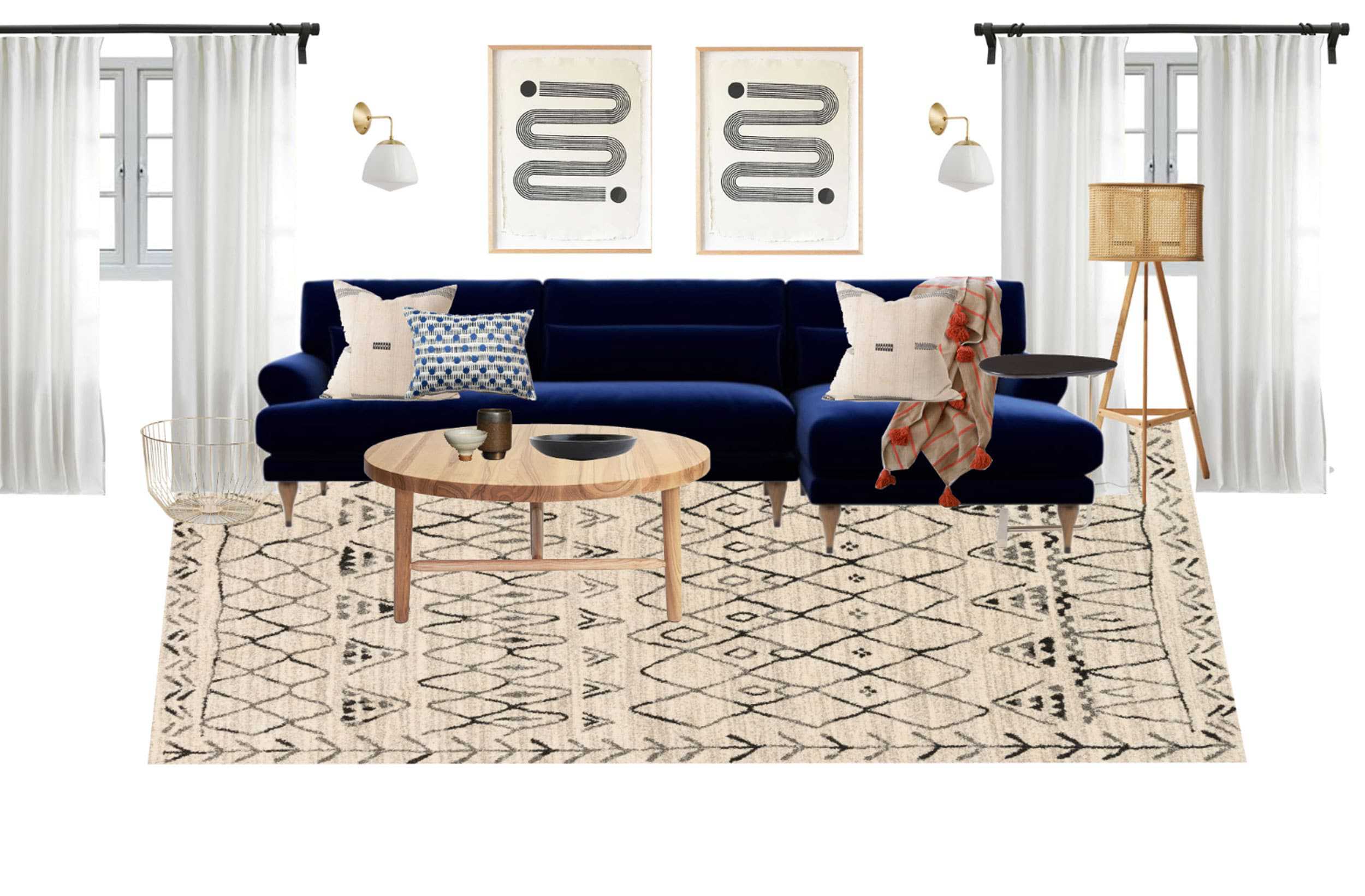
I built this entire room around that sofa. I knew I wanted it from the first mention of “Arlyn, you wanna do a MOTO?” It was designed by Maxwell Ryan of Apartment Therapy for Interior Define, and as AT’s former design editor, I actually spent a bit of time on that very sofa during meetings in the NY office when I visited. It felt like it was part of my story, plus it was GORGEOUS and deep and came in rich velvets, so it was a definite “need it.” This was actually a bit of a “conversation” with my husband, who so dearly loved our old Crate & Barrel sofa. I actually did, too. It is THE MOST comfortable sofa in the entire world (the Lounge II, for anyone wondering), but I always dreamed of an English rolled arm sofa, and this space felt ripe to receive one. Plus, something a little larger would have helped the long space.
The old seagrass rug I had was visually great (from RugsUSA years ago), but it had many a stain on it and left so much lint on your clothes even after four years of vacuuming it weekly. The idea was to bring in something graphic yet neutral, and while the above wasn’t quite it, it was moving in the right direction. Speaking of graphic, the art pieces are from Block Shop—a friend and old co-worker of mine has a giant one in her hallway and they’re pieces are so pretty in person. They were a contender, but I felt at the time that I needed more color.
In terms of wall color, I thought long and hard about whether this room even needed to be painted. My landlord had selected a warm light beige for the entire apartment, which in theory was totally fine, but just felt stodgy next to some of the pieces that started to come in, particularly my bright blue velvet sofa. After writing countless posts about how white walls are boring, I felt like a total hypocrite even considering white, but hear me out: it’s what this space needed and I ate my words for lunch yesterday, don’t worry. I tried greens and blues and peach and yellow, but it all felt overwhelming against the color I ended up picking for the dining room (more on that in a bit, I promise), plus this room gets a lot of green in it from the plants outside. I do sometimes regret not just GOING FOR IT in here and doing something crazy dramatic, but truly, sitting in a light, bright happy space every morning and night makes me happy. If I want drama, I go to the dining room.
Next(ish) board:

Honestly, this is pretty close to the finished product, and trust that there were HUNDREDS of iterations between what I just showed you and this, but if I brought those in here, you’d be reading this post until next Tuesday.
Also, seeing this, I totally forgot I intended on bringing in a mobile somewhere. I think there’s one sitting in my Etsy cart, actually, ha. Well…another time. Those chairs…I’ll talk more on those tomorrow, as well as the draperies (well…I guess I’ll talk more about it ALL tomorrow…can’t wait).
While I liked the big piece over the couch (I think this one is from Juniper Print Shop), I just felt like this whole space looked straight out of a model home. Like…who even lives here? It didn’t have enough of me or Charles in it. It was pretty, but devoid of life. You’ll see tomorrow how I turned that space over the sofa into one of my favorite things in this whole room.
Okay, dining room time…
Dining Room:

Here’s my happy dining room that I actually quite love. It’s probably my favorite spot in the whole apartment, then and now. The light is soft, not too bright, not too dark, the cove ceiling is a detail I would have never imagined having back in Florida…there was so much potential here, though that doesn’t mean it wasn’t without its tricky issues, mostly the fact that some things were centered to the room (the overhead lighting and the sconces), but everything else was centered to the wall between the doors.

Putting the table smack dab in the center of the room meant it would get in the way of the entrance to the kitchen, so I decided to center everything to the wall between the kitchen entrance and the hallway door, even if that meant all the lighting would feel off. Somehow, I’d have to find a solution for the ceiling fixture though, because the chandelier would come down to the left side of the table. It’s tied up here tight to the ceiling, but when I eventually lowered it, it was SUPER obvious that it was off center to the table. There were many times where I just thought “eh whatever, it’s a rental, it’s fine, who cares” but then I’d catch a glimpse of everything all helter-skelter and it drove me nuts. The solution would come at LITERALLY the 11th hour, but up until then, I stressed and stressed about what to do, wavering on how much I pretended to not care.
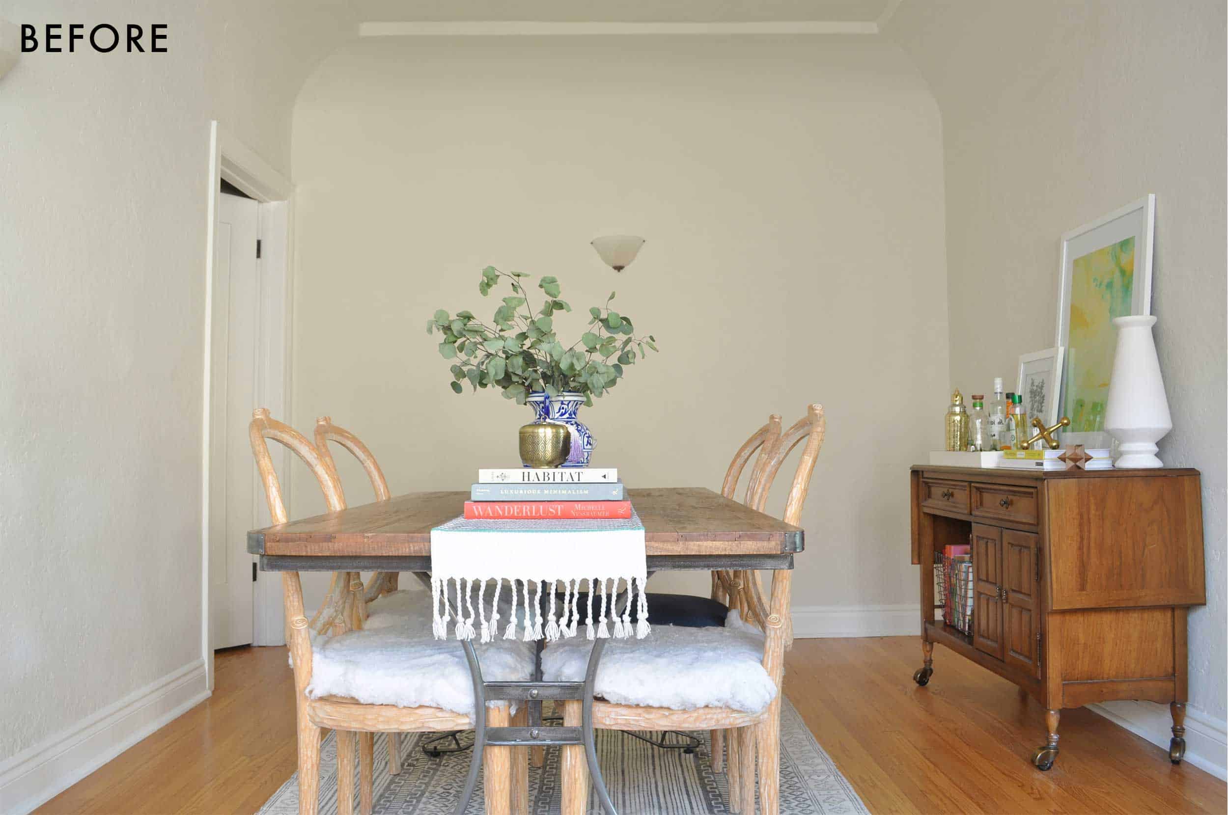
Besides the layout, let’s talk furniture: those chairs. No, that’s not some cool edgy shaggy fabric…it’s batting from a project I’ve left unfinished for four years. I found these chairs for $20 a piece at ReStore back in Florida. I actually never intended on keeping them as they aren’t totally my style. I bought them as a furniture “flip” except that actually means finishing something. These sat in a corner of my old apartment for THREE YEARS (I had other chairs as actual dining chairs that I ended up selling before the move), a constant mocking to my darling Charles who painstakingly removed all the rusty staples nearly 36 months before they made it across the country…still unfinished. I contemplated keeping them since they’ve been with me for so long. I even started writing a post about whether I should keep them for their “weird” factor or just finish them and sell them onward to a new home, but just like those chairs, I never finished that post. I am not proud. Anyway, I finally decided they weren’t what I really wanted, so they now sit in my master bedroom, awaiting the day that I’ll finish them and move on from them (ha, here’s to hoping).

I’ve had this server piece for probably six years. Another ReStore find I scooped up for about $50. It’s solid wood, the big drawer is velvet-lined and according to the branded logo inside, it’s Thomasville. The casters don’t really stay on, but otherwise, it’s in perfect shape and I love it. I had plans to paint it black once, but I’m glad I never went through with that (very “on brand” for me). As you might have seen in my living room moodboards, I planned on bringing this in there, but I changed my mind along the way because functionally, it made more sense in here. The table and rug (both which were too small for the space) were sold, which meant this room was essentially a blank slate. Standing in an empty room, trying to figure out what I wanted this space to be…that’s when I decided to design this as a living space that just so happened to have a dining table and chairs in it. I’ll explain what this means in a bit (and definitely more in the reveal post on Thursday), but the finished product is something I’m VERY pleased with, so I guess you can say the technique worked out!
Along the left wall of the dining room is this bank of windows:

Even though the wall on the left doesn’t stick out that much, it still felt like a “nook” and I knew I wanted to use it to bring in more storage. My kitchen has a decent amount of space, but I have A LOT of small appliances and platters and baking toys (a bit of an enthusiast), which was all being stored in my IKEA Besta TV console as well as the other two-door unit under the front window. Carrying my Instant Pot or food processor or lasagna pan clear across the apartment was real cute for about a day, but it got old very fast. After a little measuring, I found out that, somehow almost miraculously, both Besta units would fit nearly exactly into this niche, right under the window molding (the windows open inward, so it was important that nothing sat above the sill). The glossy white doors felt stark against the moody paint color I knew I wanted in here, so I planned on sourcing something a bit darker and with more character to retrofit (thank goodness for companies like Semihandmade that let you repurpose and elevate your IKEA buys).
Moodboard time…

This was my first stab at a finished product for the dining room. I do still like this, but it’s VERY different than where I ended up. Because of my whole “design this like a room then put a table in it” technique, I knew from the get-go that I wanted to bring in a dining settee/banquette for some really comfy seating. I also have long loved that Serena & Lily honeycomb chandelier, but while it looks centered in my mockup, it definitely landed closer to the far left chair with its heft. I ordered it anyway…
I pictured the gallery wall filling up the wall closest to the hallway door, top to bottom, left to right. Somewhere on my Pinterest boards from years ago are photos of dining rooms either full of art or full of books and I couldn’t wait to do something like that here. This is the advantage of “closed” floorplans. You can do whatever you want when you don’t see everything from another space without having to think too hard about how it will visually affect the other room.
Semihandmade had a photo of a hacked credenza on their site, so I just used this for color reference (those are the beaded fronts in desert gray designed for the brand by Sarah Sherman Samuel).

Somewhere along the line, I decided I didn’t want a dark-on-dark wood table and chairs, and because I’ve always loved caning, I tried this look with an Article table and chairs from Industry West. It was alright…even tried these chairs from Design Within Reach in person, but I really wanted something a little cushier, which led me here:

Well that sure was a sharp right turn from the last design street we were on, huh? Yup. Once I spotted this settee from Chairish, with its spirited ribbon pattern, everything changed, clearly. I was getting a little bored of “safe” patterns, and this was just nutty enough to inject some funk into the room. Next came the decision to go darker and moodier, like such:

The paint color I landed on almost instantly is Farrow & Ball’s Inchyra Blue. It’s a little blue, a little green, a bit chalky…it instantly transformed this room. I envisioned taper candles dripping wax over long, dimly lit dinners, brass light fixtures gleaming in the candlelight, friends throwing their heads back in sophisticated laughter over a perfectly timed joke I made (yeah, right). But because I didn’t want this to be a scene out of Beauty & the Beast, I brought in a dining set from Article that was way more modern to balance the look. I LOVE IT SO MUCH.
A few things changed from here to the final result, and in person it just feels so lush and inviting. The paint color is everything I dreamed it would be, and like I mentioned, I found a solution for the chandelier/centered on table dilemma.
Alright. This is where I leave you for today (3,300 words later). There is so much more I can say, trust, and I will…when I reveal the rooms, so please come back tomorrow and then the next day to see the final makeover of the living and dining rooms. I CANNOT WAIT. See you tomorrow, folks.
FOLLOW ALONG THE SERIES: Arlyn’s Light & Bright Living Room Reveal | Arlyn’s Moody Dining Room Reveal


Are you located in Chicago looking for decorator
OK, this post has me very psyched because, like you, I have a long narrow living room with very limited wall space and only one wall that fits a sofa. All the other walls in my living room are also “occupied” — with a fireplace, a stair case, an entryway to the dining room, windows. It’s been a major design problem for me, trying to figure out furniture placement and scale.
So I literally CANNOT WAIT to see what you’ve done with your similarly long narrow living room.
YES! I have a very similar living room – but I also have windows on either side of the fireplace, blocking all options for a TV. I’m absolutely stumped on how to place the furniture so we can see the TV. Fingers crossed that this living room reveal gives me some ideas!
Same here. Can’t wait to see some color and the final results tomorrow!!
In all fairness, most of the color is coming on Thursday!
I never found a solution in my living room for a big screen TV. Ultimately I put the TV behind closed doors in a beautiful wood cabinet in a corner of the room. Hiding the TV is apparently not very “chic” these days but I didn’t want a screen to be the focal point of my living room (we have a big screen TV in the basement). Plus I didn’t want a big black box to take up any of my very limited wall space. So I opted for a modest sized TV hidden away in a gorgeous piece of furniture.
SAME! My living room is huge/long (13′ x 20′) but so difficult in terms of layout. The far wall has nothing on it, but the other three walls have huge windows and double doors so sofas can’t really go in front of them at all. If I put the sofa on the empty wall, I have to put the TV in the corner 20 ft away with nothing but a coffee table between, or vice-versa, so the scale of the room looks whack. I wish I could say it’s because my house is a beautiful, historic, 1920s building that wasn’t considering TVs, but I live in a 1970s suburban home so there’s really no excuse lol.
i can’t wait to see the finals!!!!!!!!!!!!!!!!!!!!!!!!!!!!!!!!!!!!!!!!!!
this all looks great 🙂
can you provide a source for the dining chairs in your last moodboard (the one with the chairish banquette you love)?
I love meatier posts and substance so I loved this real life example which graphically shows the process and decisions made to get to the final result, thank you I am excited to see tomorrow!
Yes! So refreshing to see a substantive “real life” decor post!
Not full of sponsors and pay backs just a real informative post – thank you.
Can’t wait to see the finalé!!!!!!!
What a gorgeous apartment you have to work with! I was thinking the same thing about the “nook” in your dining room — that it would be great to use for shelves/extra storage under the windows and/or a window seat. I love all the light and windows and cove ceiling!!
And I have 2 armchairs like your soon-to-be-former-weren’t-ever-really dining chairs. I took them from my Mom when she was getting rid of them, and they’re really comfortable. Mine have caning on the seat and back that matches the wood tone of the frame. Very 80’s, and I love them.
I looked at the price of getting the backs of the chairs caned but OOF so expensive. Yours sound great!!
Just a heads up that caning the chairs yourself is very affordable. There are 2 options, the caning that comes like a fabric and then you cut to size and use a spline to keep it in, or caning where you actually weave it through predrilled holes, much more involved. I currently have a vintage set of the most perfect sized old oak chairs that the seats need to be done…so will be doing the actual weaving.
I am so excited to see the reveals!! I currently have a blue couch with a black-and-beige rug but not much else around it, so I am really looking forward to steal a couple of ideas from you, haha! It is also really fascinating to me to see how the mood boards evolve!
I’m excited for tomorrow! Also, is the rug in the first dining room mood board still available? The colours look perfect for my living room/dining room.
This post was so awesome Arlyn!! I can’t wait to see the final version (laughing about the unfinished dining chair cushions too)
In the second mood board for the living room, where is the coffee table from? Do you have a link you could please share?
It’s the table I ended up getting! It’s from anthropologie and on sale right now:
https://www.anthropologie.com/shop/geo-marquetry-round-coffee-table2
This post was great and I’m VERY excited to see the final results this week. Arlyn and her husband’s apartment is AMAZING. What a great find.
Random suggestion — sometimes I get confused about each author’s background/struggle to keep my facts about them straight. I realize this is not totally important or material to the effectiveness of the posts, but for example, when I started reading this, I had Velinda in my head and was immediately confused about her living situation. I remembered her post about the amazing tiny basement kitchen (which I recalled that she owns, rather than rents, hence the confusion when reading the intro of this post) before I realized, “duh, this is Arlyn.” If you guys made an about page with a picture/description of each author, or even if I could click on their names at the top of posts and see everything they’ve written, it would be super helpful.
I promise it’s in the works! Hope to launch very soon!
I second this! There are so many authors these days it’s hard to keep them straight. Would love a post with bios/pics.
This was fun – and perfect for my mornings. I love getting to work, settling in with some breakfast and getting to really READ something that isn’t 90% pictures. Can’t wait to see how it turned out!
I love MOTO’s and this might be shaping up to be my fave! You are so damn relatable and I feel so much better knowing that someone with great taste and design sense goes through so many of the same dilemmas. I cannot wait to see the results!
Also— perfect description of the blue/green/chalky color. I haven’t seen it obviously but can totally picture it. I was on the hunt for wallpaper in that color and couldn’t figure out what to search— is it blue? Is it green? Is it dusty green? ?
Anyway— I read and enjoyed all 3,300 words! ??
PUBLIC SERVICE ANNOUNCEMENT: Ulla Johnson (including the one Emily wore shown in Saturday’s post, style and pattern) is 40% at Nordstrom right now.
God bless you! What my blah Tuesday needed!
I see you, with your Legally Blonde reference and your “I bought these to redo but that would mean finishing something.” Haha, it’s like reading my own diary.
Super excited to see the reveal!
Story of my life…
I am very excited about this MOTO! I have been craving content which features styling a jewel-toned couch. (I have had a deep red velvet couch since my early 20’s that has been through 5 apartments and lots of style changes). As a long-time reader (first time commenter), I adore the content on this blog but cringe every time I seem the same neutral couches. So excited to see what you do with this!!!
Can’t wait to see! Do you know where I can find the first coffee table – the light wood (oak?) I’m looking for something like that right now!
Hi! That’s available through Horne:
https://shophorne.com/products/milking-table-lax-series-36dia?source=pepperjam&publisherId=73861&clickId=2412912504
where is the rug from the first dining room mood board from?
It was from Lulu and Georgia but I just checked and I don’t think they have it anymore. It’s called the Aquata Rug. Might be worth googling to see if someone else carries it??
thank you!
I’m downright excited for you! Bring on the reveals!
I love hearing what you’ve been pining for as someone in the design field. I personally would like to be the proud owner of a Caitlin Wilson rug. Currently, i’m the proud owner of a cat who would also be super interested in a Caitlin Wilson rug.
She makes real beauts! Such gorgeous color but yeah…sounds like your kitty might make that it’s nee scratching post…
OMG I can’t wait to see the rooms!! I’ve been thinking about going bold in the dining room like that and then adding a dark blue velvet couch in the adjoining front room. I need to somehow separate the spaces which I think may have to be built-ins. I’m going to use your spaces as inspiration!!
This is a lot of pressure 🙂 I hope you like it and it does in fact help you out!
I can’t wait to see the finished result! In the first mood board for the living room, where is the rug from? Do you have a link you could please share?
It’s here: https://www.luluandgeorgia.com/zimmerman-rug-ivory it was beautiful but a little too dark of a beige for the room!
I’ve been obsessively following this story since your first post/insta story on your new place. I feel like we’re kindred spirits in that I also love color, hate white/gray and want bold everything literally everywhere, but in reality I also often am eating my words because that just don’t work all the time and everywhere.
By any chance could you share what program you use to make those moodboards?
You’re telling me! What is in my mind and what would actually please me in real life I think are very different sadly but one day, maybe when I own a home, I’ll get all my full color jollies out!
Oh and for the mood boards I used Photoshop! And THANK YOU for following along. That feels so nice!!
This was such a helpful post! Love hearing your thoughts. May I please know the source of those gray leather chairs in your middle dining room moodboard?
Thanks!
CB2! https://www.cb2.com/burano-charcoal-grey-leather-sling-chair/s665031
I love this series. Now I’ll just go bite my nails until tomorrow am.
HA! Same here
I am SUPER EXCITED to see more tomorrow! I am a Maximilist and love COLOUR so when I saw Arlyn’s later mood boards, I just know I will love it. And like other readers said, it’s so good knowing that properly trained designers still have all the dilemmas and changes of heart. It’s really reassured me that my design indecision is part of the arrivals process!
Oh my! That sideboard is delicious. I am going to be keeping an eye out for something like that here in Australia. Love love love it!!
Can you link to the lamp from the first mood board?
Man I love that lamp. It’s from here: https://www.industrywest.com/cane-floor-lamp.html
Super excited to see the results! Inchyra Blue is a nice one, sort of smokey and calm.
Great post, Arlyn. I like the detail, I like that it’s tightly edited, and I like the story of how you developed your plan. Can’t wait to see the rest.
I’m hoping that a round dining table solved your DR issues.
And I love the 80s chairs – they are very Michael Taylor. Add a tall fiddle head ficus or two and voila! Classic MT style.
I would have loved a round table but the space was too narrow for one that sat six! The solution isn’t perfect but it works well for us!
Where is the striped settee in your 2nd dining room mood board from? Can’t wait to see how it turns out!
That’s from Serena and lily! https://www.serenaandlily.com/ross-dining-bench/mRDBNNA.html#q=Banquette%2B&start=1
To say nothing of the stellar design here, I have to admit I tripped over “then-fiancé” and couldn’t help wondering if that was meant to indicate he/they is now Arlyn’s husband, or a different engagement entirely! Makes zero difference to the post, its sentiment, or everybody’s right to a happy however-you-do-it life. Just stuck out to me. 🙂 Great start to the reveal, Arlyn! Can’t wait to see the rest.
Ha! Same guy! Just being a bit too descriptive with my timeline!
Arlyn u really out did urself with this makeover. It is absolutely beautiful. Everything is perfect…and the couch is spectacular. The color really pops! Great job @ every turn. Can’t wait to see more.
I am pleased that I observed this web site, exactly the right info that I was looking for!