


Here’s what happened. The ’90s were a blur of beige. That particular “beige” had a yellow undertone and when mixed with the other ’90s elements of shabby chic and faux finishes it was bad. After that we as a people were ready for a big shift, a rejection really of that warm and dated tone. So 2000 rolled around and we celebrated a new millennium by ushering in a decade (if not more) of “gray”. For whatever reason, we considered this neutral more “modern,” “fresh,” and “masculine” (this was also a decade that valued “masculine” and “feminine” differently – bu-bye).
In an attempt to be more sophisticated I started painting everything gray. I even wrote a whole post about it, with an oddly entertaining reference to Ryan Gosling. I didn’t take a ton of great photos back then but I found a few.
For the pilot episode of Secrets From A Stylist, I chose this gray grasscloth for Ian’s house (and the cheapest gray wall to wall carpet ever) and it was cold in every way.

After the show, we switched out to this warm camel color which we still love 10 years later.


Again on Secrets, I painted this dark room gray…


By mixing it with hot pink (Woah, those roses – can you say ROMANCE?) and brass it was actually kinda great and trust me if it had been white it would have been so flat – that room had very very little natural light (read about how to avoid that big mistake here). If I could go back in time I probably would select a powdery blue paint for that plaster or just a warmer, lighter gray.
But I wasn’t all wrong. Ten years ago I painted Gray Owl in Ian’s living room and still love it.

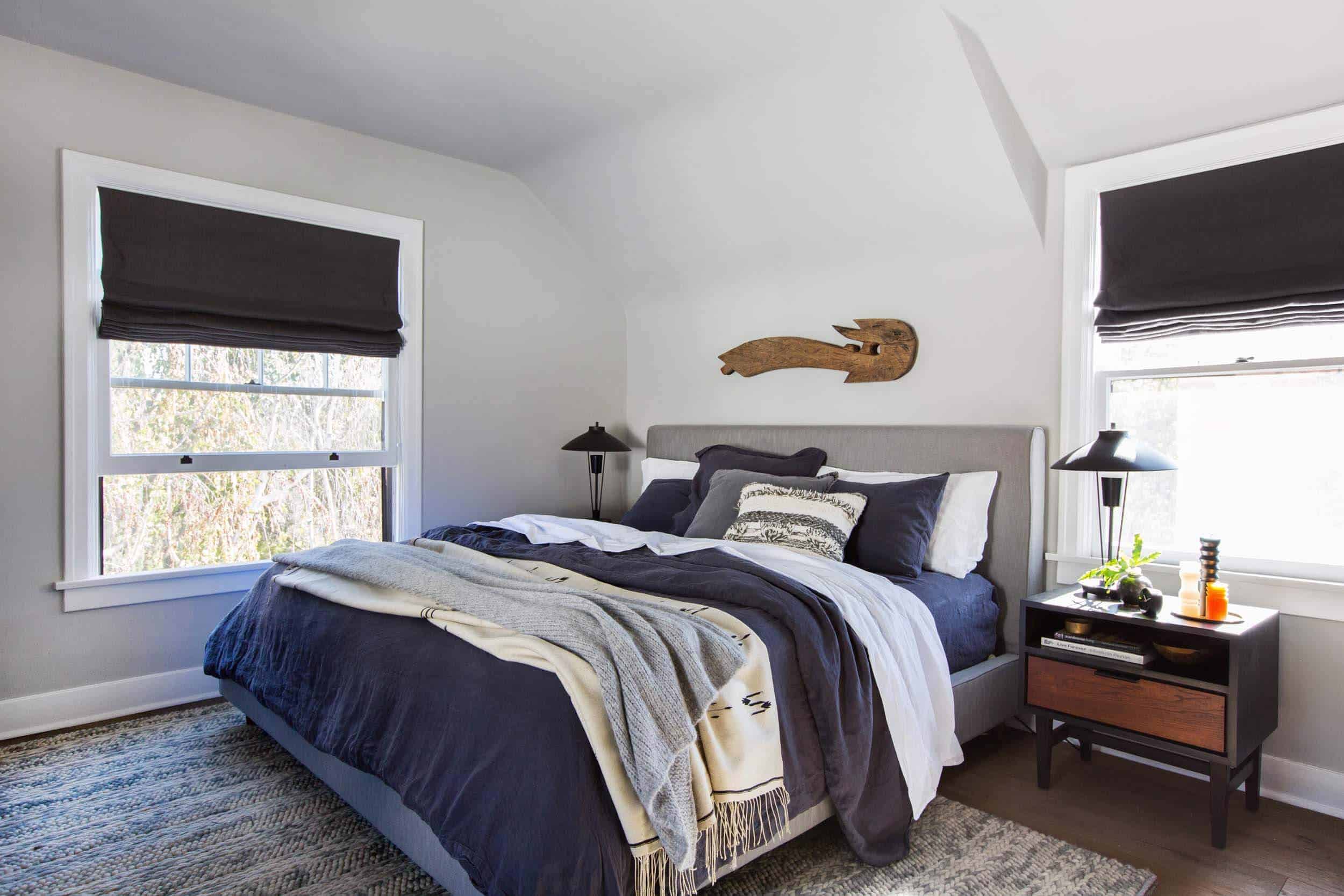
We painted my friend Scott’s bedroom Pavilion Gray and we still love it.
Again, with Gray Owl in the Lake House bedroom, and again I still love it.

Our bedroom in LA is painted Ammonite (a warm gray) and I LOVE it.

So what makes one gray depressing and another gray like a big hug?? How do you choose the right gray paint?
We aren’t done exploring…
A few years ago, Brady wrote a whole post about his “Choosing the Perfect Gray’ journey and he tried out 12 different paint colors on swatches before painting his living room.

He selected Pavilion Gray (same as Scott’s bedroom) with the help of our audience and in photos, it looked beautiful.

He thought he chose the right one… but after he lived with it he realized it was actually dark and depressing in his space – although it looked so pretty in photos. He painted it to Super White (and also switched out the sofa and his “garbage” chairs – his words – that were literally falling apart).

Now a good gray, like a good ANYTHING will always be in style. This isn’t a declaration, we aren’t announcing the demise of one of our only true neutrals. So what’s my problem?
It’s so easy to go too “cold” and a cool gray can indeed feel depressing. When I was designing the Portland house one of my best pieces of advice from locals is don’t paint anything gray. There is already enough up there. The same goes for the English who want happier colors that can also be moody, but not gray (or grey in the UK).
Here’s how to choose a good gray paint color:
- Look at the overall color tone of the whole paint strip to help determine what the undertone of the color is. Then make sure you like that undertone color. It might be blue, gray, purple, brown – this will indicate more of what it will feel like.

- Go for a warmer undertone if you want it to feel like a hug. It’s easy to go too beige and thus create taupe or what some might call “greige,” so we’ve rounded up our favorites below:

- Modern Gray | 2. Ammonite | 3. Gray Owl | 4. Pale Oak | 5. Pediment | 6. Soapstone | 7. Skyline | 8. Heron Plume | 9. Pavillion Gray
- Please paint a piece of paper and live with it on multiple walls throughout the day (like Brady did). Every paint color reacts differently based on your natural light (or lack thereof).
- Know that even if you go slightly blue, it will look blue. The amount of times I’ve tried to choose the perfect “blueish gray” is embarrassing, only to end up with baby – mother-effing – blue. We are on the hunt for the perfect blue/gray right now so stay tuned for that when we find it.
- The other colors in the room can shift your gray. It can either pull out more warm or cool tones OR it can contrast it and push it in another direction. I wish I went to design school and had more of a solid color theory scientific answer for you, but sometimes something will reflect on the walls and shift it entirely which is frustrating.

So, in conclusion, are we done with gray???? NO, but we are certainly only using it where it’s actually appropriate and recognizing that it’s not for every room or every location. It became a go-to that we went to too often. The ’00s ushered in a decade of white walls and we are similarily questioning that popularity. Both can be great neutrals and great backgrounds for any style, and we will always use and highlight our favorites. But like anything, we are being more purposeful and asking ourselves “WHY?” before selecting any color.
So those are my current thoughts and feelings about gray. I would love to know yours (and please recommend other grays in the comments – I’ve only used what I’ve used and we too need more recommendations).


We re-painted our house last year using Sherwin Williams Silverpointe with alabaster trim color in main living areas and master bedroom. I mostly love it. Sometimes it looks a little more blue than I wanted depending on the lighting in our home. We tried Sherwin Williams agreeable gray, but it just didn’t work for us.
My go to gray is silver leaf by valspar. Looks great in 2 different rooms.
In our Seattle house (plenty of dreary gray/grey weather and light there) we painted our open living and dining room Lamp Room Gray by Farrow & Ball and absolutely loved it. I don’t find grey tones too cool or depressing, personally, but I get why other PNW/UK inhabitants might not be a fan. It was light enough that it still felt airy and bright when the light was strong, and when it wasn’t it still looked nice—more sophisticated and moody than plain white or off-white, and a better backdrop for the colour palette I wanted to feature in those spaces. I live in London now in a brightly white painted rental which I can’t paint; I like it, but I’d like that soft Lamp Room Gray even better. If we buy something here I may hold off on grey because I do think we’re culturally graduating out of the Great Grey Trend (Maria Killam’s blog is great at discussing trends in neutrals) so I wouldn’t want to commit to a grey shade again and then be annoyed about it in a couple years, but I might just repeat that exact one since it was such a lovely comforting hue to… Read more »
We used Sherwin Williams Alpaca in our daughter’s room and absolutely love it. It has a slight purple undertone. I personally wouldn’t use it in a main living area or even the master because I prefer something more neutral, but it was a great compromise for our purple-loving 5-year-old. It’s a color that will really grow with her.
In our main living areas and master, we used Sherwin Williams Accessible Beige. We get plenty of natural light and it looks nice. It’s not a showstopper — it’s a true neutral, which is what we wanted. It gives us freedom to choose colorful art and decor.
For a darker blue/green/gray check out Sherwin Williams mineral deposit. I just did my bedroom this color and I love it. It’s way less gray than I thought it would be, but it’s lovely and calming and definitely warm.
OooOo! this sounds so lovely. thanks for the suggestion, Emily 🙂
I’ve always been a big fan of Benjamin Moore’s Nimbus and Light Pewter
Yes yes yes to Nimbus! When we moved into our house I tried about 16 different grays on swatches and ended up going with Nimbus throughout along with BM Simply White on the trim. It’s got a beige undertone, so it looks a little more greige in south facing rooms, then a little cooler and more “cement” toned in north facing rooms, but doesn’t feel cold at all even with dark wooden floors. Looks amazing with green, black and gold accents and makes a gorgeous backdrop for all my houseplants! I love it!
Re: your hunt for the perfect blue/gray, have you tried Benjamin Moore’s Glass Slipper?
Funny that this was today’s post because I was just wondering yesterday if gray was going out of style when I looked at my sister’s freshly painted gray bedroom. I’m happy you concluded that it is not because my ENTIRE house is painted with Behr’s Silver Drop and I really love it 3.5 years later. It’s a light grey with green undertones and it feels like the perfect neutral to me.
My house is Behr Silver Drip too, and I love it as well! I feel like it is a faded enough gray that it just gives the right amount of substance.
Ha so happy we had great timing! The right gray is always in style:)
Me too (Behr silver drop)! I chose it for the main spaces 9 years ago and still love it so much I keep painting more spaces in it. Subtle and warm but still grey and not beige.
Most of our house is in Silver Drop, too and I LOVE it! I agree – it really is the perfect neutral!
I have used two greys in my home, both Benjamin Moore, Cement gray in my kitchen which I adore! It has a slight lilac undertone which works beautifully with my nickel hardware. The living room, master bedroom and halllways are all Abalone, which is, in my opinion, the perfect greige, a lovely warm grey ?
Yes yes yes to BM Cement Gray!
We painted the interior of our house Sherwin Williams Agreeable Gray. Our house is a little dark, and this one works well because it’s a really warm gray. I also love this paint because it looks different in every room, depending on the room’s lighting and even the colors you are using in the room.
We also have agreeable grey on our entire first floor and I love it! Very warm and sophisticated looking. Then we tried to paint an upstairs hallway in the same color…. DISASTER. I think it truly is a chameleon color that can be amazing or horrible, depending on the space!
We have BM Agreeable Gray on all the walls in our mountain home. It gets tons on natural southern exposure light. On bright days, it looks completely white. On over cast days a tinge of gray. It was a great decision. Love the color so much, I tried it in my city home—a south facing craftsman with lots of oak trim and green leafy trees outside. It did not work at all. Truly does come down to the room, the lighting and the environment in which it sits.
Thanks for the rec!!
We used SW Nebulous White in our living area, but yeah, it’s blue. Verrrry light blue, but not at all what we were intending. It turns out that with our hardwood floors, wood table, wood piano, leather chair, and olive green couch, it’s just cool-toned enough to balance everything out. A happy accident, I guess!
We painted a bunch of our sunny SoCal house Sherwin Williams Modern Gray. It is a chameleon of a color. It works the pervious owners travertine floors relatively well, especially in the south facing rooms. But in the north facing rooms it leans less warm and more purple somehow. I wish I would have painted the north facing rooms something even warmer, although for a gray Modern Gray is quite warm! FYI in person it looks nothing like that tiny swatch. Way way less saturated somehow.
Our current home had a multitude of painting sins we purchased it, including a dark tan as the main wall color (but don’t get me started on the striped accent walls in every bedroom). In southern Arizona, dark tan just feels oppressive. My patient husband suffered through many paint samples, including a fruitless search for one or two of the Farrow and Ball colors you’ve recommended in the past. I thought I wanted a light, warm gray because we have oak cabinets and an oak staircase. Since oak is a warm wood, I thought I *had* to use a warm neutral. Long story short, warm gray is pretty close to light tan, and I was over that. We switched gears to a light, cool gray, then painted our powder room three times before settling on the correct one. The first two looked blue or purple in the shade! The final choice: Stone White by Glidden. In full sun, it looks white, but has beautiful, icy tones of gray in the shadows. Our great room gets tons of natural light, and we catch ourselves studying the shadows on the wall. For us, it was the perfect calm, cool and modern neutral.… Read more »
Our entire main floor has been Gray Owl for years, and I love it. However, I’ve been wondering if I want to go a touch lighter. We painted the guest room Intense White, which is the lighter color right next to Gray Owl on the paint strip. I love it so much. It only adds a touch of color to the walls, but it’s much more interesting than white. Would recommend 10/10.
Sounds so pretty!
Omg I have one bedroom in Gray Owl and LOVE it – when I’m in there, I truly often think “this is THE best gray paint color and I’m so happy we did this”. Then in our small kitchen, I wanted the same vibe but was afraid it would read too dark. I did Intense White in there instead, and it’s just so pretty. Sometimes I wonder if I’m boring as shit loving a color called “intense white” so much, but it’s just the lightest gray ever that is baaaaarely darker than white but so much lovelier and more interesting than white. It looks so pretty against my white trim and doors and I would also totally recommend it!!
We painted our family room & sunroom with Benjamin Moore Pelican Gray, which has beautiful blue & faint purple undertones.
It looks cool/cold in internet photos, but in-person, there’s lots of depth and movement in the color. I love it!
Perfect blue / grey is F&B ‘Dimpse‘ 🙂
ooh I just looked it up and I LOVE. Thanks for the recommendation 🙂
I’m just about to paint my bedroom this colour (in the UK) so I’m pleased to hear this!!
Used dimpse in our guest bedroom and I love it so much, it’s now my favorite room in the house
I love love love Felicity (I think it’s a valspar color?). It’s the perfect barely there grey, so you have contrast with your white mouldings, but it still feels super light and bright. I’ve used it all throughout my house after trying dozens of greys
I’ll admit, I’m not a big fan of grey walls. I like grey in fashion and decor, but it can get depressing really fast. I noticed that I liked all the examples you showed here of grey that works, and I realized that all the rooms had warm wood floors. I know undertones and where on the color wheel you choose your grey (or any color) from can make a big difference, but it seems like the sum total of the design makes a difference. A monochromatic grey design can feel too cool, too depressing, but grey with other elements to balance it can work so much better.
I completely agree. I painted my room gray when I was in high school and SERIOUSLY regretted it. Now I’m scarred haha
BM Silver Chain is a pretty dope blue-gray.
Just this weekend I painted my hallways Light Pewter from Benjamin Moore and I love it! They were an ugly, yellowy off-white and I wanted to brighten it up. Classic gray was too bright for my taste, and light pewter is perfect. These hallways and stairwell do not get a lot of natural light, some are very shadowed, some get a bit of sunlight, some only over head lighting. And this color works everywhere! It really is like a stone color, some places more gray, some places more neutral. But it totally works and I highly recommend it! We also have it in our bathroom with deep blue tile on the wall, and gray wood tile on the floor, and it stays neutral.
Ben Moore Silver Fox is a warm medium tone that I’ve used in several projects with success. It’s cozy for sure.
My mother chose silver fox for her new home in 1986 when I was a teenager and I LOVED it. In Michigan winters are grey but with white trim and a light carpeting with warm undertones, it was spectacular. I love grey. And always choose cool tones. But I moved into a house that had already deeply committed to a warm palette so rather than start over I’ve leaned into creamy beige. BMs Navajo White is surprisingly lovely and covers our main loving room walls and trim. We have BM Wheeling Neutral in a hallway and tv room. I just introduced an accent wall in grey: BM Graphite and it feels “masculine”. Finally, I painted a walk-in closet in BM Revere Pewter after learning it’s an exact match for Farrow and Balls Elephants Breath. Ultimately colors are the most subject to fashion so choose what you like. But my color journey taught me not to get in a rut.
Love this discussion. Yes grey is in for a long time. But the best part about that color is there’s so many variations. My favorite go-to greys are… Dolfin Fin, Irish Mist and Silver Drop by Behr.
My living, dining, kitchen, and 3/4’s of my master bedroom are painted gray owl – but I had it mixed 50% lighter so it was more of a touch of gray, rather than GRAY gray. I absolutely agonized over what color to paint when we moved in (it was originally dark brown – barf), and even after I painted, I wasn’t entirely convinced because it looked way different in person. Honestly I have my days where I wish I’d done white – especially when the lighting makes it look baby blue, which is often…so often that my husband was confused one time when I mentioned the “gray” walls – he thought they were blue!!! Overall though, I don’t actually think white would be good in my house because it’s so small with minimal natural lighting, so I’m happy enough.
Painted the inside of all of the public rooms in my home Antique Paper by Dunn Edwards. It has the slightest tint of grey with a bit of warm white. Elevated, elegant and chic with artwork. The trim is White Picket Fence by DE which is a clean white (but not too bright) with the AP.
We are so happy with the choice! It replaced a yellow/gold white which was very Tuscan and warm. We also changed out all the light fixtures which were bronze and Tuscan style. I feel like I live in a model home!
We used SW Faded Gray everywhere in our house. We love it and it really made our house look bigger. We went from Swiss Coffee to the Faded Gray and it’s a completely different house.
Our walls are Sherwin Williams Nebulous White, which is a verrrryy light cool-ish gray and I still love it, a few years later. I warm it up with a lot of walnut and cognac colored leather.
I love BM Gray Owl but when I tried it on my walls it looked too bluish/steel. I ended up with BM Edgecomb Gray. Soft and creamy.
We have Edgecomb in our living room and dining room, but for our north-facing family room, I wanted something a little lighter, and BM Gray Mist is perfection. I call these my not-gray grays because they are not cold at all, but also not pink or yellow. Just a cozy neutral.
My kitchen is Edgecomb grey and I love it. It is a true grey. I tested Grey Owl and it looked baby blue., at least it did in my space.
98% of gray’s for me are Ok ……up to 20 min in the space tops.
Yes at first glance they can look great, hence a pantry, hallway fine.
However I haven’t found the feel good grey that after 20min in a room keeps feeling good and continues to lift/have a good energy like other colors.
My main room, with a northeast exposure and fairly small windows, is painted BM’s Edgecomb Gray (more of a greige). with BM’s Decorator White trim. I really like it. I was afraid a cooler-toned gray would make the room look too cold since it has such poor natural light–it fails the ” paint it white” test, since I have to turn on a light to read unless there’s morning sun. I live east of Lake Michigan, and the weather is often cloudy for weeks on end.
My bedroom Is BM Deep Space, a very dark gray, since I work nights and wanted a cave-like feel to help me sleep. Very happy with that choice also.
I used Gray Owl in a north-facing kitchen and it looked like dirty dishwater. Yuck. But Pale Oak was beautiful in a north-facing bathroom.
Benjamin Moore’s Aura paint color Sea Salt is positively dreamy!
For a blue/grey, we used Seattle Grey from Benjamin Moore (https://www.benjaminmoore.com/en-us/color-overview/find-your-color/color/2130-70/seattle-gray?color=2130-70; we live in Seattle but swear it was just a coincidence) and have really liked it. It really doesn’t come off as all the blue until you pay close attention to it.
As opposed to Beacon Grey from Benjamin Moore (https://www.benjaminmoore.com/en-us/color-overview/find-your-color/color/2128-60/beacon-gray?color=2128-60), which we used in our living room that gets a lot of light.
The blue definitely comes out (as baby blue no less) especially when it is up against white trim.
thanks for the recommendation, Jared! 🙂
We have had good luck with SW Agreeable Gray. It’s light and warm, and very neutral to my eye.
Apparition by Benjamin Moore in my upstairs is lovely. We have Bennington Gray in our downstairs and stairwell it is decidedly the color of coffee with cream but both are a goes with everything pallete
I’m looking for a good neutral paint color. I know that beige is dated, but I‘m thinking that gray is not right for me since my decor usually includes warmer neutrals. White is popular and looks great in photos but I’m afraid would look unfinished in person. Off-white scares me since it can go a little yellow and look mismatched with pure white trim. Is there such a thing as a beige paint that looks modern and fresh? Do you have other suggestions?
The perfect gray blue is Orlando’s Benjamin Moore Sleigh Bells!
I decided my walls could go another year with whatever-the-hell-that-color-is after trying no less than SiX samples (on white cards) in my living room. They turned out to be named improperly so I renamed them: Dead Elk, Dead Shark, Dead Squid, Dead Elephant, Dead OLD Elephant and Unnamed Dead Thing.
Wake me when hot pink becomes the go-to color for walls.
Priscilla, you are funny! Just a while back, EH was talking about muted dark green colors(love them) and now its back to gray, which some look light blue to me.
I’m with you– wake me up when hot pink or dark navy or green become the go-to color for walls.
Yup agree. 80 comments of readers’ favorite just-barely-not-white greys is just, yawn. Ready for color again!
Completely!!!
I have my son’s NW facing room in Gray Owl and it’s my favorite room in the house. I found that it was too gray for the NE facing room next door and used Ballet instead, and that had just enough warmth to work. It’s also all about the light!
Farrow and Ball’s “Cornforth White” Is actually the most beautiful pale grey that gives the wall a gorgeous, cool-toned depth and color. Highly recommend it!
I *just* painted my living room woodwork & bookshelves, as well as my kitchen cabinets Farrow & Ball’s Purbeck Stone (color-matched to Ben Moore paints) so I sure hope it isn’t going out of style! The walls are white (but a warm, not pure white) and the furnishings are blue and white, and I love it. I get a lot of compliments, so I hope to love it for a lot longer!
I’m surprised to see no one has yet mentioned SW Repose Grey. We wanted the feel of white walls, but with anywhere from 8-11 dogs and a cat in our house, white walls just won’t work. Repose Grey is fabulous because it feels white and bright, yet doesn’t show ALL the dog slobber and dirt like white would. Our trim is Eider White. I LOVE it.
came here to say the same. repose is amazing. it’s NOT blue. it’s NOT green. it’s NOT dark. it’s NOT purple. It’s warm and light and classy and grey and looks pretty with cream, with white, with wood, with WHATEVER! <3
After much agonizing over greys, I painted most rooms 75% SW Repose Gray. Best decision ever.
I did choose SW Drift of Mist for a couple of the windowless rooms. The neutral background makes everything pop.
I do think gray is over in design because there isn’t much new to say with it. People will always use neutrals but the straight gray tones wood floors and gray with white trim for every house on the market is definitely dunzo, at least in LA. That said, I just spec’d a couple warm grays for trim on a house with natural wood facade. I am getting into more green grays and Taupes.
Adaptable gray, cumulous, Felted Wool.
Two blue-grays I love:
Krypton by Sherwin Williams – a medium gray with periwinkle blue undertones. Used this in my daughter’s nursery/bedroom in two different houses. Very pretty and soothing.
Misty by Sherwin Williams – a light silvery-blue gray. I’ve used this color in four different apartments/condos/houses, and I’ve loved it every time! It’s perhaps worth noting that I’ve only used it in smaller bathrooms (and a laundry room), all of which had little to no natural light and were dominated by cabinetry, stone, and tile. Not sure how it would translate in a living space with more furnishings and decor (like a bedroom or living room) but it does nicely complement a range of wood and stone finishes in both warm and cool tones.
these both sound so lovely!! thanks, Lauren 🙂
Most of the rooms in our house are painted shades of gray but our bedroom is north facing and doesn’t get alot of light. I’ve tried several shades of gray and every one of them looks depressing. Any suggestions for a complimentary color that goes with the rest of the house but doesn’t look sad and depressing?
I am happy with the blue-grey in my dining room and mud room: SW North Star. It is paired with SW Pure White trim and not feeling a bit baby blue.
Love this post! I painted my cabinets in Deep Rock from Magnolia Home (mixed by Benjamin Moore). It’s listed as a grey, but has a lot of blue in it – almost like a cloudy pale navy. Definitely appears more grey or blue depending on the light, but it’s been really pretty. Through the house though I’m all about warming up all of these super cool tones!
I have a bathroom in a very pretty blue/grey: Dunn Edwards Salina Springs.
Such a great post! We have oak cabinets/trim in our 90s house and have painted over all the beige with either Valspar’s Cream Delight (a soft creamy white) and PPG’s Fog, a pale grey that is a little lighter and cooler (less green) than Gray Owl. It looks SO GOOD with oak—really tones down the orange in the wood and makes it looks softer. Thanks for continuing to write these helpful posts.
Cement Gray – Benjamin Moore. Terrible name. Wonderful color reflecting light gray with a whisper of periwinkle lavender. Used it on walls and ceiling — love it. Recommended it to a friend and a cousin. Both used it. Both LOVE it.
Thoughts on gray kitchen cabinets?
Fun fact: Taupe and greige are not the same thing. The term “greige” was coined because it’s a combo of gray and beige. Both Taupe and greige can be either warm or cool. Warm greige has a yellow undertone (from the beige). Warm taupe gets its warmth from the red undertones. Similarly, cool greige has blue undertones (from the gray) and a cool taupe comes from their green undertones. In conclusion, taupe and greige are not the same thing but greige and warm gray can be.
We have Pediment on our kitchen walls and cabinets and I would say it’s more of a super light taupe. But I live in Oregon where it’s dark! Ugh.