


First Farmhouse reveal, y’all. And I really, really needed it. Seeing one corner, one small “moment,” totally finished is wildly satisfying even if it’s just a literal door (and surrounding area). All hail the power of a great paint color (thank you, Sherwin-Williams). So today I’ll walk you through the front door color decision-making process and you’ll see what we landed on (I was scared and feared some regret, but now I’m SO HAPPY).
To recap – we wanted to keep the original door because it was beautiful. We thought first about stripping and staining it, but it was in such bad shape (cracks, holes, missing moldings, new lock placements, etc.) that the restoration of it would have been very extensive (read: expensive). And we were at the “maybe-let’s-stop-spending-money-dear-god” phase of the project, so we said we’d patch and paint: DONE. But choosing a front door color is HARD! What vibe do you want? What do you want people to think and feel when they drive/walk up? More importantly, how do YOU want to feel when you drive up after a long day and see the first glimpse of your home??? It’s the first impression rose (spoiler) and really sets the tone for what you might find inside.

Here are the facts:
1. We were painting the house Pure White SW 7005 which we LOVE, with a light gray trim color, Online SW 7072, that works really well with the steel blue exterior door color (aluminum clad, not painted). So we felt that we probably had enough blue/gray (I don’t totally agree with this, but sure, fine).
2. Brian was super pro-red door and I mean, I LOVE red (our LA house had a red door and the kids were also team “red”). I wondered if we should do something bolder so I snagged a lot of samples from Sherwin-Williams – both in their little free paint chips and their peel & stick samples (which you can order here). I was even open to bright yellow or an almost black green. As you know, I like to weigh a lot of options and honestly am open to many different types of vibes. The options I was thinking of were black (classic!), yellow (so happy!), dark green (happy but more “Oregon), or even blush beige (their 2023 Color of the Year is so beautiful, Redend Point SW 9081).
3. However, throughout this design process I’m constantly being reminded that Brian likes more traditional and leans even “sweet.” I think it’s mostly because of the farmhouse that he grew up in (classic red barn, white house with black shutters) that every time I try to push him into a more current or trendy look he resists. He wants “classic,” and he really thinks that a red door is what this house and property wanted.

Great! I can go there. He quickly got me on “team red,” but that’s not where the debate ended obviously. WHICH RED DO WE CHOOSE, BRIAN HENDERSON??

We went round and round on this. He wanted a bright red, and I agreed but offered this advice – too bright might be annoying to look at and a darker red will read as “bright” even though it’s darker than some other reds. Anne and Sarah were both there agreeing with him, but I kept pushing back to get a darker red (that is still a red). So we ordered a ton of different great red samples from Sherwin-Williams.


Time To Stare At Red Paint Samples For 3 Days:

We ordered the sticker samples of a lot of reds and stuck them to the door. So easy and useful.

I did a LOT of staring and debating, but I wasn’t terribly stressed out because if we got it wrong it would likely just be a quick coat on top to darken.


We ended up choosing Poinsettia SW 6594 by Sherwin-Williams, but Tanager SW 6601 was a close second and checked the box. Done. Chosen. We agree. Great!
My Reaction At First Look
Then a couple of weeks later the painters painted it and it looked like this:

My first reaction was “horror movie, cool it’s a horror house,” but Brian reminded me that A. That was just one coat and B. Obviously they over-sprayed intentionally which contributed to the terrifying look, and C. The rest of the house isn’t done! Just wait! So I did, but I was already planning the repaint in my mind… It was a great red, but was it too much for me????
Next up they finished the body and casing colors – again Pure White SW 7005 and Online SW 7072 both by Sherwin-Williams.

We rounded the corner of the driveway that day and both gasped. We were so delighted with the body and casing colors (so bright, classic, and happy!), but we both immediately said that we didn’t like the red with the gray casing color. I couldn’t totally figure out why, but it’s like the red made the Online color (which is a gray) look even grayer and just kinda flat. Maybe it’s because they are both two mid-tones and the Online would have been fine with a really dark color. Either way, we both had the same “meh” reaction. But the casing was the same throughout the entire house! On every window and door! You can’t just have a different door casing color for your front door, can you??? So I asked ARCIFORM and they said “of course you can, we do it all the time,” and the next day my painters painted the casing around the door the same color as the walls, Pure White. I was afraid that it would look like we forgot to paint the casing but y’all, as you can see for yourself, it looks AMAZING (see below). I freaked out for no reason and while I would say “lesson learned” the truth is that freaking out and self-doubt are often just part of the creative process. I guess what I did learn is sometimes just let it play out and don’t let your initial doubt and fear takeover. YET.
The Final Painted Red Door And How We Feel
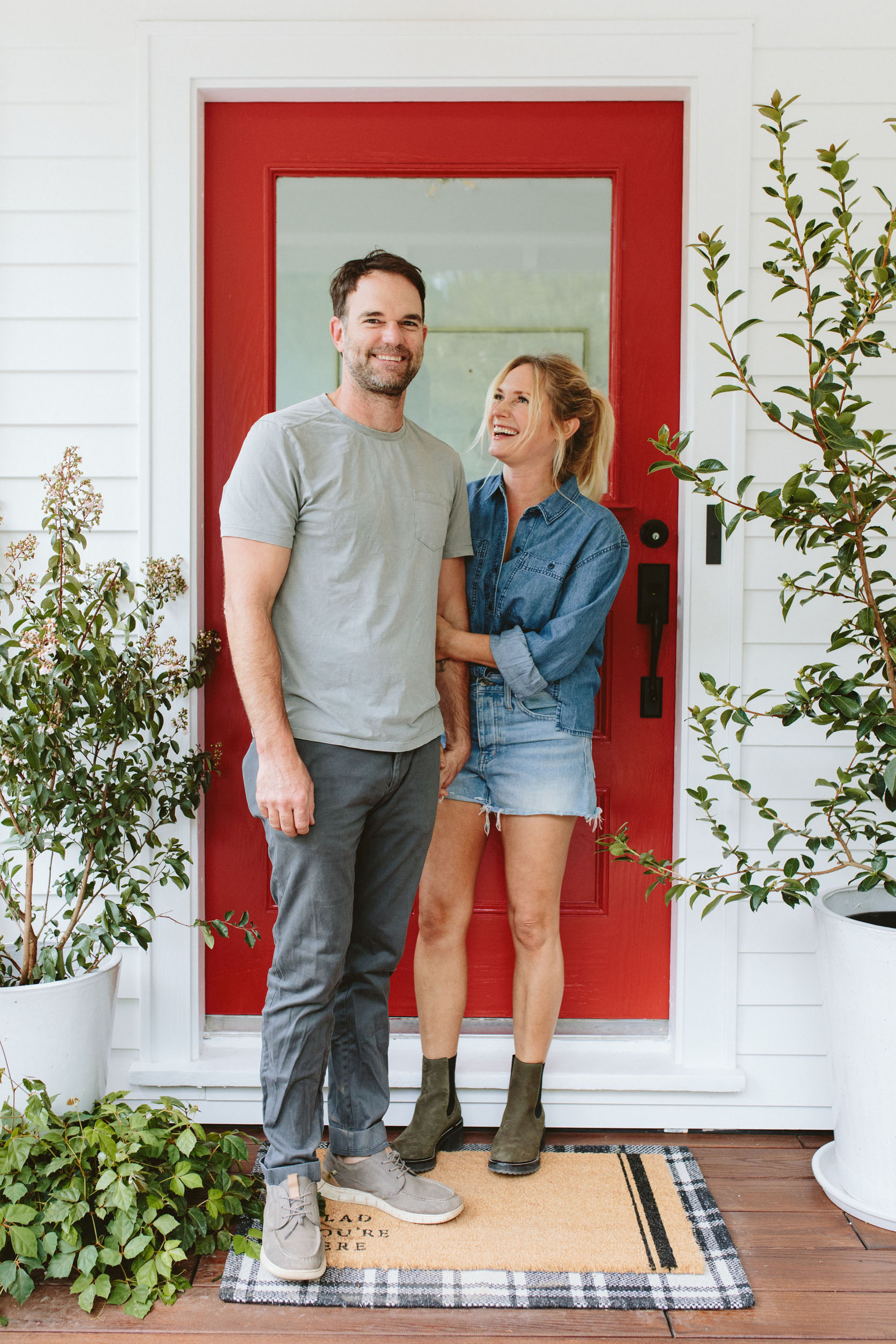
We ABSOLUTELY LOVE IT. It’s bright and happy, classic and timeless, and injects so much joy into our front porch (and lives). After I styled it out, I looked back at it and almost cried. Not everything has turned out as good as I had hoped, but this area turned out so much better than I thought.

I’m incredibly happy every single time I see this door. That’s what red does – it’s a jolt of joy! And the right red, in this case, Poinsettia SW 6594, is REALLY really good. We shot it first with that wreath which can’t help but lean a little holiday (I’m ready, are you ready?) so we took it off for the rest of the shots, but how sweet is that door? The rest of the house is an absolute dust-barren construction zone, but this front porch is my little glimmer of hope. We actually hung the hanging porch swing right next to it the following week and I can’t wait to show you how it all looks together.

We chose a semi-gloss finish for durability and boy, it just POPS. I read somewhere after we painted, that a red front door means you’ve paid off the house, which is a really hilarious joke, but to me, it means “Welcome! Come on in and be ready for some fun family time.”

Pots (Local Nursery) | Glad You’re Here Coir Doormat | Plaid Doormat | Sconce | Wall Paint | Door Paint
I went to the local nursery and snagged these pretty pots and plants (one Crate Mrytle that I’m going to have to move to more sun and one Camelia tree that will stay here – I love those winter blooms). The welcome mats are both Target (HOT TIP – if you have a big front door just layer a classic mat over an indoor/outdoor rug), and the copper sconce is of course Rejuvenation.


We Are So VERY VERY Happy!!!

Maybe a red door won’t work on every color of home, but on this classic white house it feels incredibly natural, like it was always meant to be red. When I told Brian he was right, he gave me the satisfied but sweet “I told you so” look, and instead of me reminding him that I pushed us to the darker red – the ones he wanted would have seemed almost florescent red they were so bright) I just said “Yep! You were right – we are indeed ‘red door people.'”
*Photos by Kaitlin Green
**Sponsored by Sherwin-Williams


I love it!
The darker red was definitely the right choice, and it’s the one I picked as soon as I got to that first sample photo. The other looked much more orange.
The grey casing made the door look like a Hobbit door from those cameras angles and the white trim makes it pop. Congrats on a thing being finished. Sometimes it’s what keeps you going through the tough periods of regeneration.
I know we’re not mentioning the C word yet, but it’s going to look fab with a wreath and some snow!
Me, too! As soon as I saw the samples I immediately fell for the Pointsettia. Love the black hardware.
I have to admit, I was very skeptical about red in general, but I love it! I’m glad you didn’t paint the casing grey. Won’t this be so fun to decorate for Christmas??
I can’t believe what a difference the white casing made! Congrats!
It looks wonderful! I’m so glad you painted the casing white as well.
You guys are so cute! Thanks for sharing your joy. I picked that red when I saw them so after all these years I must be learning your ways! Love it against the white.
Oh my goodness it’s GORGEOUS! I was totally not sure about the red but wowza! You nailed it!
Just beautiful–so glad you both got so much satisfaction and joy from your choice.
The door color looks both classic and fresh!
The casing made such a difference! I didn’t think it looked that bad with the gray but the white makes it really pop. We also have a red front door, and we initially chose one that we thought looked great but read more orange. So we just painted right over top and are much happier now–it’s a BM color but very similar to what you chose.
Love it!
Love love love it!! And very happy for you that you get to feel settled 🙂
Cute result-however .. and I hate to say it ….and I hate even more having to do it, respectfully, the way to pick paint colors is always is against white primer, never against the existing color. Seeing all those those reds smack against each other and most notably the dark brown door ,which is not relevant to anything since it is being painted over, throws the eye off. The dark brown distorts everything. So throw a coat of primer on the door, test paints against that- and beside the chosen trim color. I suppose if you didn’t want to prime the door, you could put up white posterboard. I just went through this myself , picking green paint to cover existing blue. NOT priming the blue out first made it needlessly difficult. I bought an expensive, non returnable gallon of mistaken green paint before I got it right. Since I am a DIYer I was bummed that it cost me time and money to fix.
it’s hard for me, too, to choose a new color while looking at the old color. i hate choosing new colors. lol, but you should see my house, it’s full of color (i have a cheat: a friend who is a color magician/maven/guru+everything good)!
I was thinking the same thing about putting the samples on a white background. But I love the red, so glad they painted the casing the same color as the house. It looks so terrific.❤️
Love it. I glimpsed the red on one of your posts or stories about the entryway, and thought I was seeing things since you’re usually all about blue!
Love the red door! I thought I would share another reason for painting a door red. The old owners of our house had a red door (and trim-had to change that) as a way to signal a place of refuge and protection because he used to take in refuges in the 70s. He learned this from the practice of old East-coast churches painting their door red to symbolize safety.
Can confirm about the East Coast red-door churches. I live in Vermont but my husband and I explore all over New England nearly every weekend, and the white church-red door thing is real! It’s a symbol of protection (harkening back to the lambs blood from the first Passover). I’ve also recently read that red doors were a sign of sanctuary for travelers of the Underground Railroad. A home with a red door was a safe house where the escaped enslaved people could rest, nourish, and plan their next moves – toward Canada, or to settle in New England. (Sorry for the history lesson – I just like to share!)
Never apologize for impromptu history lessons! That’s really cool.
I want to hear about all your New England explorations!! Need weekend trip ideas in the region
I always grew up with a red door (East Coast). My mother told me that it was a symbol for sanctuary and that “all are welcome here”. Such sweetness!
Love it so much! The white casing makes all the difference. Not only does it allow the red to pop, it also gives the door a different perceived shape – taller.
Perfect red! Love!
Love the color (and the window)! Offset by the white it does look incredibly fresh and cheerful.
Red doors bring good luck!
Brian … I see a new TREE TATTOO?!? Do tell!
“Contemplating red front door ideas? While the color might sound like a dramatic choice, it’s actually a hue that’s easy to live with, and definitely worth your consideration.
Red is the most prosperous color in Feng Shui, as well as a compelling and dominant color choice for the transformation of negative energy. Red is also connected to the fire element, which represents passion, aspiration and warmth.
As with any color used in decorating, there are many variations of red to choose from, and it’s a good idea to think about which way your room faces when selecting. The principles associated with Feng Shui suggest that this color would be best suited to south-facing door. It is also a fantastic color choice for those living in colder climates.”
Homes & Gardens
Wow can’t believe the difference the white casing makes! It looks amazing. Does anyone have suggestions for a front door colour for a red brick house?
https://www.google.com/search?source=univ&tbm=isch&q=best+colour+door+for+red+brick+house&client=tablet-android-samsung-rev2&fir=g9nTBSIGD058lM%252C3VaMZ2L3faxPaM%252C_%253ByaiW3iglCSN_cM%252CJlmclsh1eVIK6M%252C_%253BNQAeTcrwdIiUNM%252Cwac7VhLwoYpIiM%252C_%253BDZKfG2elV4SjqM%252CJ-mh-Idk-VX5IM%252C_%253B_ljeMQsuwYrrzM%252C90MDNYv5TL4yMM%252C_%253B0BDqGr8-rCIoFM%252CqZa8bYPtffrq7M%252C_%253B4TMunqd3nlP3iM%252CezwSxo-cP-DYhM%252C_%253BjrPX3Ex3HQkJEM%252CPrxarif8c0AxrM%252C_%253Bn0KkSM0aMgLFEM%252CS8-6BEZXtJgCBM%252C_%253B6PYmXRZpttBvEM%252C-UeZc2U1mG6cbM%252C_%253Bgx8FQop_ck1_bM%252CKogWT7gbjXUIqM%252C_%253BBoZgU8V8tfIXWM%252CJ-mh-Idk-VX5IM%252C_%253BVOwMCp04yQ8N0M%252C842Q5rvnKVrw1M%252C_%253BA72oZeMnZAQt-M%252Cnj8lWTiVkXoTiM%252C_%253B3HDnKZKMlpQ-QM%252CbxFtovoMRhu_pM%252C_%253BynB6FQgrQiz7YM%252CtSCxefAfLCXZYM%252C_%253Bh_ABzh8f_BFkMM%252CcWe97X9jYdzTNM%252C_%253B4Mdr67Qc2dXn5M%252CVaf0tZU3H7IqlM%252C_%253BOyNqWikfi-7yiM%252Cl8wdkyFpjrokjM%252C_%253B_N9KOmyQw70YyM%252Cnj8lWTiVkXoTiM%252C_%253BiTTb7E_6VYpJqM%252CtSCxefAfLCXZYM%252C_%253BM7AO6e6szoocfM%252C3zoq2XcgnFsfmM%252C_%253BLX0n73MHiWLx9M%252CSDFfxwJLJU0x8M%252C_%253B0ieCJXOjSQNroM%252CJ-mh-Idk-VX5IM%252C_%253BSqx_Z1r_FV57aM%252CSDFfxwJLJU0x8M%252C_%253BRaB349_ZswBfmM%252CJc_VaalW-0WjtM%252C_%253BympA9e4hNINRPM%252CSDFfxwJLJU0x8M%252C_&usg=AI4_-kQYbwvNhcLOUkF-pbbM2ArPkj066A&sa=X&ved=2ahUKEwiw3NfT8sb6AhVP7jgGHf3MDecQ7Al6BAgFEEU&biw=1024&bih=768&dpr=2
Yikes! That was lonnnnnng. Sorry.😖 Good inspiration though.
Maria Killam’s blog has some great suggestions for door color for brick
It’s so good Emily! Funnily enough i also recently swatches Tanager for a project and loved it! The color you landed on is just perfect! So so excited for y’all.
*swatched
Whoa! The sconce!!! ❤️
It’s lovely! 😀
Very cute! So glad you can start to see pieces coming together. New houses are a blessing, and they are also exhausting 🙂
I love it! We have a red door too and it totally pops against the white and black of our house. Photos are so cute too!
Love a red door! And I believe it is crepe myrtle, not crate myrtle. (Sorry, I’m not usually a typo scolder but this one hurt my soul just a little.)
Believe it or not, it’s actually Crapemyrtle or Crape Myrtle! The US National Arborteum calls them Crapemyrtle. https://www.usna.usda.gov/science/icra/lagerstroemia/
Crepe and crape are both accepted spellings of lagerstroemia. Not crate though.
CREPE myrtle, not crate myrtle.
It seems like it should be crepe myrtle, but it’s actually crape myrtle! I’m guessing that their spell check accidentally changed the word crape to crate.
Commonly called the “lilac of the South,” the spelling of this tree is a litmus test of geographic origins. Crepe myrtle is the most commonly accepted “southern” spelling; north of some unspecified crepe-myrtle line, it becomes crape myrtle.
Beautiful! I love the classic color choices. I suspect the red didn’t work with the grey casing because they are both quite cool and read dull next to each other. The warmer red that Brian chose might have worked better with the grey but you gained something else by painting the casing white — the focus is now wholly on the gorgeous door rather than the casing as well and it opens up the space visually. It’s the reason I seldom light a colored mat around a framed piece of art, it distracts and closes in the view. Win win with the paint choices!
Love the red front door. You will really appreciate the “pop” of color on gray Portland days. It is so easy to repaint a front door, if you get sick of the color. I just went from a dark gray house, to white. I ended up with an olive green front door. But love that pretty much any color, will work with the white exterior. I could paint the door a new color yearly, if I so choose.
But I’m really here for the pallet front steps. Genius temporary solution! I chuckled.
Perfection! Can’t wait to see more!
I LOVE a red front door! Mine is SW Red Bay and it makes me happy every single day!
very important non-door question. what are your green suede boots in the last series of photos? thanks!
Those are the Madewell Chelsea boots that she posted about a week or so ago, I think!
bingo! thanks!
I love it!! Can’t wait to see the swing and the entryway…and the whole house. What you’ve shown thus far is beautiful. So good!
I love it <3
And as if by magic, I now want a red front door 😂😂😂 looks sooo good! And great save with the trim. So looking forward to more reveals
It looks really nice with the black hardware! I love a red door, where it works, and it works at your house!
Perfect color, after all that work, you nailed it
The red is lovely and lively! Does it make you reconsider the gray trim for the rest of the house? Because that white on white looks so crisp and clean, and the gray is rather washed out and dull in my opinion.
Anyway I love these mini reveals — looking forward to more
Love the red and the idea of painting the door casing a different color than other trim! Who knew? I laughed out loud at the pictures of you all staring at the door, because my neighbors have walked by on more than one occasion while we are staring at the front of the house trying to decide what color to paint it!!
Is it just me, or does Brian seem super uncompromising on like…every little home decor decision? Bruh your wife’s an award-winning stylist with a great business going, maybe you don’t need to assert control over every little thing?
See today’s post. Emily is the designer, the book author, the business owner. And Brian is saying all whites are the same. It feels like everything that Emily ends up regretting or feels is a mistake, is because Brian forced the issue of what he wanted. I absolutely would say this to his face, because telling controlling men they are being controlling is probably my favorite thing. Why is Brian digging his heels in about not letting Emily pick a white she likes? Brian, stop making digs at your wife and trust her skills.
See Emilys response to the Living Room post. You are clearly projecting and bang out of order. Rein yourself in.
Vid….if you think having an opinion on the colour of a front door is controlling, tge ypu gave little idea of what a trye controlling person is, as in Coercive Control.
I’m flabbergasted by your naive and degrading comment.
Wot?!?!?😳
First, love it! But, also, going way back to your primary bedroom fireplace paint agony, I want to revise a comment I made. I had said that I wasn’t sure about the grey roman shades on the windows–seemed to clash with the dark color choices for the fireplace, and I wanted the shades to melt into the background. But! Now I am seeing that the trim, closet door colors, and much of the house keys off that grey color. Nice! Soooo…I realized that the reason so many of us readers liked that dark grey option for the fireplace (upper L corner in the post, can’t remember paint color name) is that it was a darker version of the roman blinds, so it tied them together. Therefore (!) as a late entry into that post, I agree with the idea that a dark grey is the way to go for the fireplace. Nix the blues and just make it a version of the roman blinds and trim color you are using throughout, albeit a good 10 shades darker. The blue can come in elsewhere in the room? maybe with a a few grey styling moments to tie it together?
I love it! I have a red door as well and agree it is so cheerful. For our door we, have painted the casing in red which makes the door feel bigger and gives it more presence. Agree the grey was a bit off since the rest of the house is white.
“I freaked out for no reason and while I would say “lesson learned” the truth is that freaking out and self-doubt are often just part of the creative process.” Yes Yes Yes!
I never post here Emily because how can one person read so many comments in a day? Lol!!! You get so many and I’m happy for you! I had to say that it is so lovely and is a total awesome job! Love the copper barn light…I had to have one for our home as well…we’re not in a farm house as I’d liked but due to hubby’s job we are closer for him BUT..I got me a barn light and it makes me happy!! Your doing great with your home! Make it yours girl!!
If you are interested in an evergreen perennial for your front door pots you may want to look into a camelia – ‘camelia sasanqua ‘yuletide’. Fall and winter blooming, red camelia (there are also white ones…you might like one called ‘buttermint’ or ‘settsugekka’), anyways, naturally camelia are very slow growing and should be shaped like a small open tree. could be quite pretty there. They take a fair bit of shade, but will also tolerate sun. You could underplant them with seasonal stuff (pansies in winter, white begonia in summer….)
OMG NOW I NEED A RED DOOR
I may have missed this, but did you paint both sides of your door red? I have a front door paint dilemma and I’m not sure whether to use the same color on both sides.
Red is color for goods and scary both. but in our culture it is symbol of new beginning. I like to include red in everything that I have. Loved this.
Off to paint the casing of my front door the same color as the siding. The house styled looks very LL Bean … in a good way. Although the copper lamp gives me pause.