


Remember way back when in June (four months ago) when you guys chose the materials for the first level guest bath? Well, now it’s time to show you how we actually designed this bathroom. She is dark, moody and seemingly very dramatic but toned down enough to work in this cabin because some of the finishes are earthy and grounded. I was nervous that it would turn out cheesy, as black, gold and marble can go Liberace fast. But when we visited it last week and saw what has already been installed, we LOVED IT because it’s absolutely working. It’s extremely out of my usual EHD wheelhouse, but that is precisely why it’s so exciting. Taking risks, folks. Rolling the design dice (non-Vegas style) and hoping that while it may not look like typical EHD, it will still have a risky quirk about it that makes it feel like me (and this house).
As a recap, when we first bought the house over a year ago now, this guest bath looked like this…

…and as a reminder, here is where it is in the house:

The floor plan for this bathroom didn’t drastically change from the original—we gained a few extra feet (about 2 and a half) by turning that bathroom off the living room into a powder bath, which you can see reflected in the floor plan above (and a more direct side-by-side of the floor plan change below). This gave us room for a 60-inch double vanity which is always nice to have for guests, although a single sink could’ve worked just as well here.

For any visual learners out there, here’s an overhead of how it’s all laid out, but in a really pretty rendering:

If you missed the original materials vote for this room (that or you just can’t remember all the elements that you voted on), here’s the winning materials board from the original I Design, You Decide:

I still LOVE that materials board and happy to (dramatically) stretch my wings, but was still VERY nervous about the black cladding on the walls. Ross, Georgie and their team from Ross Alan Reclaimed Lumber just installed the black stained reclaimed wood in the bathroom the other week and we are all so happy that you guys overwhelmingly voted (81% to 19%) for it. We all walked into the bathroom and let out audible gasps of joy. It is very different than the typical EHD brass and blue combo that you have come to expect and so far it is looking STUNNING. One of you even hilariously commented on the materials post that this bathroom is “Emo Vaguely Danish Emily” and you were so spot on.
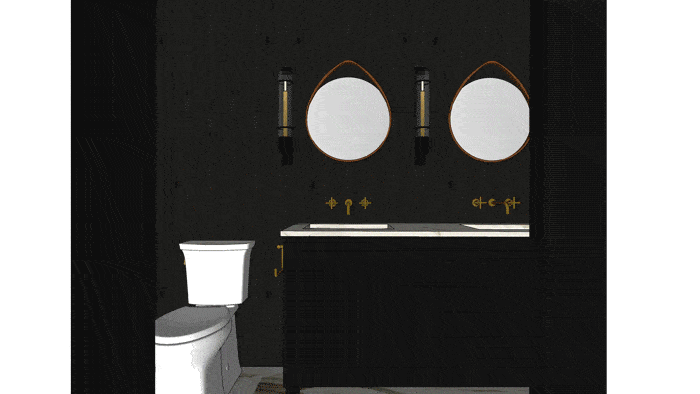
Now it’s time to take a look at it all put together.

The Purist line in the Vibrant Polished Brass is just so beautiful and I know that I will never not love it. We went with wall-mount faucets and undermount sinks to keep it feeling clean and modern (remember the vessel/undermount debate we had?)
When we first proposed this material board, we had initially thought to keep the Poplin vanity from Kohler the standard linen white color but in the comments, many of you thought the white against the black stained wood would be too much of a contrast. And we agreed, so we played around in SketchUp with some dark color options. We ended up going all black for the walls, vanity (for now) and hardware which then draws your eye to the warmth of the Calacatta Oro Borghini marble and the Purist faucets. We ordered the fixtures for this bath in the Vibrant Polished Brass finish which is part of their finish to order program that I got to preview as part of my partnership with Kohler. This is the same finish as the kids and master bath fixtures to ensure that they all feel like they belong in the same house. As a reminder, the faucets are made to order in the finish I choose, no matter the line I picked from (you can visit your local Kohler Signature Store or Kohler Experience Center to learn more about the program which rolls out in early 2019), but if you are looking for something with a faster turn around (i.e. ready to ship), the Modern Brushed Gold finish is similar in tone to Vibrant Polished Brass.
As for the black vanity, I will say that now that we saw the walls up in the space, we want to try the white vanity before we go ahead and have it painted black. Last week, on the site visit, we all looked at each other and thought the same thing: maybe the white would work just as well. We’ll see…I’d be excited about them both. You have to remember that on paper, something could look perfect (or on the flip side, feel like it just won’t work), but until you’re IN a space and see all the elements coming together, you don’t 100% know and sometimes things have to shuffle/adjust to feel right.
Now for the details, the stuff that you might not know about (like the sconces and mirrors)…

Sconce | Mirror | Wall-Mount Faucet | Towel Ring | Marble | Toilet | Vanity | Undermount Sink | Hardware
Those beautiful lantern-like fixtures are the Huntley sconce from The Urban Electric Co., which we ordered in a Matte Black except for the candle sleeve (that’s in an unlacquered brass). There are a couple of can lights in the ceiling in addition to the three sconces above the vanity so not to worry—we have plenty of functional and ambient lighting for this space. The mirrors are from Thos. Moser which we fell in love with at the Portland house (you might remember them from the foyer reveal earlier this month). They are bent-wood and add some much needed grounded warmth in this dramatic bathroom.
In an attempt to make every bathroom interesting and unique, we realized that this was perhaps the only bathroom that could have flanking sconces, which is why we went for that versus installing them above the mirror.

There was a lot of debate about what materials were going to go where in the tub/shower area. For instance: Should we continue the tile on the tub front or keep the black stained wood going all the way around the room? Should the tub top be white to match the tile or black to tie in with the wood? We ultimately went with a Thassos marble tub deck to blend seamlessly with both the Pratt & Larson chevron tile (which is so quiet and beautiful), installed horizontally instead of the traditional layout, and the Kohler Underscore tub.
You can see on the right-hand side of the tub that there is a 6-inch ledge for our guests’ toiletries; the render is a little distorted in this photo so it looks larger than what it will be in the end. The Thassos marble will also have a 1-inch overhang so we don’t run into any issues of the wood warping from water getting on it. The wood has also been properly sealed by Ross and his crew to prevent any warping from steam in the bathroom so it can last for years and years to come (but we also know that wood in a bathroom is a little more maintenance and I wouldn’t do it in a kids bath).

Showerhead | Rite-Temp Valve Trim | Valve With Cross Handle | Chevron Tile | Wall-Mount Bath Spout | Handshower | Slidebar Trim | Bathtub | Thassos Tub Top | Reclaimed Wood Tub Front
Now, this bathroom isn’t as luxurious as the master and upstairs guest bath with the DTV control panels but it does have the Rite-Temp pressure-balancing valve which helps to maintain perfect water temperature throughout the duration of your shower. So, if the water pressure dips at any point or someone flushes a toilet nearby, the Rite-Temp feature keeps your water within +/-3 degrees Fahrenheit…no more surprise ice-cold water shooting out all of a sudden (or scalding hot water, for that matter). It’s an easy install, too, and works for thick-wall, thin-wall and back-to-back installations as well as a variety of pipe materials.

Grace spent many hours rendering out multiple views for you all to really feel like you know what the space will look like inside and out. Once this bathroom is completely installed, we will style it out to soften and add more warmth and contrast through wood accents, plants and a washed linen shower curtain. A glass shower door was considered for this space but I haven’t seen one done in a way that I completely love so the shower curtain will be great for now (we also hope to save some money, but truthfully the idea of an oatmeal washed linen curtain feels like what this bathroom needs).
Here you can see all of the fixtures and materials on one board with all the links to the products below:

Reclaimed Wood Wall | Mirror | Sconce | Vanity | Wall-Mount Faucet | Marble | Undermount Sink | Vanity | Hardware | Window | Towel Ring | Toilet | Flooring | Towel Bar | Robe Hook | Shower Surround Tile | Showerhead | Rite-Temp Valve Trim | Valve With Cross Handle | Wall-Mount Bath Spout | Handshower | Slidebar Trim | Bathtub | Thassos Tub Top | Reclaimed Wood Tub Front
This bathroom is definitely the most “out there” design-wise than the rest of the four baths in this house (well…maybe the kids’ bath with the green quartzite wins out) but it was a risk that I am so glad we all decided to take together.
So, what do you think about this bathroom? Are you happy that you voted for the bold black stained walls or do you miss the brass-and-blue Emily Henderson special? Let us know in the comments…even though everything is already ordered, on-site or installed and probably won’t be changed, it is still fun for us to know what you think of the design.
And, here is the SketchUp walkthrough in case you feel like you need to be in the space even more.
Thanks to my great design team Julie, Grace and Velinda for obsessing about the details and ensuring me on a daily basis that a black bathroom was what I needed to be doing in life. And thanks Ross Alan for having the perfect reclaimed wood, stained black for that rustic (but refined) matte look.
I’M EXCITED, ARE YOU EXCITED????
*This post is in partnership with Kohler but all words, designs and selections are our own. Thanks for supporting the brands we love that support the blog.


Beautiful.
But I feel like the tiles in the tub area would look better if placed verticaly.
I re-read the original post and a consistent theme was to avoid a high black/white contrast, but that is the first thing that strikes me when I see the juxtaposition of the shower and the rest of the room. Maybe a non-black vanity would balance the extreme contrast? Thanks!
Ha. I know. We are going to put it in as white and then if need be paint it black. I know that seems annoying. When you get in there it doesn’t feel like ‘black’ and ‘white’ it feels more like ‘charcoal wood’ and ‘warm stone and tile’. But we’ll see 🙂
This is pretty and I do love that you’re taking some risks! I’m voting white vanity – but excited to see where you land!
Way to take risks! This is beautiful. The 3 sconces + 2 mirrors on the wall behind the sink looks somehow… busy? unibrow-y? prison-y?. Like the two mirrors are eyeballs and the sconces on either side are eyebrows, and the one in the middle is the awkward 3rd-wheel-unibrow. But also the shape of the sconces reminds me of prison bars, somehow. What if you played with removing the middle of the 3 sconces and just keeping the 2 outside ones?
LOL! I’m not sold on the mirror/sconce setup either. What if instead of round mirrors, there were rectangular mirrors with rounded corners?
Prison references not withstanding (ha!), having three sconces ensures that people at both sinks will have lovely light on both sides of their faces when getting ready, putting on makeup, etc. Functionally, it’s a nice design.
Yah, this was our only bathroom we had the space to do side sconces (the rest are pendant or above sconces) so we wanted to do something different. We are into it, but who knows it might look busy once installed. If I didn’t love and already have those wood mirrors I might consider something rectangular, but i love them tooo much.
Oops, looks like you’ve already thought about a larger rectangular mirror. Maybe the circular mirrors could go somewhere else?
love the mirrors and all Moser in general. I had no idea UEC sconces woudl be that pricey…must be amazing in person!
I love it!! I continue to like the idea of the black or off-black vanity. Otherwise, I feel like it could get to choppy. You can always bring him some lighter elements with art and accessories. Don’t change a thing! ?
It’s stunning, but I’m on the fence with all the black. I just prefer a full bath to be light, bright and happy, saving the dramatic dark moments for powder rooms. Still, it is gorgeous! Good for you for taking risks!
I wouldn’t do this for our master bath or the kids. It’s the guest bath so its a fun place to take a risk. xx
Just wow! It is breathtaking!
I’m sorry. I REALLY hate to be a nay-sayer, but this is too dark personally. I wouldn’t want to shower or put on makeup in a bathroom that dark. Again, I’m sorry. I love the tile and the fixtures. I just wish it wasn’t quite so dark.
Ha. again, remember its one of the guest baths not our master. It’s an exciting space to be and experience, but yah, its definitely not an all day every day space.
All I can think of when I see the renderings with the dark walls and dark vanity is “man, that bright white toilet sure does stick out.” My first instinct was to paint the vanity white. But, I could also see making the toilet color match the walls. How? Well, either with a dark-colored toilet (which might be weird), or by installing that beautiful white tile behind the toilet (so that your eye sees a large white rectangle, instead of the crisp white silhouette of a toilet). Also, and this is just a crazy idea, how about framing that window with a pair of white vintage shutters? You know, to get the eye to go from the gorgeous white shower tile on the right to the other side of the room without landing directly on the only white thing on the left, the toilet. Seriously loving the dark wood and the tile, in case you cannot tell. It looks quite cozy!
Love the idea of Vintage shutter. It does seem like some added white on that end would balance the room.
OOH that;s a cute idea! I wonder if we have the space …
I’m sure there will be shelves or towels above the toilet to balance the color.
Great ideas!
I love the black walls, but I hope you don’t go with a black vanity. Too dark IMO. A natural wood vanity (like a birch or maple type finish) would look beautiful in there and wouldn’t have the high contrast as a white one. I am very excited to see how this one ends up!
Yes! I agree. While my favorite color is black, I think in design you only need hits of it to be impactful. Too much of a good thing may not be a good thing.
You know what I think that a natural wood vanity would be great in here, too, but we already have this one in white. We can paint it any color but we like the idea of the black but the white might be better. gonna try the white and then if we don’t like it, we’ll paint her. xx
I am not opposed to the black vanity at all. But what about a greige instead of bright white? Seems like that would work well with the shower curtain and not be as stark as white.
I so agree! I love the dramatic-ness of this room, but I wish the vanity was a lighter wood.
I think the design is interesting particularly in the context of the project and the look you are going for. My only concern is the use of the two types of marble. I would prefer the consistency of one marble repeated.
There aren’t two types of marble. OH the thassos. Thassos just looks white, so it does’t compete, but I see your point. Hmm.. I wonder if we should change the tub top stone … that actually would save some money on honing the thassos because right now its polished.
I agree. That was the first thing that bothered me. Two different types of stone. I’d also prefer the countertop to be repeated on the tub top.
Surrounding the bathtub with the same marble would be overkill. ? Black bathrooms aren’t my jam, but this is beautifully done. Because you’re an interior designer, it makes all the sense that you would take these risks. I have no doubt this will be styled to perfection, and whenever you get “over” it, we’ll live vicariously through you and get to enjoy the next design as well.
looks great! this bathroom perfectly says “I am a little modern, but still very mountain”.
Happy to see something different than blue-and-brass-Emily, but sorry – too dark for me. I love lots of light and bright in a bathroom for makeup and just general “let’s start the day” happiness. Happy your success affords you to put 2 $2200 mirrors in a guest bath. Congrats!
They’re $850. The set of 3 is $2,200
This seems a little mean.
I love it. I’m so glad to see you play – this doesn’t feel like a stretch from OG EHD to me at all. OG EHD loves to play! Hope it feels as wonderful as it looks!
Not sure how to say this without sounding so negative but this is not a space I would want to spend any time in. It feels like one shag rug away from bad 70’s basement bathroom and I think it will be dated very quickly. A wood tone vanity would help lighten things up or maybe only 1 black wall? But not surrounded by black. I’m not so crazy about the sconces either. (geez I feel so bad saying all this!)
Well, I don’t think you feel SO bad for saying it 🙂 I don’t agree, but I do agree that taking risks also takes the risk of doing something that is dated. But its our risk to take 🙂
Thanks for calling me out on my rudeness…although I disagree I sure could have said it in a nicer way. I look forward to seeing how it all turns out.
Thank you for calling me out on my rudeness….although I disagree with this design plan I sure could have said it in a kinder way. Sorry (for real), I look forward to seeing how it turns out.
Here’s my two cents. I much prefer a modern vanity to a traditional one. (I’ve made this comment on your site before, actually.) If the vanity in this bath were modern, the room would look more “cabin-y” and more “euro” (and less “Liberace” to continue your joke, though I’m not saying it looks Liberace. It doesn’t.) My fantasy would be to have a floating, wall-mounted vanity in natural wood. I’d choose teak against the black, but I know you dislike orange-y wood. But to reiterate–the cabinet need not go to the floor! This is a guest bath–your guests aren’t setting up shop in there.
And now I’m anticipating that you might say, “Teak and brass fixtures don’t really match.” I’m not as enamored by brass fixtures as you are. If you go with a white vanity, try a floating one…:)
I just noticed that on your mood board there was no towel ring, but a towel bar! Yeah! I’ve been railing against towel rings for awhile–my hard work has paid off (JK) ;D
HA. I never really realized that yes, towel rings are harder to style. Bar FTW!
Of course it will depend on how it looks in person, but based on the renderings, I would go with the white vanity first! As you have mentioned, you can always paint it dark later, but in my opinion it would nicely balance out the white of the toilet and the bathtub.
That’s the part that was bothering me – the white toilet. Not that I’d suggest a black toilet (at least not a traditional one, for sure – there’s a “we keep it dark in here for a reason”/bar&lounge vibe that makes me think “60 percent of the time, it works every time”), but the toilet is a large splotch of white in that area, and it is enough to take away a bit from the drama of the black. It’s not quite as Dwell magazine moody modern serene. A white vanity will do that, too, but it might make the black side of the room look more evenly seasoned with white.
While the renderings are super helpful, I think they really can’t come close to showing how gorgeous the stained wood is going to look. The subtle variations in tone and texture are going to be incredible. I love it so much. Please paint that vanity super dark green (or at least show us a rendering). I wish the window trim had remained the unfinished white oak. I get that it was a lot of tones, but it helped transition between the dark wood and light tile. and it would have tied in the beautiful bentwood mirrors.
HMMM. interesting. I think that the window is still a white oak, but maybe i’m wrong!! The design team is up there today so i’ll have them send a pic and I can story it.
Agree! I think the renderings probably make this come off as more flat black and light-sucking than it really is. In person, I’m sure it feels much more rich, textured and cozy. ?
Love the idea of the dark green vanity. You have my vote.
Oooh dark green would be so pretty. Great suggestion!
I want to give some kind, honest feedback: I don’t enjoy seeing renderings. It actually kind of bugs me to see a rendering as the hero image of a post. I appreciate that they take a massive amount of skill to pull off (and I applaud those skills!), and if I were a design client, I would be thrilled to see a rendering before my room were finished. But I would honestly have enjoyed this post more with just the pictures of the products and the before images.
I have been less interested in the blog lately in general, because it feels like there are a lot of posts like this one. I love hearing your thoughts on the design process, Emily. I would actually prefer to just imagine the outcome and then see it. Seeing a rendering first and then seeing the finished project is less satisfying on both ends. The rendering is less satisfying because it isn’t real and the finished project is less satisfying because I already pretty much saw it in the rendering.
Thanks for your feedback. Sounds like you should skip these posts and come for the reveals. We are actually done with these anyway (I think). 🙂
How interesting!
I am loving the renderings. I find they make it infinitely easier for me to imagine the real thing going forward. Also, as someone who has retired from a career in software, I get a kick of seeing how close the renderings can get to reality, and how close I can get to compensating for the renderings in my imagination!
I guess in the end I just want to thank you for opening up the comments to this kind of feedback and discussion. Feels very companionable.
I also disagree! Seeing all parts of the process is so interesting — and having the renderings is so helpful to understand the materials in context. I wish I had the skills to do the renderings for my own home! Keep killing it EHD team!
I love the renderings as well. I am bored just trying to imagine things.
Wow, it’s interesting to hear that others like the renderings so much. Glad to hear it. I can’t quite figure out why they bug me, but thanks for letting me share my opinion. I hope I didn’t hurt any feelings along the way. Keep up the beautiful work.
I like a ll the elements but I’m not sure if I would have wrapped the whole bathroom in black wood. I think as a feature wall and in front of the bathtub it would provide a great texture but I’m unsure if I’m sold on the whole bathroom since it’s so dark. Maybe the white vanity would help to brighten it up a little.
It is a really bold move though so maybe it’ll be perfect as is once it’s completed.
Whoa, some of the comments (first 18 anyway) are not what I was expecting..? For my part -I freaking LOVE this bathroom and it’s dynamism!!! I imagine in person, that delicious stained black reclaimed wood brings so much energy + interest + subtle movement + sense of history & drama to the space (meaning, it won’t be a flat dark space that swallows all the optimism in the world! in truth, black walls can actually be very flattering to us humans…). I think it’s great you guys will be trying the vanity in it’s original white before painting it and although I like the black possibility fine, pulling a moody darker color from the lovely marble countertop/floors for the vanity could be an option..? But of course, you guys at EHD know that already!!! Mostly, I just wanted to say how much I appreciate the intense amount of work each room in the Mountain Fixer has required from so many talented folks (pretty sure you guys know how to make even a shag rug timeless ; ) and that I am often in awe of how generously (and bravely..?) you share that work with us. Thank you!
Ha. thank you! HOnestly the controversy on a guest bath is fun. I wouldn’t do this for my master bath but this bath is tucked away in a corner of the house and we think it will be a super fun experience and if not, well, its just a guest bath and its our job to take risks, show people how they work or DON’T 🙂
This is lovely – I’m quite excited to see the real thing! Totally agree that the washed linen shower curtain is a better choice than glass, and I wonder if a white vanity will work in the end?! I’m a fan of the horizontal tile in the tub area and think you found great materials and put together something very special here.
thank you 🙂
Am I the only one that wants to see a wood vanity hanging on that wall. I know i wouldn’t want to clean under that vanity. ( I have one on legs and its a pain )
Wow, definitely feels different, in a good way! I love the walls and mirrors, and the tile choices complement each other nicely. I have a feeling that the render makes the walls look darker than they might actually end up looking in real life, when sun is filtering into the bathroom. That’s my hope anyway! I agree with other about maybe having a modern vanity or a lighter color vanity. Overall, nice work Emily!
As one who did not enjoy the the Portland house design, finding it too cold/austere and therefore not “Emily” enough, I ADORE this bathroom. I imagine that all these different subtle textures – the tile, the wood and the marble – will feel SO warm, so natural, and yet so sophisticated. Also so relaxing and serene? With a touch of drama, which, to me, would be amazing as a guest experience.
Also I love the scones and the mirrors together – a little quirky, but such a good mix of earthy and tech-y. Which also makes me think this is very California Mountain style – we are a bit of our own breed;).
EXACTLY Lisa! (Except I saw the Portland house in person and I found it to be neither cold nor austere but rather impeccably & inspirationally designed combined with plenty of whimsical features -reading nook and hidden playroom for instance- that was perfectly poised for any lucky family to pour their personalities into the home : ). I’ve learned sooo much from this project -risks both taken and rejected- and cannot wait to see the Mountain Fixer -with all it’s earthy warmth and quirkiness- completed!
Hmm, odd mix of comments and snark about the mirrors!
I like the design. The dark is different and works well in a guest bath. I like the paler bath area as the renderings make it feel like a little room of it’s own. Stepping back and looking at the moving renderings, there’s almost a ship feeling that the round mirrors and brass creates which makes it a cabin in a cabin! (pleased with myself for that one ?).
I think it would be good to bring in a dark green to link to the outside view, so maybe a plant hanging in the corner by the toilet, or huge, plush forest green towels.
I like the dark vanity as otherwise I think it will look like white goods plonked in a dark room, rather than the cohesive look I think it has in these renderings.
I love it so much! It won’t be for everyone— black can be controversial— but I’m SO into it. I’d be interested to see it with the white vanity but I really like this as-is too! It’s fun to see you pushing limits and taking risks. So many design companies are doing things that are absolutely beautiful but so predictable and standard. Kudos for being courageous!
Completely agree. Love the black because it is so unique! I can’t quite picture the vanity in white but trust you and your team to make the right call. I love that you took such a huge risk, and doing it in a guest bath makes so much sense. Like many others, I need brightness and light in my own home but just LOVE the look of this bath nonetheless. It is so so pretty.
Love it! Now that I see the black cladding on all the walls (not just a focal wall), I do wonder if a white vanity would look better… Either way, it’s a beautiful bathroom!
I love it all- the black, the mirrors, gorgeous fixtures, tile, lighting. So nice to see something different but still beautiful.
I love this space! With the vanity – is it too late to consider a wood vanity? Perhaps that would soften the black/white contrast and tie in with those gorgeous mirrors. I can’t wait to see what you decide.
This is going to be gorgeous. Can’t wait to see the final pics.
Beautiful! Is there any concern about water damage on the reclaimed wood tub front?
Oh I love this! This looks like something I’d find in a chic, up-scale ski lodge somewhere in the Alps 🙂 It’s dramatic, cozy, clean, and classy. Still so happy this design won out!
I totally agree with this!!
In real life I’m much more Emily blue and brass, but it sure is fun having you (EHD) taking the big risks for me. Since this is no one’s full time bathroom, take the risk! Eat the flan!
I’m in the camp that thinks the bathroom might feel a bit dark, but I am really excited to see the dark wood on the walls. I feel like a white vanity would be too stark in the other direction. What about a deep taupe with grey undertones to play off the brass and the marble, and still brighten the room up a little?
I think the main thing is that when guests look at themselves in the mirror the lighting should be bright enough to allow them to see food in their teeth, but not so bright and abrasive that they can see their post-ski hangovers….
Wow, black invokes so much controversy. Good for you for taking risks. They are yours to take and we’ll learn from your experience.
Taking all the items separate of themselves, they are beautiful. All together though – it’s too jarringly dark. Paneling in the bath just doesn’t jive for me regardless if it’s used infrequently.
Without animus, thank you for sharing. Love your site.
I DIG IT. I would love to get ready in this bathroom! Kind of sexy, kind of cozy, kind of daring. Definitely a cool vibe. I can see where all the darkness could be controversial… but honestly, life is short and it’s a guest bathroom. Why not have some fun and give it a shot?
(But I just realized in my current bath reno, I’m painting walls dark, painting vanity to match, using marble floors and white shower tile sooooo maybe I’m biased.)
I’m basically going through a semi-goth phase and want everything to be black/charcoal so I can’t tell you how much I love this design. I know especially in person it’s going to be SO beautiful. Can’t wait to see the reveal!
Beautiful hardware and tiling, love it!
Beautiful bathroom. If this were my bath, I would prefer a white bath front & white cabinet.
I agree that you want to take risks and do something a bit more exciting in a guest bathroom. Looks beautiful – I like the black wood, the tile and marble.
I think it is a bit too dark, and there is something about the proportions of the mirrors and sconces above the vanity that aren’t quite right. I wonder if it would work better to have a single much large mirror above the vanity. Depending on what the mirror reflects, it could bring in more light to the space?
I love bold, dark and risky but in a powder room, not a guest bath. I would not want to put makeup on in such a dark space. I also don’t get the double sinks in a guest bath- seems unnecessary. It seems like a great idea but in the wrong type of bathroom to me.
I have a suggestion. In my experience, the toilet paper holder should be installed facing the opposite direction so the opening is toward the wall. Most people pull toward the front of the holder and the way you have it pictured the roll can (and does!) come off the holder. If you hang it the opposite way with the opening toward the wall, the roll will hit the vertical part of the holder and won’t go anywhere! I love the design and look forward to seeing all of the elements for real!
So very interesting. The bath tile saves it from being sterile and I think the walls uniqueness in person would be so cool. I am in agreement that a white or I would go a bit cream/white for the vanity might look best. Though I’m In a deep relationship? with the EHD look your trying something new was so great to see. You’ve got a lot in you that can be expressed Emily and team so thanks for switching it up:)
Love, love, love this bathroom! To me it is the most “mountain” of any of the bathrooms so far. So glad to see something a little bolder and different.
I love the risks you are taking and can’t wait to see the texture and movement in the walls in real life. I agree that there should only be one marble. Also will there really be a 6 panel colonial door? That seems inappropriate for mountain cabin.
Why do people keep doing the double sinks? I was thinking it was a fad that would die but it hasn’t yet. Counter/storage space seems much more valuable to me than a second sink. Sink on one side and drawers on the other for storage. Am I crazy?
Thank goodness! You didn’t talk about it, but you didn’t move the toilet!!! Great call! I was so perplexed by the plan to move it!
The design rocks!
I love the double sinks in the guest bath! If the tub is not already in I’d recommend making this a shower! Much better for older and mobility challenged guests on the ground floor! Also a add a few more of those simply hooks! Guests need to hang robes, towels and clothes!!
I have a teeny tiny black powder room and I love it so much for it coziness factor. I can imagine how lovely this bathroom would be to take a bath in or just remove makeup before bed. Swoon!