


Design plans get presented, accepted, and edited, but rarely outright rejected. But, it happens. So instead of throwing away a perfectly good design, I figured we’d blog about it so maybe one of you could use it. You all know this house above, right? It belongs to my friend Ian who now shares it with his fiance (a good friend), and soon to be son. Six years ago I designed it for the pilot episode of Secrets From a Stylist, and it is still one of my favorites. And since I feel style ownership over my/their house I hijacked the nursery and am designing it for them as their baby present.

The whole house is a blend of antique comfort mixed with a mid-century cool guy vibe. His fiance has since made it more feminine, adding her touch but it’s mostly the same as you see here.

So, when it came time to do the nursery I decided to started on the design plan without consulting them on what they actually wanted. Again, it’s practically my house, after all.

Here is the room in question. It was the old guest room and needs to be turned into a baby room in the next couple months.

That certainly is the worst photograph ever. But it hasn’t really changed much since I styled it 6 years ago. The room is challenging because it is really small, doesn’t get a lot of light and has gray carpet – which is fine but means that we need to make sure the walls contrast enough, so it’s not a gray cave (how it is now). We can’t go dark on the walls because it would turn into a cave, and we can’t bring in too much pattern or it will feel really busy and small. So there are the challenges – we need to lighten it up, without being busy or boring.
So, on Sunday mornings I would spend an hour or two sourcing and putting together a design plan. Trilby (Ian’s fiance) told me she wanted blue, white, and gold, and maybe some big pops of color. Here is what she pinned to help guide me:

It was muted but happy. Then she also pinned these more poppy images: 
I liked it, but it wasn’t what I was picturing, so I pretty much just ignored it and went with what I wanted to do.
This is the plan I put together:
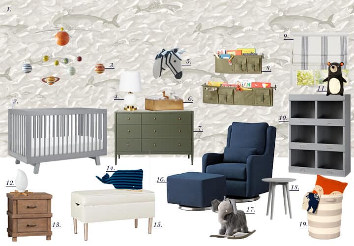
1. Wallpaper in Walnut | 2. Crib | 3. Solar System Mobile | 4. Lamp | 5. Zebra Head | 6. Gold Basket | 7. Dresser | 8. Wall Pockets | 9. Window Shades | 10. Cubbies | 11. Bear Pillow | 12. Camp Fire Nightlight | 13. Nightstand | 14. Whale Pillow | 15. Storage Bench | 16. Glider + Ottoman | 17. Ride On Elephant | 18. Side Table | 19. Laundry Hamper
They were like “Uh . . . that’s cool but not anything that we were picturing.”
Fine. But back to me for a sec . . .
I went for gender neutral, vintage-inspired, and modern, with a bit of rustic nursery. I love that Moby Dick themed wallpaper (called Melville), and thought it would be great for them as they are both big readers. I liked the idea of keeping the walls warm, cozy and neutral, while adding olives and navys to keep it feeling happy and just “boy” enough. It’s very adventuresome and explorer-esque, which I think fits their personalities, and most likely their little munchkin.
We all wanted a pattern but it couldn’t be too high contrast as the space is so small and she really wanted something that made the room look brighter – which admittedly the Melville paper didn’t do. So we went through hundreds of papers which you can see on this pin board. She wanted regency, bright, and feminine, and Ian wanted more antique, and masculine. And I wanted it to be cool, collected, unexpected but work with the style of the house.
We ordered 40 samples of wallpaper, which they narrowed it down to a few that we all really liked, and I pulled together a couple plans. Ultimately they both said that regardless of the style they want it to feel really magical, soothing, happy (and bigger). I can certainly get behind that. Stay tuned for one more rejected design before we settled on the real plan that we are currently installing.
It’s funny how kids rooms tend to be very simple themes (jungle), or no theme at all. What you’ve done is make a more complex theme, which is so cool and different that it took a minute for me to understand (why is there a zebra head and solar system in a whale room?)
Awesome idea! Just adventuresome in general, a room that would stay relevant way past babyhood. It makes so much sense! Maybe this is the future of nursery and kid design…rooms more interesting and encouraging for imagination. It feels authentic, non-cartoony..not overly juvenile…even the color palate is more nuanced. We have dumbed-down children’s rooms– that’s obvious after seeing this design.
Very cool!
You have the best sense of humor. This post cracks me up. Their house is beautiful and the mix of pieces in those rooms are impressive; I mean, a wing chair that sits opposite a danish chair? How did you pull that off?? As always, I can’t wait to see what you do. These are the type of room reveals that I love because they’re challenging and only a pro like you can pull it off.
Her name is Trilby?? Did she name herself? I love that name! Do you think two weeks before the first birthday is too late to change your daughter’s name? Children are adaptable, right?
I love that Daydream wallpaper. It’s not too “put a bird on it” or is it? I want it for my powder room.
I just sent off for a sample of the Melville wallpaper myself. I’m looking at it for a bathroom. I REALLY like the Fornasetti cloud one, but there is no way I can afford that. Seeing the Pinterest board was great fun and inspiring–thanks for including it. Looking forward to seeing the final.
I love that cloud one, too. So much. xx
i love this option. for me. i have to have the whales and the solar system. this is way chic, the hamper and the shades’ grey stripe, the army uniform wall pockets. love the campfire night light. does the ride on elephant come in a big girl size?
you, Amy, are awesome. i want to go over to your house to play.
This was hilarious. Your sense of humor is amazing and very entertaining. Thank you for sharing a beautiful “reject” that we can all use for our own inspiration!
I love this nursery plan! One comment, though: I don’t mean this in a nasty way, but if I were your client I would feel really bad reading that you now consider the work I hired you to do for my home as not up to par or good. I would feel especially embarrassed to have a list of the things that are ugly or done wrong listed on a widely read, public forum on the internet for anyone to see. Just a thought.
What post are you reading?
The post was edited to remove the comments to which I referred.
Ha. they are such good friends and non-paying clients so we are pretty open about things. I like that guest room but I wish I had done a few things differently. I did edit it though as i don’t want people thinking that I would do it to any paying clients 🙂
That makes sense about them being close friends then! I really appreciate your candidness when it comes to mistakes or things you’d like to change in your own home – as a decorator-in-training myself, it really helps me learn and is also encouraging to read that other designers go through some trial and error once in awhile! I’ve just noticed that you’ve mentioned similar doubts on some other past client project posts too (like the Lake House, if I remember correctly), so just was commenting on how the clients may feel reading those, more as food for thought than anything else. I’m glad you seemed to interpret my comment in the spirit in which it was intended! Thanks for your reply!
I love all the furniture pieces in that nursery! They’re so pretty!
Paige
http://thehappyflammily.com
There are so many awesome elements to this room- I love the solar system mobile, elephant rocker and whale toy. And the crib is perfect for a baby boy. I think that you have a very conceptually advanced nursery going on here so maybe that’s just not for everyone?
-Stefanie
http://thestylesafari.com
Hi!
Where is the sectional couch available?
Love your blog and read your book constantly!
Woohoo! I love Trilby and Ian’s house and can’t wait to see the new baby room.
I just love how you are making fun of yourself here! We all get a little overzealous sometimes and think of just ourselves. I just love it!
The design you came up with was very cute. I see what you were doing with the Moby Dick thing! I’m excited to see the re-design.
Please no alphabet dresser!!! It’s everything this design is not–cheesy.
Awww, I really like your design! It looks like if they’d gone with it, it would have been the best room in the house (in my opinion, but I know it’s their house after all). The planet mobile I don’t really get, but then again I don’t really understand statement mobiles to begin with (our jungle Fisher Price one works just fine for us and it plays music). Getting back to this room design, I love it! And as a mom of two, I think it is very functional too.
I feel like this is kind of like a test shoot for a photographer. You got to do some low-pressure creative flexing and they got to see some free work, without having invested anything. It was probably still a nice jumping off point for the eventual design and we all get to see some fun ideas too! Win win win win.
I love this plan! It probably needs a much bigger room, though – or maybe I’m not understanding the dimensions. I particularly like the Olive with the blue.
This was the episode that made me fall for your style; the bones of the house didn’t hurt either. I’m pleased to see it come back in your/our life and still look very similar to the way it did when you left it, right down to the portrait! You are a talent and I love reading your post, sprinkled with self-deprecating humor.
I just wish I could press ”like” on the first 4 photos. 🙂
I just love the design and so happy you were able to share a design reject with us!! I love the vintage, gender-neutral inspiration.
Anyone able to advise on where to buy the pendant lamp on Client Inspiration, above the beetle. Thanks a lot!! 🙂