


Welcome back to Day 3 of Arlyn Takes Over the Blog With Her MOTO. Last day, promise. You can have Emily back right after I’m done parading my dining room around your eyeballs. Thanks for hanging in there, but I left the best for last. For anyone just joining, there’s been an intro post and a living room reveal so far, and today is my dining room, a.k.a. my favorite room in my whole home.

You got a sneak peek yesterday of the above, but now it’s time to turn the corner and show you the rest…
But first, let’s acknowledge the “before”:

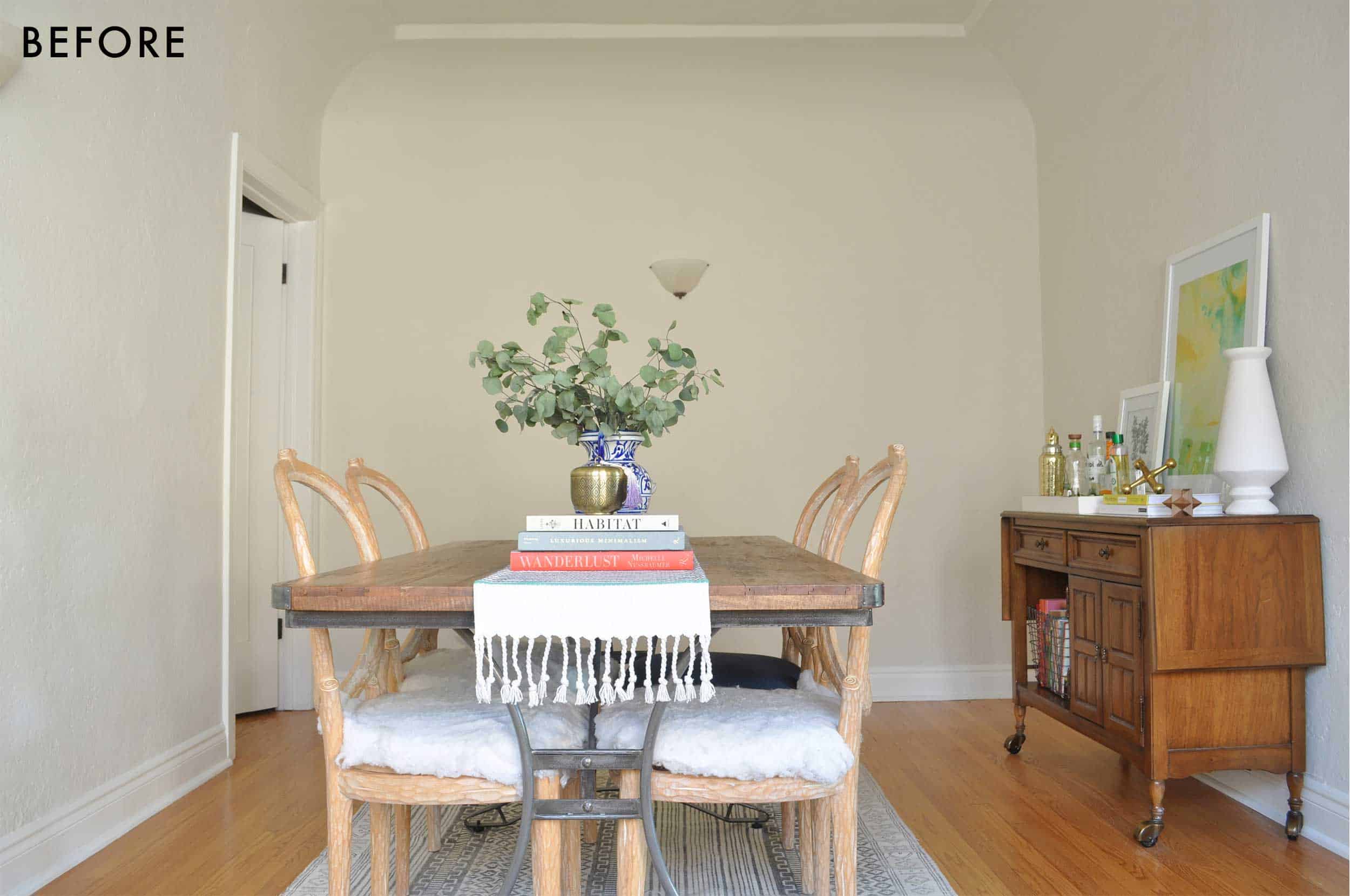
Cute, but the furniture was too small and the whole thing fell a little flat. Sure, there wasn’t much in here (this was right after we moved in), and I could have jazzed up what I already had, but I had other plans…

As I mentioned in the intro post, this room went through quite the design transformation. My moodboards started out as one thing (light walls, dark furniture) and then I flipped everything. After I went with a white color in my living room, I knew I wanted this to be the drama moment in the front of the apartment. So often people say their powder room is the “jewel box” of the home, but well, I don’t have a powder room, so this is my jewel box.
The wall color—Inchyra Blue by Farrow & Ball—absolutely makes this room IMHO. I wasn’t sure if my landlord would go for it, but I had already mentally built the space around it, so I sent off an email with a hope and a prayer (and a promise to paint it back) and all went well. Phew. It reads a little more teal in these photos because of the light, but it’s so wonderfully chalky and this very happy place between blue and green. It has a certain je ne sais quoi. The decision to paint the ceiling was a no-brainer. The curve of the cove ceiling would have made for an awkward transition if I left the top white/beige, so I went all in and boy am I happy I did. It feels like the room is hugging you. It’s good for the soul, the chicken soup of rooms.
With regards to the furniture, my approach was “design a living space, then make sure there’s a table and chairs” so I started with the dining bench first and foremost because every living space needs a sofa(ish) piece. (FYI, the idea to design it like a living space came from knowing I would do far more than just dine in here…I sit in here and work sometimes, I perch on the banquette and chat with Charles if he’s in the kitchen or vice versa…I really wanted this to be the “salon” of the apartment, if that makes sense.)

I honestly can’t remember how I found this, but it’s a new piece designed by Angela Chrusciaki Blehm for Chairish. Maybe it was Instagram, maybe it was an email, maybe it was directly on the retailer’s site, but either way, it was one of those moments where things clicked. I know it’s not for everyone, but the whimsical ribbon pattern was just wild enough to break up the seriousness of what this room could have been. The color is white and slate-y blue (sometimes the light makes it feel a little more cobalt), which felt like a good place between the wall color and the sofa in the living room. Emily called it “editorial” and yeah…let’s go with it!
To balance the dark, moody paint color, I opted for a light and subtle table and chairs and Article had just released their new Ventu line that fit exactly the length I needed. It also comes as an 8-seater, but 6 was just right in here. While I don’t typically go for the whole matching dining set thing, there was enough going on in here that the tone-on-tone of the light leather chairs and blonde oak worked to break things up a bit.
As for why I chose to put nothing above the banquette, well…maybe I’ll fill that wall one day, maybe I won’t. I like to leave things open so I can grow into a space because design is never really finished, is it? If every single nook and spot is taken up, where will all my future treasures go? Besides, with the gallery wall on one end and windows on the other, I wanted a place to really just see the paint. Negative space is just as powerful as filling a space.

Because I didn’t really need any more pattern or color, I kept the rug (from Lulu and Georgia) simple but textural. The weaving alternates between white and gray, so the eye still registers it as “interesting” without being overwhelming. And because it’s made of wool, it’s pretty stain resistant naturally (just needs a little blotting and good as new).
Okay, let’s discuss one of my biggest headaches in this room: the light fixtures. I said this Tuesday, but this room is tricky because the lighting is centered on the room’s footprint, while everything else is a bit askew, centered to the wall between the kitchen opening and hallway door. That meant I needed to either be okay with a pendant/chandelier falling SUPER to the left of the table or find another solution. About a week or two before this shoot, as I entered straight-up panic mode, I was on Schoolhouse’s website and found this beauty. It was a God send, no joke. If I connected one canopy to the current junction box, and installed the other to the ceiling, it would miraculously be centered on the table. I have to imagine this is why they make these types of light fixtures. To help desperate people like me who can’t/dont want to move junction boxes. THANK YOU SCHOOLHOUSE FOR COMING TO THE RESCUE. It’s made of ceramic “bells”, brass plates and pretty white oak connecting pieces. This fixture is insanely special in person, and I’m very much in love with it.

Before moving over to the gallery wall, here is the IKEA Besta unit I teased about. I worked with Semihandmade and Park Studio to give this baby the makeover of her life. For anyone who doesn’t know, Semihandmade makes fantastic custom cabinet doors to retrofit onto IKEA furniture and kitchen cabinets, and here, I went with the beaded front in desert gray from Sarah Sherman Samuel’s line with the brand paired with the Mackinaw handles in large from Park Studio. Man do these elevate a big box piece into something very special. I’d love to add a custom-cut wood top one day, but I’m happy with it as-is.
This holds all our board games, some books, some tools, serving pieces like platters and cheeseboards, and all my small appliances. It used to be my media console, but it works so well in here to keep everything within reach when I need it.
A few other talking points because it’s impossible to get me to stop: those lamps…I found them almost nine years ago when I first moved to South Florida from Orlando (my home town). I was out to brunch with new friends/coworkers and we decided to stroll through an antique market happening on Lincoln Road in South Beach. I spotted these, fought about them with a friend who claimed to see them first (she didn’t), I won, ran to an ATM to take money out of my savings (don’t do this, very irresponsible), and then…they sat in random corners of several apartments before they made it onto this console. They finally have their time to shine. The circa 1960s Murano glass and bulbous shape is modernized with a black shade (hot tip, for you…black shades freshen up older silhouettes).

The silver pineapple—an ice bucket!—is another vintage piece from the ’60s. I found it on a work trip to Belgium a few years back when I was researching a story about antique shopping in Europe (oh, just some work dreams come to life). I was enjoying a cherry tart in an antique dealer’s ridiculously charming kitchen complete with roaring wood-burning fireplace when I spotted it and bought it on the spot. I left behind a pair of pants to make sure it fit in my carry-on. Sacrifices. Worth it.

Gallery wall time! Hats off to Jess who came over the night before my shoot and stayed up with me until almost 2 am to hang everything (I gave my neighbors the heads up after profusely apologizing in advance for the banging). I did not ask her to stay that late, she’s just a literal angel (who also has mad gallery wall skills…her living room proves it). Going top to bottom and left to right really visually enlarges this room and makes the ceilings feel SO tall. Anything that draws the eyes up will do this.
My favorite piece on this whole wall happens to be my favorite person in the whole world. Up there in the top right corner is a photo I took of my Charles (husband) that I had Framebridge print and frame. You can’t see it here, but in the opposite corner is a photo he took of me, so our images are hugging this wall of art. The line drawings are from Wit & Delight’s shop and such a fun graphic punch. I love so much of the art on their site, but I only have so much wall space.
The big black and white piece to the right of the sconce is a macro photo of pencil shavings Charles and I took and had printed years ago; it speaks to both our passions: writing for me, sketching (and photography) for him. Right underneath that is a piece that consists of little compliment notes from all my amazing coworkers. It’s a tradition we started in the office for birthdays, and it makes me very, very happy. Oh, and the stickman drawing is Orlando’s! My first weekend in LA after moving was his book signing at West Elm (where little did I know Grace was at, and I met Michael before we ever dreamed of him working here). He gave out these to the first 200 people; this is #170, Grace evidently has #49…typical Grace. 😉

Okay, so that black and white elephant photo. I have wanted that for the better part of a decade but never pulled the trigger. It’s SO special to me, so I’m insanely grateful that I was able to work with Getty Images Gallery to get that happy fella into my home. It’s titled “Hungry Elephant” by Fox Photos, Courtesy of the Getty Images Gallery, and is just one of their amazing curated archive collection. They sell prints (this is a silver gelatin print retouched by hand from vintage negatives that came with a certificate of authenticity) and also offer framing services. I absolutely plan on sourcing art from them again as I have my eye on a few other things spotted on their Instagram.

That’s me in the left-hand corner—a snapshot Charles took on a Christmas trip to Quebec from a few years back. Magical trip, magical photo made even better with a simple yet awesome frame job from Framebridge. They also did the elephant and the “slow down” tea towel by my front door in the living room. I’ve never had anything professionally framed before, and man…it’s some nice stuff (paper backing, hanging wires and hardware, felt pads…the works).
The swimming photo, I got from Minted (I thought the green would be cool against the wall). When it arrived, Charles said “who’s that lady and why should we care enough about her to have her on our walls?” Oh Charles…BECAUSE IT LOOKS COOL, OKAY? He’s a bit of a “make everything yourself” purist when it comes to art. A very “architect” quality of his. The abstract above it as well as the funny “roast chicken” print—which reminded me of Julia Child for some reason—are also from Minted.
By now, maybe you’re wondering about these sconces. This is not what I initially picked out for the space. In fact, all the lighting in here was a “take 2” moment. I sourced these beautiful brass and milk glass articulating arm sconces from Hudson Valley Lighting, but silly me didn’t realize they’d stick out from the wall quite a bit. That was fine over the banquette, but on the other wall, it quickly became a nuisance. So back they went, unfortunately. A little hunting on Etsy led me here and they’re so fun (and super affordable).

I talked about this server a little in the intro on Tuesday, but as a refresher, I found it for like $50 at ReStore in Florida (where I used to live…have I said that enough yet?). Once upon a time, when I was very into painting all thrifted furniture, this was going to be black, but because it’s not in my DNA to finish a single DIY project, I never got around to it (thank goodness). I love its rich wood color, its original hardware and casters. I never put the drop leaves up, but it’s cool that they’re there, I guess. The two drawers are actually just one big drawer with dividers, what I imagine is for proper “silver” and “serving utensils.” Ha, if I opened this, you’d see a bunch of random votive candles, napkins, Canadian coins from a past trip, mail I’m not dealing with. Anyway, let’s just pretend it has “serving ware” in it. I’m very fancy, obviously.
I will give credit where credit’s due: this is Sara’s tree that she brought in specifically for this shoot. I have mourned it since she took it back because honestly, it belongs in here. GIVE IT BACK SARA. I will now move on in this post-borrowed-tree life, trying to find my own tree that will likely never live up to this one, forever haunted by these beautiful photos.

Because doing “moody and glam” can get very serious, very fast, I added in this cheeky little art print from Minted. You might have to squint to see it, but it just says Hahahahaha over and over again. I joke that I thought I ordered it in a much larger size (I didn’t, I was wrong), so when it came, it was laughably small. Pretty appropriate.
This also happens to be mine and Sara’s favorite photo of the whole bunch. I think of it as a “moment” like…”oh I just left this pretty drink here, casually on a napkin, while I stepped away for a sec.” In reality, it’s just a little prop Sara thought to add and whatever, even if it’s not real, it’s pretty, okay? I got the brass jigger, glasses and tray at West Elm. The black bowl is actually a piece specifically made for marinated onions I bought from Teri of No Crumbs Left (one of my favorite food blogs, FYI). When I’m not marinating onions, it’s a great citrus holder.
The mirror was a $25 find from a thrift store in Delray Beach, Florida. I had wanted a gilded mirror for a while but never wanted to pay top dollar for one. I found this one by accident one day looking for nightstands and loved it even more because part of the wood frame was broken. Character, people…and super glue. Anyway, I love it, and putting it off-center to the buffet loosened up the vignette a little, too.

I can’t believe that’s it. I’m done talking now. If you made it to the end of this post (and yesterday’s and Tuesdays), you now know my whole life story and we’re basically BFFs. Wanna come over for dinner? THANK YOU for following along, and look, if you just scrolled to the bottom, I get it. It’s a lot to take in. Thanks for (sort of) looking. Not to sound cheesy or dramatic (two things that are inherently part of my personality), but I’m pretty honored that I got to design these rooms and share them here. Thank you Emily for letting me blab for three days straight, thank you readers for reading three days straight, thank you friends and coworkers who helped me to get everything camera ready, thank you husband for dealing with my straight-up insanity and procrastination that somehow was your fault in my last-minute lunacy. This was so, so fun, and I can’t wait to work on some other rooms in my home to share with you again.
For all the shopping bits and baubles, we put together a Get the Look, and please let me know what you think/if you have questions. If you couldn’t tell, I have no issues with sharing. Brevity, yes; blabbing, no! See ya next time, everyone.

1. Black and Brass Sconce via Illuminate Vintage | 2. Centerpiece Candleholder | 3. Inchyra Blue via Farrow & Ball | 4. Regent Chandelier via Schoolhouse | 5. Kissa Chair via Article | 6. Ventu Table in Light Oak via Article | 7. Skirted Settee in Navy Ribbon by Angela Chrusciaki Blehm via Chairish | 8. Sanela Curtains | 9. Gilah Rug via Lulu and Georgia | 10. Pillow Fabric | 11. Drapery Rod | 12. Cabinet Handle via Park Studio LA | 13. White TV Unit | 14. Cabinet Door via Semihandmade | 15. Cabinet Legs | 16. Flock of Sheep Planter | 17. Curved Vase | 18. Magnifying Glass | 19. Roast Chicken Print via Minted | 20. Cascade Blues Print via Minted | 21. Head and Hand Print via Wit & Delight | 22. Abstract Portrait via Wit & Delight | 23. Abstract No. 9 Print via Minted | 24. Pool Illumination Print via Minted | 25. Ha-ha-ha-ha Print via Minted | 26. Frame via Framebridge | 27. Hungry Elephant Photo via Getty Images Gallery | 28. Mirror Tray | 29. Plant Pot | 30. Angled Jigger | 31. Glassware
***photography by Sara Ligorria-Tramp for EHD
FOLLOW ALONG THE SERIES: Introducing…Arlyn’s Living & Dining Room Makeover Takeover | Arlyn’s Light & Bright Living Room Reveal


I love this MOTO, and I love how it tells the story of you and Charles and your life together and how you’ve reflected that in your home. So dear and gorgeous and home. Thank you for sharing!!
What does MOTO mean?
Make Over Take Over
Makeover, Takeover! 🙂
Long live the dining room!! I keep hearing that’s the dining room is dead or obsolete, and this is a beautiful case for modern dining room. I love the idea of a setee to make it more of a comfortable hangout room. I have a dark dining room too, and this post has inprised me to kick it up a few notches. Thank you!
Thank you Erin!
The color is beautiful. I especially love how it showcases the wall texture.
Yeah! I didn’t love the extreme texture in the beige color, but in this color, it feels extra special.
GOrgeous !!
i love this dining room!!! i can’t believe those sconces were a take #2, and really the chandelier too. They seem to go perfectly together. at first i assumed you bought them as a set. They are so much alike, like the chandelier is the mom and the sconces are the babies : )
the besta pieces under the windows look amazing and look like they provide an insane amount of storage. i usually don’t like the look of the besta, but with the new doors, they are so good!
i literally love all of this.
this 3-day-long post series has been so fun, like, i looked forward to each one every day! yay!
Yes! The lighting I had in here initially was totally different and while I loved them, they just didn’t work for the room. Both of these are a happy accident/surprise.
So well done! Beautiful.
It came out beautiful! And your voice is a pleasure to read!
🙂 Thank you!
Love it all! I also love your writing style. Thanks for sharing.
This is so beautiful!! I haven’t been a fan of the trend towards darker rooms, but this dining room might just convince me that it can be a good idea!! It just looks like it would be so cozy at night!
It IS cozy at night…and during the day!
I WANT your dining room!
Everything turned out absolutely beautiful.
Now you’ve got me all inspired to fix up my current gallery wall! I would love it if you could do a post that discusses gallery walls in general. Like, when to use floating frames, what frame colors work best with pictures, when do add a mat or not, if we should place the picture above the mat, float it, that kind of thing. I love what you all do with frames, and they definitely make a room complete, but I never know what works best with what. Thanks! 🙂
Yes! Please do a dedicated post!
Your writing “voice” is sooo like Orlando’s!!! Your descriptions and openness make me smile! 🙂 I looked forward to each post.
Thank you for sharing. Such fun!
Agreed! Wonderful.
EHD staff – I love hearing your voices. You have been vetted and hired by EHD. You are not second string. I get a little distracted by the self-deprecation in MOTO and other posts. Love the humor, but hope you can own your place a little more in your posts. You belong.
I agree with you Annie! The whole “You’ll have Emily back tomorrow, don’t worry” isn’t needed. We’re here to see YOUR home and read YOUR voice Arlyn. It’s actually a breath of fresh air to check in and see ideas from someone new every now and again!
Yes! What Annie said – you have earned your spot. You have done the work. Trust yourself and own it!
Also, gorgeous spaces, Arlyn! I’m glad you got to use a beautiful paint color after all!
Thank you all!
You are amazing, this room is amazing, your living room is amazing, all the color is amazing, the anecdotes about coworkers are amazing, and I can’t wait to see more!
Your comment is amazing! 🙂
Can we have a post (discussion) about what trees can live indoors and not 1). DIE, 2). Cause a mess, and 3). Don’t have to go outside to suntan? (Minneapolis (and other midwest/northern areas weather is quite treacherous and bringing plants outside to get sun isn’t a possibility in the winter months!) I’m always “searching” for something tree like with visual height and width at the top (insert Sara’s fabulous tree). Is this a unicorn of design and only feasibly possible for those in warm climates?
It depends on the conditions inside… pretty much any tropical can thrive if you have a big window with southern exposure. Sad to say this ficus would *never* survive in this dark corner. They like a lot of light. Actually, there’s really no plant that would thrive in a corner like this and that’s the problem people have. They put plants where they fit the decor, and not where the plants will be happy. Signed, someone with a lot of happy plants
Forgot to say – I’m from the Twin Cities also ?
EP, is that a ficus? I was guessing pear from the trunk.
Sara says it’s a decorative pear tree!
Sorry — didn’t even notice the trunk. I had my eyes dilated at the doctor this morning. ?
though this is not a ficus, I had a ficus indoors for 10+ years in chicago, it was a beauty (and similar look to this tree)! sadly once I had kids i became a bad plant mom and it died.
I did drag my 7 foot tall ficus outside every summer…it really thrived in the sunshine and heat and regained its vigor for another round of midwestern indoor winter. most tropicals will enjoy some outdoor time in the midwest but if you have the right light indoors they can hack it!
So gorgeous! I also have a navy dining room “jewel box”– Hague Blue, by F&B– and an upholstered bench, so your stunning room really speaks to my heart! I hope you get joy from it for many meals to come! Bravo!
Oh how I love Hague Blue. I tested it in here but it was a little too dark. Your dining room sounds beautiful!
Absolutely beautiful work. I will be working this one over in my head for a while. Congratulations!
Thank you!
Arlyn, you and your hubby seem like such a fun couple, and both rooms speak to your personality so well! These spaces are fun, unique, and drop-dead gorgeous! So honored that you chose to share them with us! Also, that settee is drool-worthy… there, I said it! 🙂
Thank you! I’m honored you all were around to read this and take a look. Thank YOU.
I LOVE this and am so inspired to update my “dining” room which I also think of as a bit of a salon. But question for the EHD team, do you think you can go bold with a color like this in a more open concept space?
Hmmm…I say yes but make sure it’s a color you LOVE and lean into it. Commit to the color, go into it confidently and I’m sure it’ll be wonderful.
Those pale wood/leather tones look terrific against the deep blue. I think my favorite wall is actually the one with the windows and the long cabinet. You sure can’t tell that’s an Ikea upgrade. Looks perfect in that spot.
Great paint color. I’m not sure I could do that deep color in my dining room, though, because I don’t get nearly as much light as you do.
I like it. I want to do something similar in my bedroom, but with the trim painted the same color so furnishings pop more.
YES DO IT. I wanted to paint the moldings as well, but they run into the living room and it just didn’t work for this room.
This might be my favorite post ever. I love everything about it. Just everything!
Yay!!! Thank you so much. It’s my favorite room I’ve ever done and just like to stand in there and stare.
Love the lights, I agree, they look like a cool set! And also the table and chairs, gorgeous hue and texture.
I applaud your edgy colors – I myself would be too jangled by the tonal contrast of the cobalt/electric blue sofa, the green/blue walls, and the French/Swedish/navy banquette, but that’s just me. I appreciate the aesthetic, even if I’m not hard-wired to live in it.
Sounds like you and your husband are very happy, a very late congratulations on your marriage:).
Amazing transformation! I love Angela’s ribbon artwork and look longingly at it on Chairish trying to figure out how I can incorporate it. The paint color is absolutely gorgeous! I use blue throughout my house but am searching for that perfect in between is-it-blue-is-it-green color for my husband’s office to make it dark, moody and man-cavey but still presentable if that’s possible! Getting this sample today!!!
The color is SO good in person. It’s very hard to capture accurately in photos, but depending on the light, it’ll go either more green or more blue. GOod luck!
Arlyn, lovely space and thank you for the in depth explanations on your thought process! Question: how did you decide on the placement of the sconces?
Hi Faith! I didn’t have much say in placement. Since I’m a renter, I just replaced what was already there. Sorry I couldn’t be more help!
favorite MOTO to date! great job everyone!
I love this room so much, and loved your writing. I appreciate finding another kindred spirit, with all the awkward smiling for a photo, appreciation for prints with a sense of humor, hanging out with architects, and a husband who thinks all art has to MEAN SOMETHING.
My colonial-style tiny townhome outside of DC will never have enough cool factor to pull this off, but I’m super inspired. Congrats on a beautiful home.
I bet your colonial style townhome could ABSOLUTELY pull this off! I think it could be a cook juxtaposition, actually.
LOVE! What about the rest of the house? I see the kitchen there …. 🙂
once my bank account recovers, I plan on moving down the apartment. I’ll show more soon I hope!
YAY ARYLN! It all came together so beautifully! I would honestly never leave if I were you. BRB gotta go paint my whole house this color.
trust me, it IS hard to leave! 😉
I love this so much! Your space is so beautiful and very inspiring for my own overwhelming rental decorating endeavor. I would also love it if you guys could do more makeover posts for rental bathrooms. As a current resident of an apartment with a truly heinous bathroom, I could really use advice on how to make it look nice without completely gutting it (which I happen to dream about doing every time I’m in there…)
Just stunning. That’s one of the prettiest gallery walls I’ve ever seen. Bravo, Arlyn!
Before I paint my next dining room or kitchen this exact gorgeous shade — I’m curious how the wall color makes food look. Is that a thing? I’ve heard blushes and golds in bathrooms, and lighting at the right level (not overhead), can make us look all pretty in the mirror, and that makes me wonder if green bathroom walls will make me look sick. So, blue in the dining room. Not the choice of fast food joints, because it’s an appetite suppressant. But does it ever take away from the appearance of food? Curious minds…
This is soooooo delicious! I saw the sneak peeks yesterday and knew it was gonna be AMAZING!
OMG Arlyn is this STUNNING! So beautiful, comforting, elegant, and cool. I like the mix of art pieces in the gallery wall, and your Besta makeover just gave me major inspiration! I’m planning to make my own door for an existing unit using this walnut plywood (seen on Yellow Brick Home). https://www.homedepot.com/p/Columbia-Forest-Products-3-4-in-x-2-ft-x-4-ft-PureBond-Walnut-Plywood-Project-Panel-Free-Custom-Cut-Available-1765/203552991
It occurs to me that with veneer edging, the plywood would work as a topper for your unit. They’ll even to the custom cuts for you!
Thank you for the inspiration!
THANK YOU! And ohhh yes that sounds like it could work. Will check it out. Thank you so much for sharing.
Hurrah! I’m currently shopping for door options! YAY!
Arlyn, this is gorgeous! Giving me serious inspiration for our upcoming move with a very similar paint color that I have been fretting about working with.
I had a question about your framed photos, which are just beautiful and really make the space extraordinary–did you have Framebridge print digital files as well as frame them? I’ve tried to print personal photos in the past and have lost all faith in photo printing services locally!
Yes they printed the photo of Charles and myself. They look awesome! I’ve also used AdoramaPix before and really liked their quality (in terms of printing).
Oh, awesome! Yay, thanks so much!
The wall color is perfect. I have a question about the F&B paint you went with. Did you use their Estate Emulsion or Modern Emulsion? I really wanted a flat, chalky look but we were advised to go with Modern Emulsion (7% sheen) because we have little ones. Our painter just painted it and it looks incredibly shiny. My husband thinks it looks like semi-gloss. If you did use Estate Emusion, could you give feedback on how it’s holding up? Thank you!
I used Estate Emulsion. It looks much chalkier in person than in these photos, but yes it has a little sheen to it (mostly because of the richness of the paint pigment I think).
ARLYN!!!
It’s all so very wonderful, but my favorite part is the photos of you and your husband in the corners. You two are the cornerstones of your home, and the pics themselves are just fabulously happy. The poses so in sync and symmetrical and all those fun things. It reminds me of the Brady Bunch photo grid, like you two are winking at each other. You executed it with such subtlety – I think it’s just perfect.
You should be very proud!
I can’t lie, besides the paint color, those photos are also my favorite. Seeing Charles’ beaming smile up there every day…swoon.
Thank you for your wonderful comment!
This whole mini series has been incredible, but this ROOM. My apt is similar in that you walk into the living room, can see the dining room and walk through that to the kitchen, so figuring out how to make the dining room a comfortable pass through and also dining space was tricky and my exact thinking was “if we have to walk through this constantly, it might as well be my jewel box of the home” (mine is painted lilac with a dark, moody floral rug!).
But mostly I came down here to say that $25 thrifted mirror from Delray is a find of a lifetime. I’ve been desperately looking for a mirror like the ever-popular Anthro one I see everywhere (https://www.anthropologie.com/shop/gleaming-primrose-mirror2) and now have hope I’ll find a well-priced dupe if I just keep looking.
You WILL find something! I was looking for years, truly. Everytime I stepped into a thrift store, I’d take a peek at the mirrors. I found another one at ReStore in Boca Raton, but didn’t have my car at the time and lost it by the time I came back to get it. It haunted me for years. Then I found this one and I was SO happy. My heart was racing when I saw it, assuming it’d be at least $100 but NOPE!
Love it! The mirror and the gallery wall are my favorite parts. And I love the paint color!
Gorgeously curated update! I think I lived in this or similar fourplex apt. building, pre-kids. The footprint is remarkably similar, but my starter apartment never reached this level of amazingness. The landlord was an old school interior designer and also owned a b&b.
Really enjoyed this post and reveal – great job!!! We are dealing with the same awkward ceiling light fixture placement in our dining room, and it was great to see your elegant solution. One question – can you tell us anything about the interesting candelabra on the bar / server? Thanks!
There were a few things I borrowed from Emily’s prop closet for the shoot…that being one of the things. My heart ached when I gave it back but I’m on the hunt for something similar!
I loved every moment of these 3 posts. Girl, you are GOOOOOD at telling a story. And your home is stunning too. So happy and personal but also perfectly on trend and curated. A true mix and so lovely! Thank you for sharing!
Your comment makes me beam. Thank you!
WOWZA!! Just simply stunning, I must say!! I read and stayed for the entire story!! Loved every word! You rocked it, Babe!! You should be proud!!
I cannot tell you how much I have enjoyed these three days with you…..your verbiage, your tales to tell and the pictures of a most beautiful home! Thank you for sharing it all!!!! Quite inspiring in so many ways!!!
Thank you Patty for following along. It truly makes me so happy to hear.
What a beautiful room!!! My ONLY thing that comes up every time I see a very darkly painted room is “what does it look like at night?” I wish that every photo we get to see wouldn’t be flush with sunlight. What is like at night? Moody and atmospheric?
Truly I love this room in sunlight and at night. The chandelier light is warm so the space feels sexy and moody and sumptuous. I adore it.
Sounds lovely!!
your house is so beautiful and I love all your personal touches!
sidenote: my most favorite mirror in our house was a $10 huge mid century gem from Goodwill in Delray Beach, FL that I found on my last day there before moving to New York <3
If it’s the goodwill on Federal, I know it well!
I love your DR. The paint color is spectacular – looks like a lot of us are considering it for our own homes. Talk about an “influencer!”
I had no idea that there were ceiling light fixtures that could be moved away from the junction box. That is useful information for me.
I don’t usually like gallery walls because they are too busy for my eyes (it’s a migraine thing), but your gallery wall is beautiful and somehow not too busy for my eyes. It’s nice to see Charles’ photo after reading so much about him in your articles.
Can’t wait to see what you do with your bedroom.
All your wonderful comments and feedback have me itching to get to work on another room. Thank you!
I love this room. It is so vibrant and eclectic and–perfect. It’s perfect. It was so awesome to have Three Days of Arlyn!
🙂
I am absolutely, head over heels in love with your home! Both spaces are insanely gorgeous and play off of each other so well. I just love your use of color Arlyn! Thank you so much for sharing and the process behind your design motivations. Your voice is a spectacular addition to EHD.
This is another of Emily’s blog BEST! makeover’s/designs! Thank you! I wouldn’t have missed a word of it, love your voice and what you have done. Relatable, accessible and just right!
Thanks for the inspiration! Love it all!! And I’ll be over for dinner ASAP! 😀
Emily is a smart woman…she KNEW we would fall in love with you and your “voice”, your thoughts and your designs. I think we must have passed each other on the interstate…I lived in Orange County( CA), and just moved to Central FL. I edited (gave away) over 60%of my collected goodness in my home there to make this journey. I miss California terribly, but like you, I am diving head first into my new story and finding all the buried treasure I can here in this area to build my nest. Really enjoyed following along the past few days and I thank you for giving me the push I needed to colour my life differently here in a new locale. ?